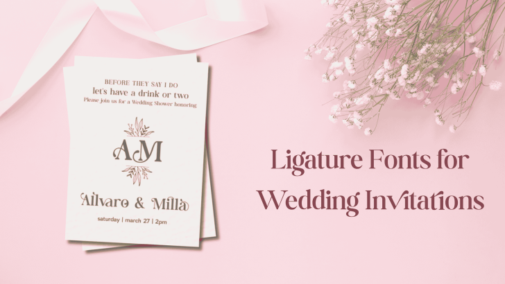
Choosing the right ligature fonts for wedding invitations can completely change the mood of your design. Wedding stationery often needs to feel personal, elegant, and memorable, and ligature fonts can add that extra level of detail without making the layout feel overly decorative.
Unlike standard typefaces, ligature fonts connect or reshape certain letter combinations to create smoother and more expressive typography. These details can make names, wedding dates, initials, and short headlines feel more custom.
Still, not every ligature font works equally well for wedding stationery. The best choice should balance beauty with readability, especially when the design includes venue details, dates, RSVP information, and other practical content.
Why Ligature Fonts Work for Wedding Invitations
Wedding invitations usually rely heavily on typography. Names often become the visual centerpiece, while supporting information needs to remain clear and easy to scan. This creates an ideal situation for combining an expressive ligature font with simpler typography.
Ligatures can make a couple’s names feel more distinctive without requiring a fully custom lettering design. They can also create a sense of craftsmanship that fits romantic, luxury, editorial, or modern wedding themes.
The key is restraint. Use the ligature font for important elements such as names, initials, or short headlines. Then pair it with a cleaner serif or sans serif for longer text.
If you are also designing engagement stationery or coordinating typography across a full wedding set, read Best Fonts for Pre Wedding Invitations and Photo Albums for more ideas on building a consistent visual direction.
Ligature font recommendations for wedding invitations
1. Bergavick
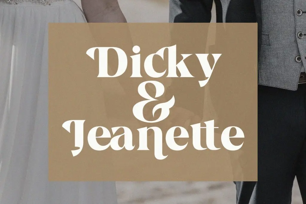
2. Yasmen
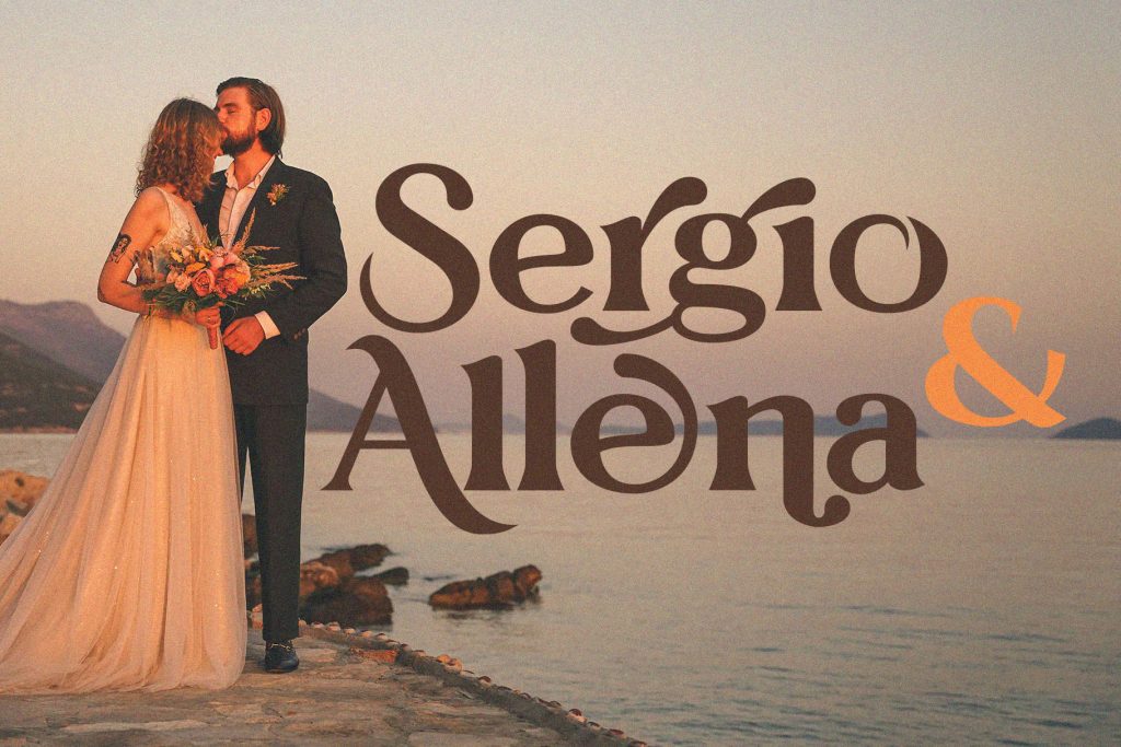
3. The Braga
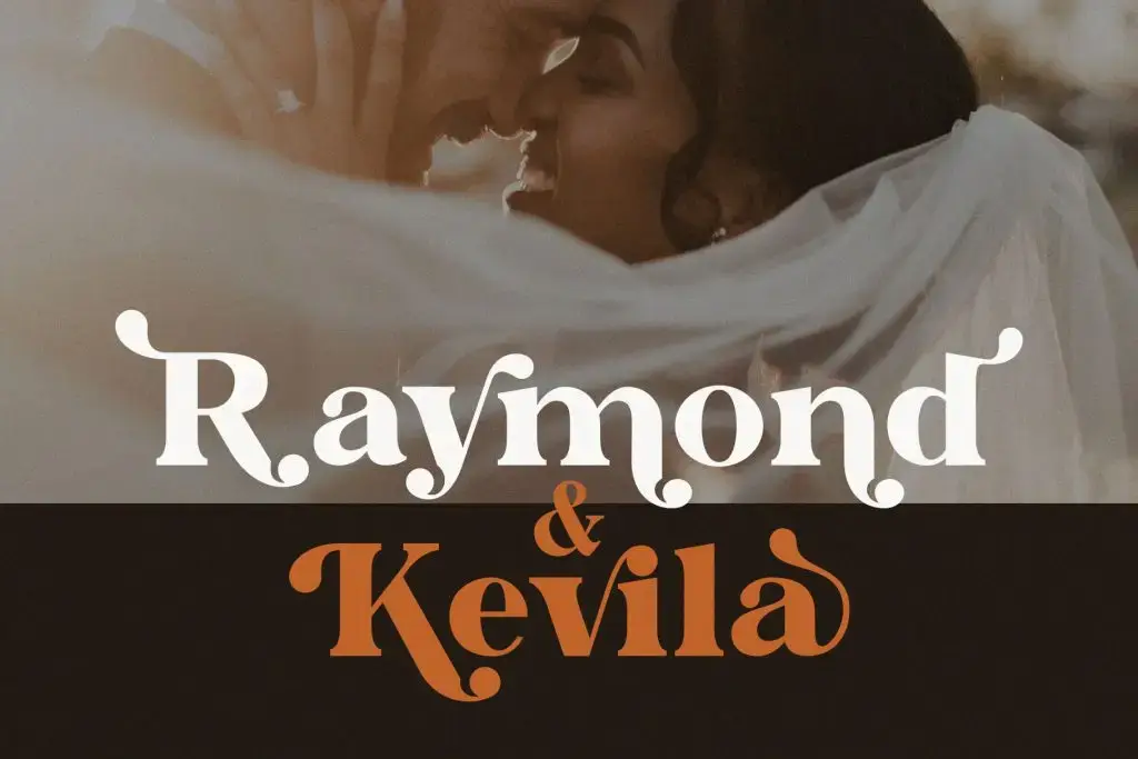
4. Monna Kalingga
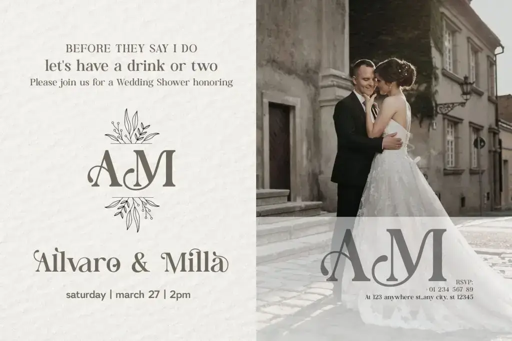
5. Kefhila
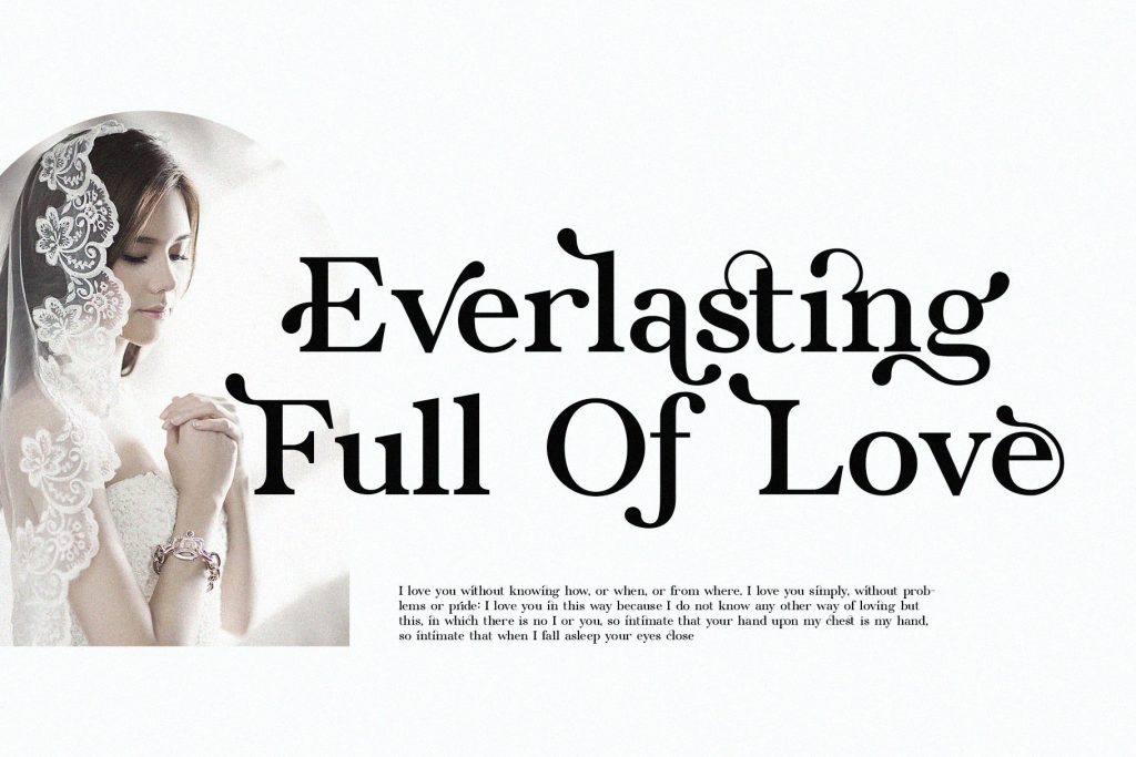
6. Sterla
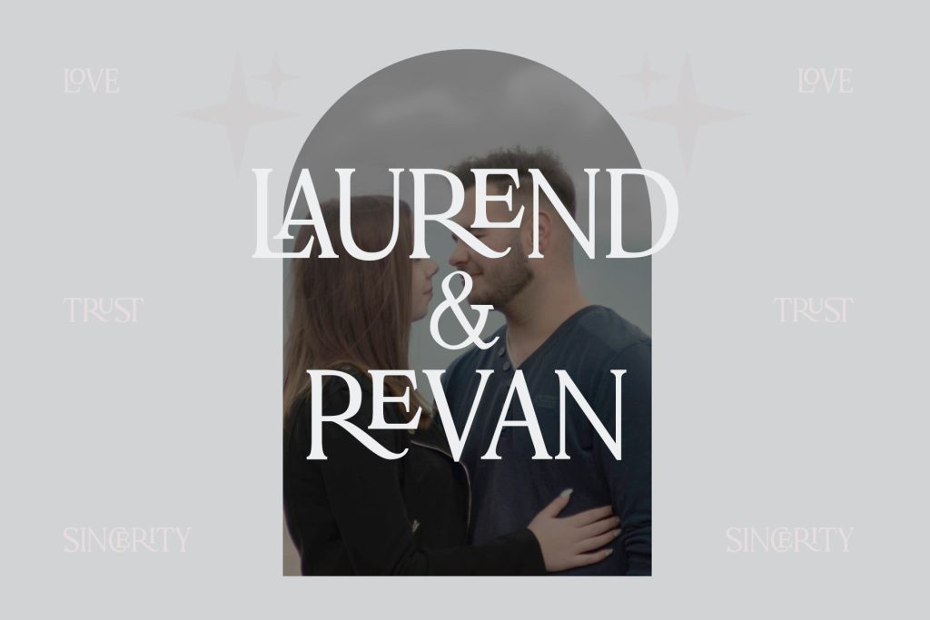
How to Choose the Right Ligature Font
With several options available, the right font should ultimately match the personality of the wedding. Start by defining the atmosphere. A formal ballroom wedding may need a more sophisticated typeface, while an outdoor celebration may suit something softer and more relaxed. Modern weddings can benefit from cleaner ligatures, while editorial concepts may support more dramatic letterforms.
Test the Couple’s Names First
Always test the actual names before choosing a font. Ligature fonts can behave differently depending on letter combinations. One font may look beautiful with a particular name but feel less balanced with another.
Try several uppercase and lowercase variations. Check spacing, connections, and how the names look together. This simple step can help you avoid selecting a font based only on specimen images.
Keep Readability in Mind
Wedding invitations are not only decorative pieces. They also need to communicate important information clearly. Avoid using ligatures for long paragraphs, addresses, schedules, or RSVP instructions.
Instead, create a clear hierarchy. Use Bergavick, Yasmen, The Braga, Monna Kalingga, Kefhila, or Sterla for expressive focal points, then choose a simpler supporting typeface for functional information. This balance allows the typography to feel elegant while keeping the invitation practical.
Final Thoughts
The best ligature fonts for wedding invitations combine personality, elegance, and readability. Fonts such as Bergavick, Yasmen, The Braga, Monna Kalingga, Kefhila, and Sterla can each create a different mood, from soft romantic layouts to modern editorial stationery.
Rather than choosing the most decorative font, focus on the one that best supports the wedding’s visual direction. Test names, experiment with hierarchy, and use ligatures selectively. When the typography feels intentional, even a simple invitation layout can become more personal and memorable.
