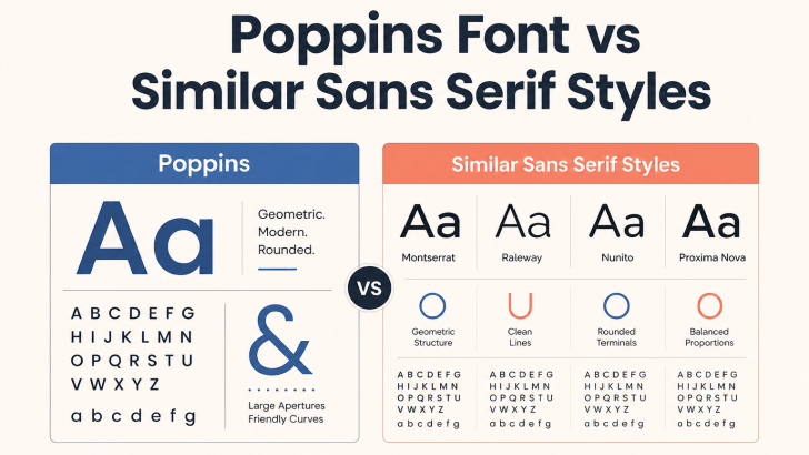
Comparing Poppins font vs similar sans serif styles can help designers decide whether to keep a familiar geometric look or move toward a more distinctive visual identity. Poppins is popular for its clean shapes, balanced proportions, and flexible weights, but many modern sans serif fonts offer a similar sense of clarity with different personalities.
The best choice depends on what you want the brand to communicate. Some alternatives feel more editorial, while others look softer, more refined, or more functional.
What Makes Poppins So Recognizable?
Poppins is a geometric sans serif with rounded forms and a clean overall structure. It feels modern without becoming too cold, which makes it useful for websites, apps, branding, social media, and presentation design.
Its multiple weights also make hierarchy easier to build. Bold styles can support headlines, while regular and medium weights work well for navigation and supporting copy. This versatility is one reason designers often use Poppins as a reference point when looking for modern alternatives.
Poppins Font vs Similar Sans Serif Styles
Similar sans serif fonts may share the same clean direction, but small structural differences can change the overall mood.
1. Geometric Sans Serif Styles

Geometric sans serifs are usually the closest match to Poppins. They often use circular forms, even stroke widths, and balanced proportions. These fonts work well for technology brands, startups, lifestyle businesses, and modern websites. If you want to replace Poppins while keeping the same overall feeling, this category is a strong place to start. However, some geometric alternatives may appear sharper, wider, or more minimal than Poppins. These differences can help a brand feel less familiar.
2. Refined Modern Sans Serif Styles
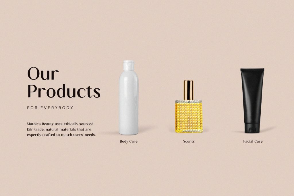
Some Poppins alternatives keep a modern foundation but introduce softer curves or more elegant proportions. They can feel more polished and editorial while remaining clean. This style may suit fashion, beauty, hospitality, and premium lifestyle branding. It is useful when Poppins feels slightly too neutral, but you still want to avoid a decorative typeface.
3. Humanist Sans Serif Styles

Humanist sans serifs usually feel more natural because their letterforms include subtle variation. Compared with Poppins, they may appear warmer and more approachable. They work well for education, wellness, healthcare, professional services, and content-heavy websites. Their open shapes can also support readability at smaller sizes.
4. Condensed Sans Serif Styles

Condensed fonts have narrower proportions than Poppins. They can create a stronger editorial or urban impression while using less horizontal space. This makes them useful for fashion campaigns, posters, packaging, and bold website headlines. However, they are usually better for shorter text than long body copy.
Compare Proportions Before Switching
Two sans serif fonts can look similar at first glance but occupy very different amounts of space.
1. Check Width and X-Height
A wider font may make headlines wrap earlier, while a narrower font can make the same layout feel more compact. X-height also affects how large lowercase text appears. Test the alternative using real brand content rather than only comparing alphabet previews.
2. Review Spacing
Poppins has a relatively balanced rhythm. A replacement may need changes to letter spacing, line height, or paragraph width. Do not assume the same settings will work perfectly after the switch.
Compare Personality, Not Just Shape
A similar font should match the brand, not simply imitate Poppins. Ask whether the alternative feels more premium, friendly, technical, playful, or editorial. These subtle differences are often the main reason to change fonts in the first place.
For specific alternatives, explore Modern Fonts Similar to Poppins for Modern Branding. The guide can help you compare clean sans-serif options while keeping a contemporary visual direction.
Consider Readability Across Digital Formats
Poppins performs well in many digital situations, so any replacement should be tested carefully. Check navigation, buttons, mobile headings, product descriptions, and long paragraphs. Some alternatives may look stronger in headlines but feel less comfortable in body text. A good font should maintain clarity on both desktop and mobile screens.
Keep the Typography Hierarchy Consistent
Changing fonts does not necessarily require changing the entire design system. Use the new typeface in the same roles first. Keep headline, subheading, body, and CTA relationships consistent, then adjust size or weight as needed. This makes it easier to compare the old and new typography fairly.
If you are actively replacing the font across an existing identity, read How to Replace Poppins Without Losing a Clean Modern Look for a more practical transition strategy.
Conclusion
Choosing between Poppins font and similar sans serif styles depends on the personality, readability, and flexibility your brand needs. Poppins remains a reliable choice for clean and modern layouts, but alternative sans serif styles can introduce a more distinctive, editorial, refined, or approachable character.
Instead of looking for an exact replacement, compare how each font performs across real applications such as websites, logos, packaging, and social media. The best choice is the one that keeps your typography clear and consistent while giving the brand a stronger visual identity.
