How Typography Shapes the Personality of a Beverage Brand

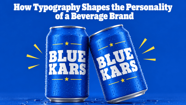
Understanding how typography shapes the personality of a beverage brand can help designers create packaging, menus, advertisements, and social media content that feel more consistent and memorable. Before customers taste a drink, they often notice the bottle, can, cup, label, or menu first. Typography becomes one of the fastest ways to communicate whether the product …

Continue reading →

Bold Serif vs Bold Sans Serif: Choosing the Right Tone for a Brand

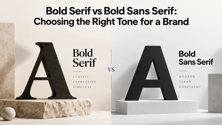
Comparing bold serif vs bold sans serif fonts can help you choose a typeface that matches the personality of your brand. Both styles can create strong visual impact, but they communicate very different moods. Bold serif fonts often feel more editorial, established, or sophisticated, while bold sans serif fonts usually feel cleaner, more direct, and …

Continue reading →

How Social Media Fonts Shape Brand Personality

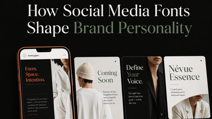
Understanding how social media fonts shape brand personality can help brands create posts that feel more consistent, recognizable, and emotionally relevant. On platforms such as Instagram, TikTok, Pinterest, and Facebook, typography often works alongside photography, color, and layout to communicate a brand’s tone within seconds. A bold display font can make a brand feel energetic, …

Continue reading →

Modern Fonts Similar to Poppins for Modern Branding

Choosing modern fonts similar to Poppins for modern branding can help designers keep a clean, geometric, and contemporary look while creating a more distinctive visual identity. Poppins is widely recognized for its modern sans-serif structure, balanced proportions, and versatility across digital and print projects. However, using a similar font can add personality while preserving the …

Continue reading →

How to Choose the Right Ligature Font for Your Brand

Learning how to choose the right ligature font for your brand can help you create a more distinctive visual identity without sacrificing readability. Ligature fonts can add elegant connections, custom-looking letterforms, and subtle personality to logos, packaging, websites, and campaign graphics. However, not every ligature style works for every brand. The best choice depends on …

Continue reading →