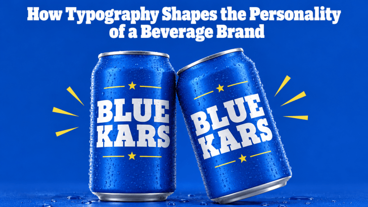
Understanding how typography shapes the personality of a beverage brand can help designers create packaging, menus, advertisements, and social media content that feel more consistent and memorable. Before customers taste a drink, they often notice the bottle, can, cup, label, or menu first. Typography becomes one of the fastest ways to communicate whether the product feels premium, refreshing, playful, natural, bold, or sophisticated.
A beverage brand may use the same ingredients as a competitor, yet look completely different because of its typeface. A refined serif can suggest craftsmanship, while a rounded sans serif may feel friendly and approachable. Bold display fonts can add energy, and handwritten styles can create a more personal, artisanal mood.
Why Typography Matters in Beverage Branding
Beverage branding needs to communicate quickly. Customers often make decisions while standing in front of a shelf, reading a menu, or scrolling through a social feed. Typography helps them understand what kind of product they are looking at before they read every detail. A strong type system also connects different brand touchpoints. The same visual personality can appear on packaging, café menus, posters, delivery apps, websites, and promotional materials.
For more inspiration on food and drink typography, explore Food Fonts for Cafe Menus and Signage. Many of the same principles apply when choosing typefaces for beverage labels, café displays, and drink promotions.
Font Style Sets the First Impression
Different font categories create different emotional signals.
1. Serif Fonts Feel Refined and Established
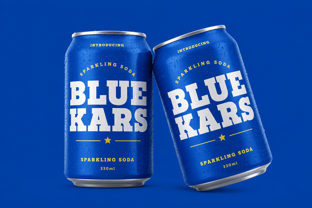
Serif typefaces can give a beverage brand a more premium, classic, or crafted personality. They work well for specialty coffee, wine-inspired non-alcoholic drinks, artisanal tea, premium soda, and luxury bottled beverages. High-contrast serif fonts can create an editorial look, while heavier serif styles may feel more traditional and robust. Use serif fonts for brand names, product titles, or limited-edition collections when you want the packaging to feel considered and elevated.
2. Sans Serif Fonts Feel Modern and Accessible
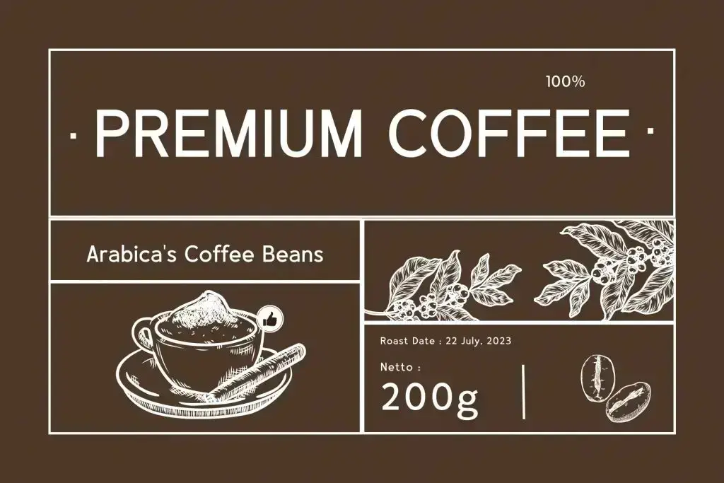
Sans serif fonts usually feel cleaner and more direct. They are often effective for bottled water, energy drinks, modern coffee brands, plant-based beverages, and lifestyle products. A geometric sans serif can feel sleek and contemporary, while a humanist sans serif may feel warmer and more approachable. This versatility makes sans serif typography useful across packaging, websites, and digital advertisements.
3. Script Fonts Feel Personal and Handcrafted
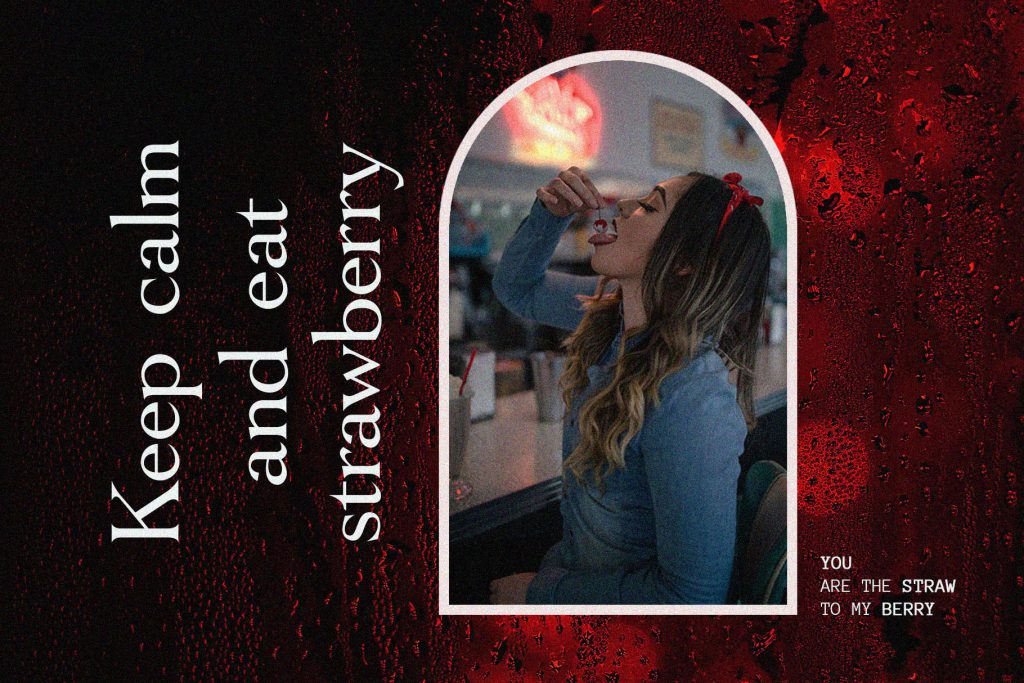
Script fonts can create a more expressive or artisanal mood. Their flowing shapes may suggest handmade recipes, small-batch production, or a more emotional brand story. They can suit specialty tea, café drinks, syrups, or seasonal beverages. However, script fonts should usually be reserved for short names or accents because longer text can become harder to read.
Font Weight Changes Brand Personality
Font weight has a strong psychological effect.
Bold Fonts Create Energy
Heavy typefaces can make a beverage brand feel confident, youthful, and noticeable. They work particularly well for sports drinks, sodas, energy products, and bold flavor campaigns. Large bold lettering also performs well on cans and bottles because it remains visible from a distance.
Light Fonts Feel More Premium
Thin or light fonts can create a refined and minimal appearance. They may work well for sparkling water, wellness beverages, botanical drinks, or premium tea. However, thin typography needs enough contrast to remain readable. Test it carefully on transparent bottles, textured labels, and small packaging.
Letter Shape Influences Emotion
The shape of the letters can communicate personality even before customers consciously notice it.
Rounded Letters Feel Friendly
Rounded terminals and soft curves can make a brand feel welcoming and casual. This works well for family-focused drinks, smoothies, milk-based products, or playful flavored beverages.
Sharp Angles Feel Bold
Angular letterforms can create a stronger and more energetic personality. They may suit sports drinks, modern soda brands, or products targeting younger audiences.
Condensed Fonts Feel Fast and Urban
Condensed fonts take up less horizontal space and often create a compact, confident mood. They can work well for canned beverages, promotional graphics, or street-inspired brands.
Spacing Helps Define the Brand Tone
Typography personality also comes from spacing. Wide letter spacing can make a brand name feel calm, premium, and sophisticated. It is often used in minimalist packaging where the typography needs room to breathe. Tighter spacing can create more intensity. It may make a bold beverage label feel louder and more energetic. The key is balance. Overly tight spacing can reduce readability, while excessive spacing can make words feel disconnected.
Match Typography With the Beverage Category
Different beverage categories create different expectations.
Coffee
Coffee brands can use serif, slab serif, or bold sans serif fonts depending on whether the identity feels artisanal, premium, or modern.
Tea
Tea packaging often benefits from elegant serif, script, or soft sans serif typography. These styles can suggest calm, tradition, or natural ingredients.
Soda
Soda brands usually have more freedom to use expressive typography. Bold display fonts, rounded forms, and energetic color combinations can create a more playful personality.
Wellness Drinks
Clean sans-serif typography often works well for kombucha, functional beverages, juice, and plant-based drinks. It can communicate clarity, freshness, and simplicity.
Keep Typography Consistent Across Touchpoints
A beverage brand should not look one way on the bottle and completely different on Instagram. Use the same primary font, supporting typeface, spacing rules, and hierarchy across packaging, menus, social media, signage, and websites.
Consistency does not mean every design must be identical. Seasonal campaigns can introduce new colors or imagery while keeping the core typography recognizable.
Build Personality Through Intentional Typography
How typography shapes the personality of a beverage brand comes down to the relationship between font style, weight, shape, spacing, and hierarchy. Serif fonts can feel refined, sans serifs can communicate modern clarity, scripts add a handcrafted touch, and bold display styles create energy.
The strongest choice is not simply the most attractive font. It is the one that supports the product category, audience, packaging format, and overall brand story.
