Choosing cute handwritten fonts for kids can instantly change the mood of a children’s brand or educational product. These fonts often feel more playful, personal, and approachable than rigid geometric typefaces. Used carefully, they can make worksheets, packaging, activity books, and learning materials feel warmer without sacrificing readability.
The challenge is balancing personality and function. A font can look adorable at first glance but become difficult to read in longer text or smaller sizes. That is why designers should evaluate handwritten fonts based on clarity, tone, flexibility, and how well they support the final product.
Why Cute Handwritten Fonts Work for Kids’ Design
Children’s design often benefits from visual elements that feel friendly rather than formal. Handwritten letterforms can suggest creativity, imagination, and personal expression, which naturally fits learning environments and playful brands. Their softer appearance can also make educational content feel less intimidating.
This is especially useful for products aimed at younger audiences. A worksheet title, flashcard set, activity book, or toy package can feel more inviting when the typography looks expressive and approachable. The font becomes part of the emotional experience, not just a tool for displaying words.
Choose Friendly Letterforms Over Decorative Ones

Not every handwritten font works well for children. Some styles use exaggerated loops, irregular baselines, or complex strokes that may look attractive but reduce readability. For kids’ products, simple letterforms usually perform better.
Look for clear shapes that are easy to recognize quickly. Letters should feel playful without becoming confusing, especially when the product supports early reading or classroom activities. A good handwritten font should add charm while still making the message easy to understand.
Keep Character Shapes Easy to Recognize
Pay close attention to letters such as a, g, l, I, and t. Highly stylized versions of these characters can be difficult for younger readers to identify. Clear differentiation helps maintain readability while preserving the handwritten personality.
This detail becomes even more important in educational products. If students are learning vocabulary, spelling, or basic reading skills, typography should support comprehension rather than become another obstacle. Cute styling should always come second to clarity.
Match the Font to the Age Group
A font designed for preschool materials may not work for older children. Rounded, bubbly handwriting often suits early childhood products because it feels playful and gentle. However, older students may respond better to handwriting that feels casual, energetic, or slightly more structured.
Designers should think about the audience before choosing the typeface. A kindergarten activity sheet, elementary school workbook, and tween lifestyle brand all need different visual tones. The best font is the one that feels age-appropriate without looking overly childish.
Use Handwritten Fonts for Strong Visual Moments
Handwritten typography usually works best when it has a clear role. Instead of using it for every line of text, apply it to titles, labels, short instructions, callouts, or playful highlights. This keeps the design expressive while maintaining a clean hierarchy.
Body copy should usually remain in a more neutral and readable typeface. Pairing a handwritten display font with a simple sans serif can create a balanced layout. The handwritten style adds emotion, while the secondary font handles longer information more efficiently.
If you want a broader understanding of when this style works best, read Handwritten Fonts: When and How to Use Them in Graphic Design. It explains how handwritten typography can support different design goals without overwhelming the layout.
Think About Educational Use, Not Just Appearance
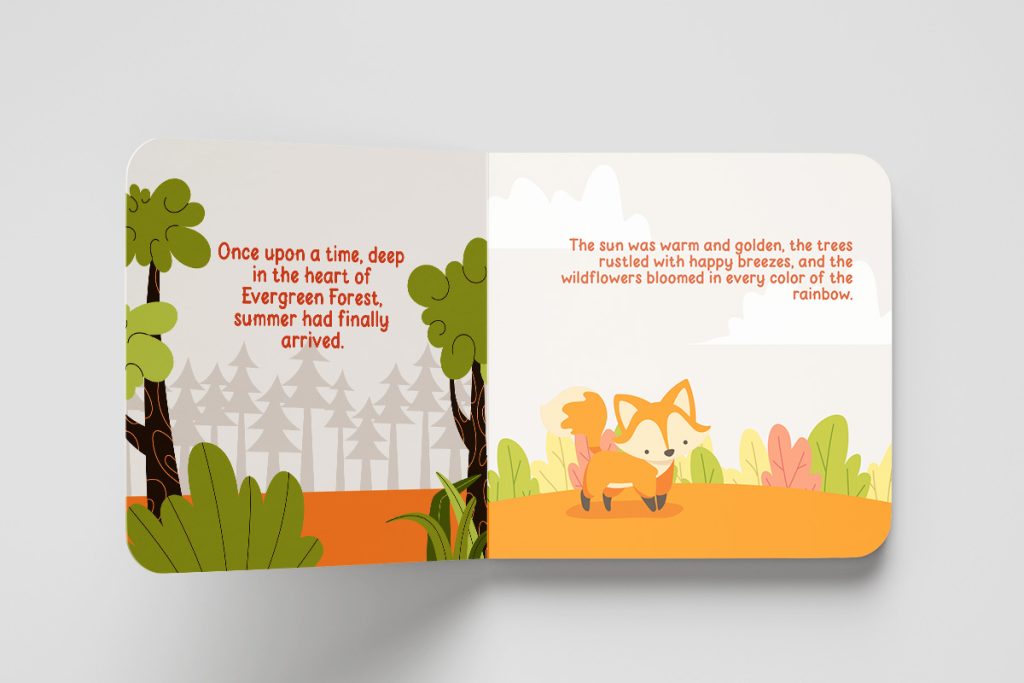
Educational design has different priorities from purely decorative branding. The font needs to support learning, instructions, and information that children can understand quickly. That means spacing and character clarity matter just as much as visual personality.
A cute font that looks good on a poster may not work well on a worksheet. Small text, answer boxes, instructions, and vocabulary lists require stronger readability. Designers should always test the typeface in realistic educational layouts before making a final decision.
Use Color and Typography Together Carefully
Kids’ design often uses bright colors, but combining too many colors with a highly expressive font can make the composition feel chaotic. Handwritten typography already brings personality, so the surrounding visual system should give it enough breathing room. Simpler color combinations often help the font stand out more effectively.
Try using the handwritten font for one or two key elements rather than every section. This creates focus and prevents the design from looking overly busy. Consistency also makes the final product feel more professional.
Test the Font Across Different Products
A strong font choice should work across more than one application. If you are designing for a children’s brand, test the typeface on packaging, social posts, labels, worksheets, and promotional graphics. This helps you understand whether the style can support a complete visual identity.
For educational products, try different sizes and formats. A font may look excellent on an A4 worksheet title but lose its charm on flashcards or mobile learning graphics. Testing early helps prevent inconsistencies later.
Consider the Human Quality of Handwritten Type
One reason handwritten fonts remain popular is their ability to feel personal. Small variations in stroke, shape, and rhythm can make digital content feel less mechanical. This quality can be especially effective for brands that want to communicate warmth, creativity, or care.
The appeal of handwritten typography also has deeper historical roots. If you want to understand how handmade letterforms developed into modern digital styles, explore The Story Behind Handwritten Typography in Graphic Design. That background can help designers understand why handwritten type still feels emotionally powerful today.
Avoid Fonts That Feel Too Messy
Playful does not mean uncontrolled. A handwritten font with excessive irregularity can make a product look unpolished or difficult to navigate. This is especially risky when the design includes many labels, categories, or instructions.
Look for a typeface with consistent spacing and a stable baseline. Some variation is useful because it creates a handmade feel, but too much variation can weaken the overall visual system. The goal is to create charm without losing structure.
Build a Clear Font Pairing System
A handwritten font becomes more useful when paired with a complementary typeface. A clean sans serif can handle body text, while the handwritten font adds emphasis and personality. This creates a clear distinction between functional and expressive information.
Keep the pairing simple. Two typefaces are usually enough for most children’s branding or educational projects. Too many font styles can make the design feel confusing and reduce visual consistency.
Final Thoughts
Using cute handwritten fonts for kids is about more than making a design look fun. The right typeface can support readability, create emotional warmth, and help a children’s brand or educational product feel more engaging. The strongest choices combine playful character with enough structure to remain clear and flexible.
Before choosing a font, test it with real content and real layouts. Compare how it performs in headlines, labels, activity sheets, packaging, and digital graphics. When the typography supports both personality and function, it can become an important part of the overall experience.
