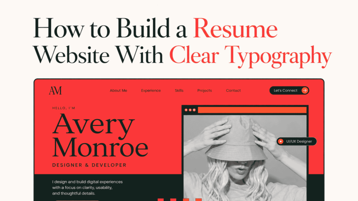
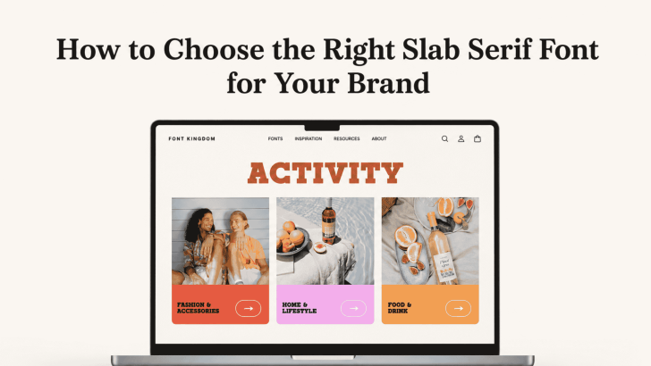
How to Choose the Right Slab Serif Font for Your Brand

Choosing how to choose the right slab serif font for your brand starts with understanding what your brand needs to communicate. Slab serif fonts are known for their strong, block-like serifs and confident presence, but they are not all the same. Some feel editorial and sophisticated, while others look playful, industrial, retro, or bold. That …

Continue reading →

How to Choose Fonts for User Interface Design

Choosing fonts for user interface design is not only about finding a typeface that looks modern. A UI font needs to help users read labels, understand navigation, complete forms, scan content, and recognize important actions without unnecessary effort. The right typography can make an interface feel clear and professional, while the wrong choice can make …

Continue reading →

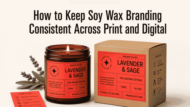
How to Keep Soy Wax Branding Consistent Across Print and Digital

Learning how to keep soy wax branding consistent across print and digital can help a candle business look more professional, trustworthy, and memorable. Customers may first discover a soy wax candle through Instagram, an online shop, a printed label, or a market display. Wherever that first interaction happens, the brand should feel familiar. Consistency does …

Continue reading →

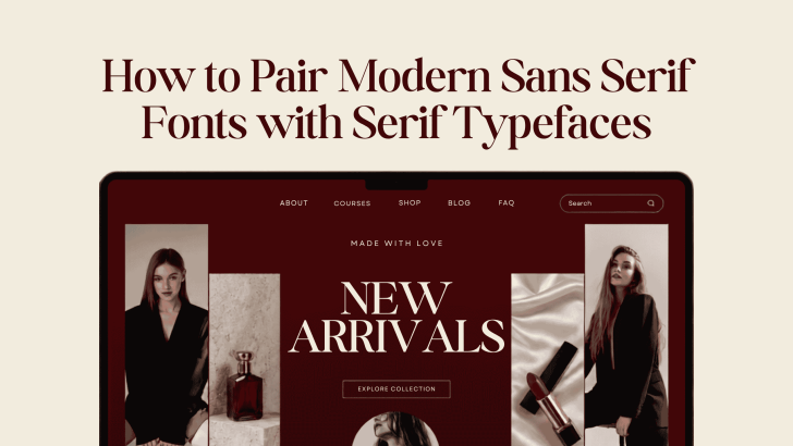
How to Pair Modern Sans Serif Fonts with Serif Typefaces

Learning how to pair modern sans serif fonts with serif typefaces can help designers create layouts that feel balanced, polished, and easier to read. Sans serif fonts often bring clarity and a contemporary mood, while serif typefaces add character, elegance, and visual contrast. When both styles work together, they can create a stronger hierarchy without …

Continue reading →