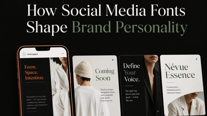
Understanding how social media fonts shape brand personality can help brands create posts that feel more consistent, recognizable, and emotionally relevant. On platforms such as Instagram, TikTok, Pinterest, and Facebook, typography often works alongside photography, color, and layout to communicate a brand’s tone within seconds.
A bold display font can make a brand feel energetic, while a refined serif can create a more premium impression. A rounded sans serif may feel friendly and approachable, while a condensed font can give content a stronger editorial or urban look. Because social media moves quickly, font personality can influence whether people stop, recognize the brand, and continue reading.
Why Font Personality Matters on Social Media
Social media content is usually viewed in fast-scrolling environments. Users may only spend a few seconds looking at one post, so typography needs to communicate quickly.
The font should support the message rather than simply decorate it. A playful typeface may work well for a casual lifestyle brand, but the same font could feel inappropriate for a premium fashion campaign or professional service.
Consistency is also important. If a brand uses completely different font styles in every post, the feed may feel disconnected. Repeating the same typography system can make content easier to recognize over time.
How Social Media Fonts Shape Brand Personality
Different font categories naturally create different impressions.
Bold Display Fonts for Energetic Brands
Display fonts are designed to attract attention. Their strong shapes, unusual proportions, or distinctive details make them ideal for short headlines and promotional messages. They work well for fashion, entertainment, music, events, and youth-focused brands. Use them for phrases such as “New Drop,” “Summer Sale,” or campaign names.
For more inspiration on expressive typography, explore Display Font for Social Media Design and see how stronger type styles can create more memorable content.
Serif Fonts for Elegant and Premium Brands
Serif fonts can make social media graphics feel sophisticated, editorial, and established. They are especially useful for fashion, beauty, hospitality, jewelry, and luxury lifestyle branding. Use serif fonts for campaign headlines, product launches, and quote posts. Pair them with a simpler sans serif for captions, prices, and smaller information. This combination creates personality without reducing readability.
Rounded Sans Serif Fonts for Friendly Brands
Rounded sans serif fonts often feel warm, approachable, and modern. Their softer shapes can suit wellness brands, food businesses, children’s products, education, and casual lifestyle content. They work particularly well for social media posts that need to feel positive and easy to engage with. Keep the weight strong enough for mobile screens. Very thin rounded fonts may lose clarity when viewed quickly.
Condensed Fonts for Urban and Editorial Content
Condensed fonts use narrower letterforms, which can make social media graphics feel bold, efficient, and contemporary. They are useful for streetwear, architecture, editorial campaigns, sports, and creative studios. Because condensed fonts take up less horizontal space, they can also fit strong headlines into limited layouts. However, they are usually better for short text than long descriptions.
Recommended Font Styles for Social Media Branding
Rather than choosing one font for every brand, consider the personality you want to communicate.
1. Modern Sans Serif
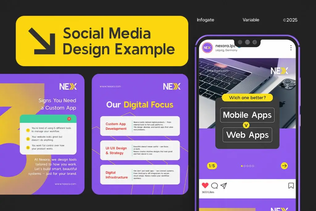
A modern sans serif is a versatile choice for brands that want to appear clean and contemporary. It can work across product posts, educational carousels, promotional graphics, and brand announcements. This style is especially useful when the visual content already contains strong photography or illustrations.
2. Elegant Serif

An elegant serif can add more refinement to social media campaigns. Use it for fashion, beauty, premium food, and lifestyle brands that want a stronger editorial tone. Keep the supporting text simple so the serif remains the main visual feature.
3. Expressive Display Font

An expressive display font works best when the brand needs immediate personality. It can help promotional posts and campaign headlines stand out in crowded feeds. Use it selectively. Too much decorative typography can make a social media feed feel inconsistent.
4. Rounded Sans Serif
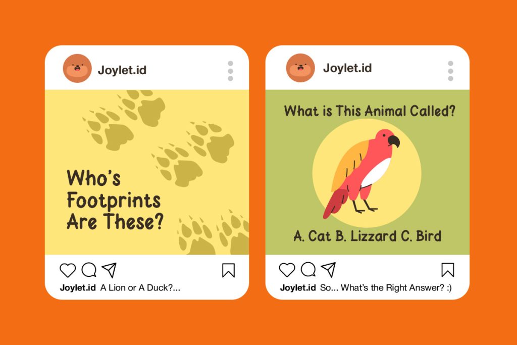
Rounded sans serifs can make a brand feel more approachable and casual. They are effective for friendly service brands, wellness content, food businesses, and educational accounts.
5. Condensed Sans Serif

A condensed sans serif can create a stronger editorial or urban personality. It works particularly well for poster-style posts, fashion campaigns, and social graphics with limited space.
Remember Font Licensing
Social media content is often part of a commercial brand campaign. That means designers should check whether the font license allows use in advertising, branded content, promotional graphics, and client work.
Do not assume that every downloaded font is automatically approved for commercial use.
Before applying a typeface across a brand’s social media system, read Font Licensing Explained for Commercial Use in Social Media to understand what usage rights should be reviewed.
Build Brand Personality Through Consistent Typography
How social media fonts shape brand personality comes down to matching visual style with brand tone. Display fonts can feel energetic, serif fonts can feel premium, rounded sans serifs can feel approachable, and condensed fonts can create a more editorial direction. The strongest choice is the one that supports the audience, message, and platform while remaining consistent across posts.
