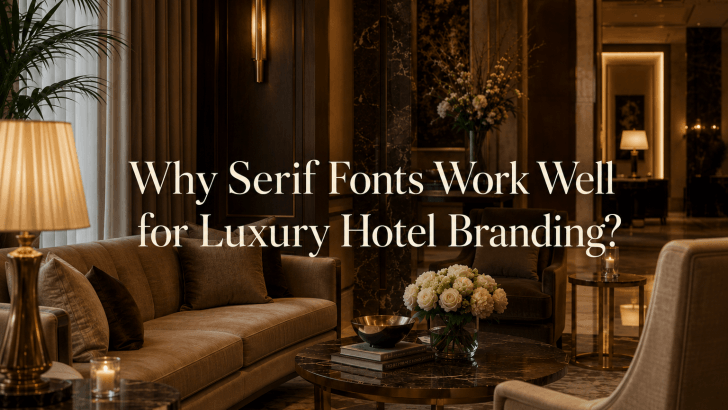
Why Serif Fonts Work Well for Luxury Hotel Branding?

Understanding why serif fonts work well for luxury hotel branding is essential for hospitality businesses that want to create a premium and memorable brand identity. In the luxury hotel industry, first impressions matter. Before guests experience the service, step into a lobby, or book a suite, they interact with branding elements such as logos, websites, …
Continue reading →

The Role of Sans-Serif Fonts in Summer Posters

When designing seasonal marketing materials, many creative designers struggle with one common problem: their posters are visually appealing but fail to convey their message quickly. Bright colors, tropical imagery, and summer-themed illustrations may grab attention, but if the typography is difficult to read, the overall design becomes less effective. This is where sans-serif fonts in …

Continue reading →

Summer Poster Design Trends: Typography Techniques That Capture Attention

Understanding current summer poster design trends can help designers create visuals that stand out in a crowded marketplace. Many summer-themed posters struggle with the same problem: despite using bright colors, beautiful photography, and seasonal illustrations, they still fail to grab attention. Often, the issue lies in typography. Typography is one of the most powerful elements …

Continue reading →

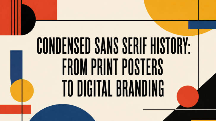
Condensed Sans Serif History: From Print Posters to Digital Branding

The condensed sans serif history reflects the evolution of modern typography itself. From bold advertising posters in the early 20th century to sleek digital branding today, condensed sans serif fonts have remained one of the most practical and visually impactful typography styles in design history. Designers continue to use condensed sans serif fonts because they …

Continue reading →

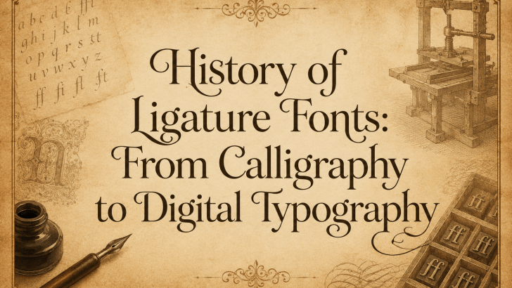
History of Ligature Fonts: From Calligraphy to Digital Typography

The history of ligature fonts is deeply connected to the evolution of writing itself. From handwritten manuscripts created by ancient scribes to modern branding and digital typography, ligatures have always played an important role in improving readability, elegance, and visual harmony. Today, ligature fonts are more popular than ever in logo design, packaging, social media …

Continue reading →

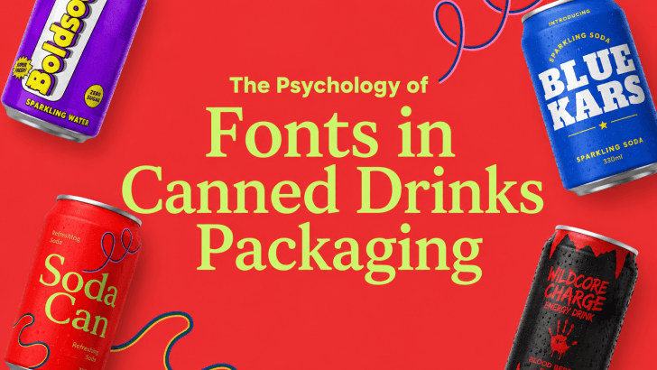
The Psychology of Fonts in Canned Drinks Packaging

The psychology of fonts in canned drinks packaging has a powerful influence on how customers perceive beverages before they even take the first sip. In the competitive beverage industry, typography is much more than decoration. Fonts shape emotional reactions, communicate brand personality, and help products stand out on crowded store shelves and social media platforms. …

Continue reading →