The history of ligature fonts is deeply connected to the evolution of writing itself. From handwritten manuscripts created by ancient scribes to modern branding and digital typography, ligatures have always played an important role in improving readability, elegance, and visual harmony. Today, ligature fonts are more popular than ever in logo design, packaging, social media branding, and modern typography trends.
For designers and brands, ligature fonts are not only decorative elements. They are powerful visual tools that create identity, sophistication, and memorability. At Font Kingdom, ligature fonts continue to become a favorite choice for creatives who want typography with personality and style.
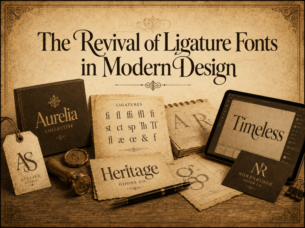
What Are Ligature Fonts?
Ligature fonts are typefaces that combine two or more letters into a single connected character. Instead of displaying letters separately, certain letter pairs merge into one harmonious form.
Common examples include:
- fi
- fl
- ff
- ffi
- Th
Originally, ligatures were developed to make handwriting smoother and faster. Over time, they evolved into aesthetic features in typography and became essential elements in modern font design.
Why Ligatures Matter in Typography
Ligatures improve typography in several ways:
- Enhance readability
- Create smoother visual flow
- Reduce awkward letter spacing
- Add elegance and uniqueness
- Strengthen branding aesthetics
Today, many premium fonts use artistic ligatures to create luxurious, handwritten, or modern branding styles.
The Origins of Ligatures in Ancient Writing
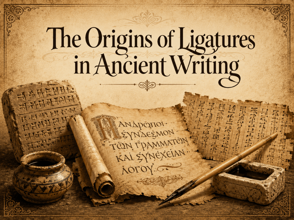
The story of ligatures began long before digital typography existed. Ancient Roman scribes and medieval calligraphers often connected letters naturally while writing by hand.
Ligatures in Roman Scripts
In ancient Rome, stone engravers and scribes discovered that combining certain letters improved writing efficiency and readability. Some inscriptions featured connected letters that later became standard ligatures.
This practice was especially common in handwritten Latin manuscripts.
Medieval Calligraphy and Manuscripts
During the Middle Ages, monks and scribes copied religious texts by hand. Writing every character separately was slow and inefficient, so they developed connected letterforms to speed up the writing process.
Calligraphic ligatures became popular because they:
- Saved space on parchment
- Increased writing speed
- Created an elegant visual rhythm
- Improved manuscript aesthetics
This period heavily influenced modern script and calligraphy-inspired fonts.
The Printing Revolution and Standardized Ligatures
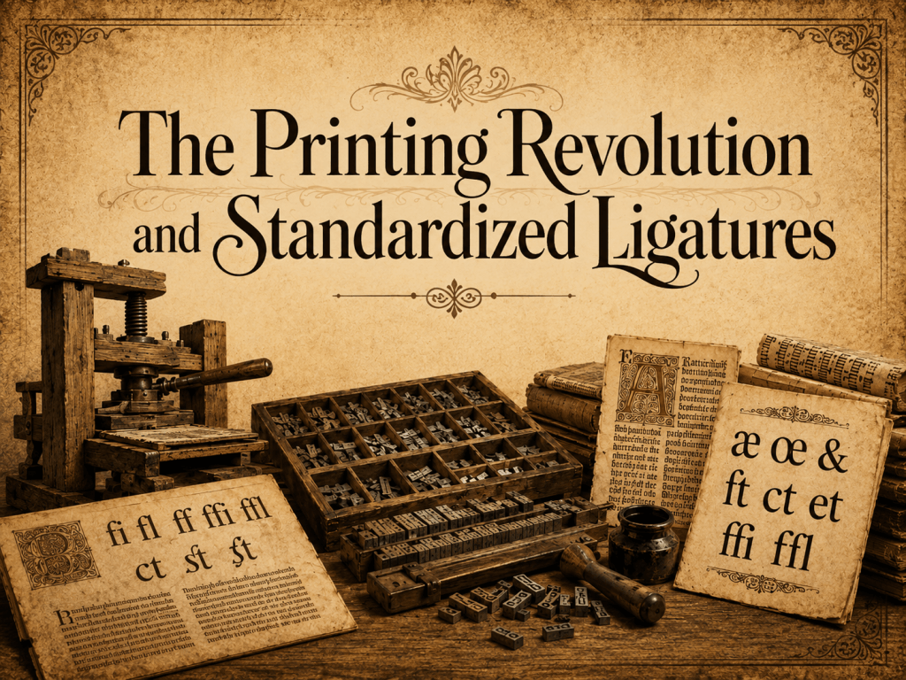
The invention of the printing press in the 15th century transformed typography forever.
Gutenberg and Metal Type
When Johannes Gutenberg introduced movable type printing, typographers needed efficient ways to organize characters in metal type systems.
Certain letter combinations caused spacing and readability issues, especially pairs like:
- fi
- fl
- ff
To solve this, printers created dedicated ligature characters.
These ligatures became standard in traditional typography and remained widely used for centuries.
Ligatures in Classical Serif Typography
Classical serif typefaces often included ligatures as essential design elements. Fonts such as Garamond-inspired and old-style serif typefaces relied on ligatures to maintain visual consistency.
This era established ligatures as both functional and artistic typography components.
The Decline of Ligatures in Early Digital Typography
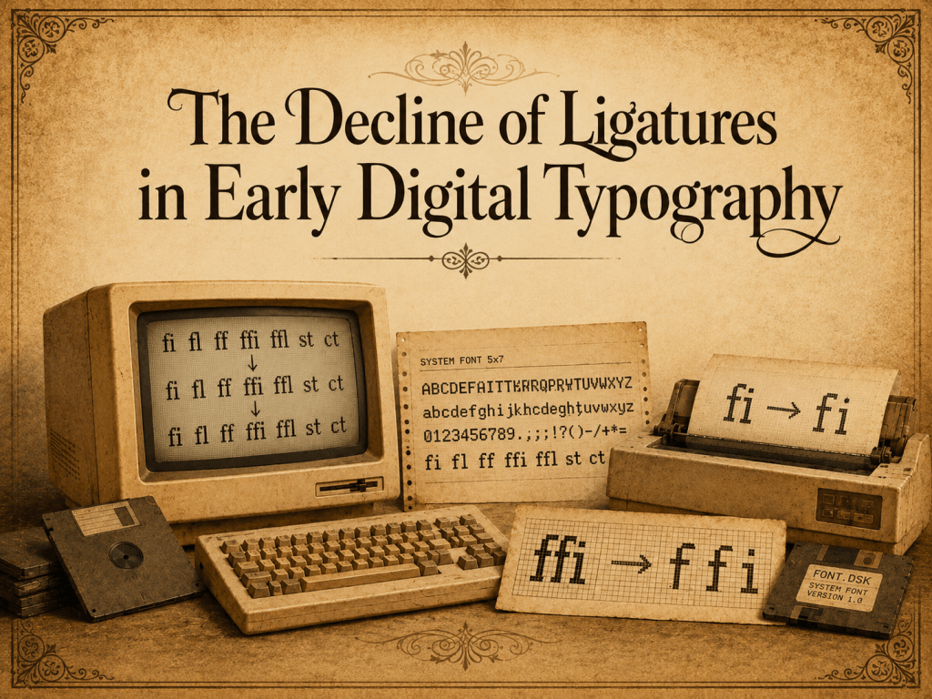
The rise of computers changed typography dramatically.
During the early digital era in the 1980s and 1990s, typography systems became more simplified. Many early operating systems and software programs lacked advanced typography support.
As a result:
- Ligatures were often removed
- Typography became more mechanical
- Font rendering prioritized speed over aesthetics
Early digital fonts usually displayed letters individually rather than using connected glyphs.
Limited Technology and Character Encoding
Older software systems had strict character limitations. Including complex ligatures increased font file sizes and complicated encoding systems.
Because of these technical limitations, ligatures temporarily became less common in mainstream digital typography.
The Revival of Ligature Fonts in Modern Design
As technology improved, ligatures returned stronger than ever.
Modern OpenType technology allows fonts to include advanced typographic features, including:
- Standard ligatures
- Stylistic ligatures
- Contextual alternates
- Swashes
- Decorative glyphs
Today, ligature fonts are widely used across creative industries.
Why Ligature Fonts Became Popular Again
Modern branding trends favor typography that feels:
- Personal
- Elegant
- Luxurious
- Handmade
- Unique
Ligature fonts help brands stand out in crowded markets by creating memorable visual identities.
Social Media and Branding Influence
Platforms like Instagram, Pinterest, and Behance accelerated the popularity of aesthetic typography. Designers began using ligature fonts in:
- Logo design
- Packaging
- Beauty branding
- Fashion campaigns
- Wedding invitations
- Café and lifestyle branding
Minimalist brands especially love ligatures because they create a premium and modern appearance.
Ligature Fonts in Modern Branding
Today, ligatures are no longer just technical typography features. They are branding tools.
A well-designed ligature font can communicate:
- Sophistication
- Creativity
- Luxury
- Femininity
- Modern elegance
For example, many beauty and fashion brands use script ligature fonts to create emotional and stylish branding experiences.
Choosing the Right Ligature Font
When selecting a ligature font, designers should consider:
1. Readability
Overly decorative ligatures may reduce readability. Good ligature fonts balance creativity and clarity.
2. Brand Personality
Different ligature styles communicate different moods:
- Script ligatures → elegant and feminine
- Serif ligatures → classic and luxurious
- Sans-serif ligatures → modern and clean
3. Versatility
A good font should work across multiple platforms, including:
- Websites
- Packaging
- Social media
- Presentations
- Print materials
You can also explore more typography inspiration in our guide to modern font trends on the Font Kingdom Blog.
OpenType Technology and the Future of Ligatures
Modern typography software now supports advanced OpenType features that automatically activate ligatures.
Programs like:
- Adobe Illustrator
- Adobe InDesign
- Canva
- Figma
- Photoshop
allow designers to use sophisticated typography more easily than ever before.
AI and Typography Innovation
Artificial intelligence is also beginning to influence font development. Designers now experiment with AI-assisted typography systems that generate dynamic ligatures and adaptive letterforms.
The future of ligature fonts may include:
- Responsive typography
- Variable ligatures
- Interactive font systems
- AI-generated glyph combinations
As branding becomes more visual and personalized, ligature fonts will likely remain a major typography trend for years to come.
Best Uses for Ligature Fonts
Ligature fonts work especially well for:
- Luxury branding
- Fashion logos
- Beauty packaging
- Café branding
- Editorial design
- Wedding stationery
- Social media graphics
However, they should be used carefully in long body text because excessive decorative ligatures can affect readability.
Conclusion
The history of ligature fonts reflects the evolution of typography itself. From handwritten manuscripts and classical printing presses to modern digital branding, ligatures have continuously adapted to changing design needs.
Today, ligature fonts combine tradition and innovation. They offer designers a way to create typography that feels elegant, expressive, and memorable.
As digital typography continues evolving, ligatures remain one of the most timeless and visually powerful tools in modern font design.
If you are looking for stylish and professionally crafted ligature fonts for your next creative project, explore the latest collections at 20 Beautiful Ligature Fonts Designers Love in 2026.