The condensed sans serif history reflects the evolution of modern typography itself. From bold advertising posters in the early 20th century to sleek digital branding today, condensed sans serif fonts have remained one of the most practical and visually impactful typography styles in design history.
Designers continue to use condensed sans serif fonts because they combine readability, efficiency, and modern aesthetics in a single typeface style. Whether for fashion branding, editorial headlines, posters, packaging, or social media graphics, condensed typography offers a strong visual presence while saving space.
Today, condensed sans serif fonts are widely used across industries because they feel clean, contemporary, and highly adaptable. At Font Kingdom, condensed typography remains one of the most requested styles for modern branding and creative projects.
What Is a Condensed Sans Serif Font?
A condensed sans serif font is a typeface with narrower letter proportions than standard sans serif fonts. The characters are vertically stretched while maintaining readability and balance.
Unlike decorative fonts, condensed sans serif typefaces focus on clarity and efficiency.
Key Characteristics of Condensed Sans Serif Fonts
These fonts usually feature:
- Narrow letterforms
- Minimal ornamentation
- Strong vertical structure
- High readability
- Modern appearance
Because the letters take up less horizontal space, designers can fit larger text into smaller layouts without sacrificing visual impact.
The Origins of Condensed Typography
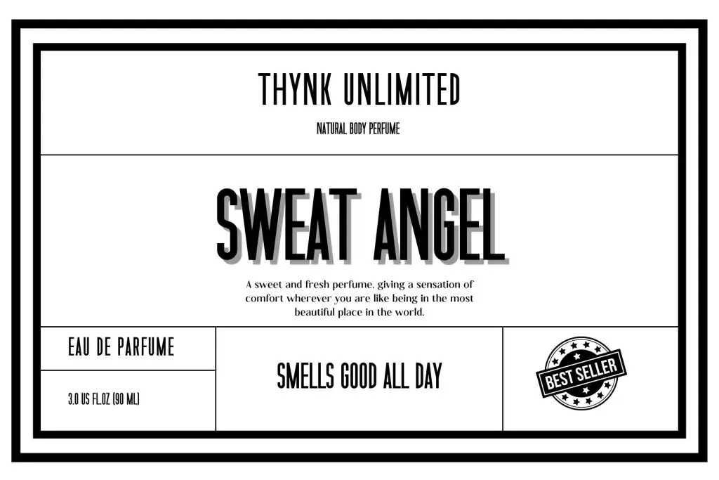
Condensed typography began to gain popularity during the Industrial Revolution, when printed advertising rapidly expanded.
Early Advertising and Poster Design
In the late 19th and early 20th centuries, businesses needed eye-catching typography for:
- Posters
- Newspapers
- Product advertisements
- Billboards
- Public announcements
Printers faced limited physical space, especially in newspaper columns and urban posters. Condensed fonts solved this problem by allowing more text to fit into tight spaces.
This practical function became one of the defining characteristics of condensed typography.
The Influence of Industrial Design
The rise of industrialization influenced typography aesthetics. Designers began favoring bold, functional, and efficient letterforms that reflected modern technology and urban life.
Condensed sans serif fonts matched this movement perfectly because they looked:
- Structured
- Clean
- Mechanical
- Modern
- Efficient
This era established the foundation for many condensed typefaces still used today.
The Rise of Sans Serif Typography
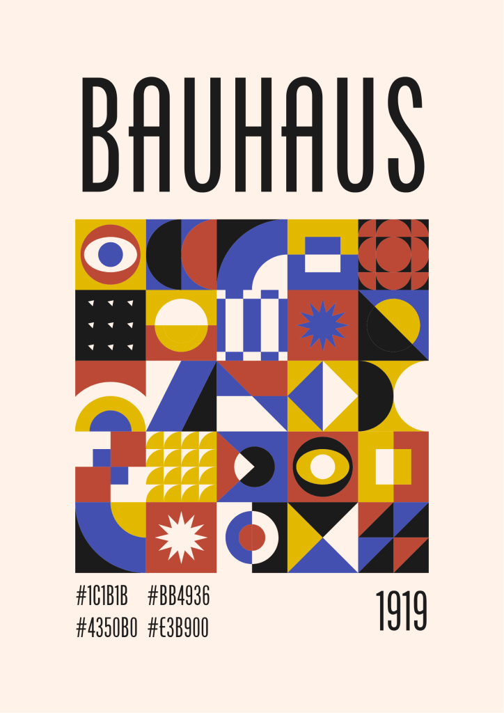
Sans serif fonts became increasingly popular during the early 20th century.
Unlike serif typefaces, sans serif fonts remove decorative strokes at the ends of letters. This created a cleaner and more modern appearance.
Modernism and Functional Typography
Design movements such as Bauhaus and Swiss Design promoted typography based on simplicity and functionality.
Designers believed typography should prioritize:
- Clarity
- Structure
- Readability
- Efficiency
Condensed sans serif fonts align perfectly with these principles.
They became widely used in:
- Transportation signage
- Editorial layouts
- Corporate branding
- Posters
- Product packaging
Condensed Fonts in Vintage Posters

One of the most iconic uses of condensed typography appeared in vintage poster design.
Movie Posters and Advertising
Classic movie posters often used bold, condensed sans serif fonts because they created a dramatic visual hierarchy.
The narrow structure allowed designers to place large headlines without overwhelming the composition.
Sports and Event Promotions
Sports advertisements and event posters also relied heavily on condensed typography because it communicated energy, urgency, and boldness.
Even today, many modern sports brands still use condensed sans serif fonts inspired by vintage poster typography.
Why Condensed Sans Serif Fonts Became Popular
Several factors contributed to the lasting popularity of condensed typography.
1. Space Efficiency
Condensed fonts maximize limited layout space while maintaining readability.
This makes them ideal for:
- Headlines
- Packaging
- Mobile interfaces
- Posters
- Social media graphics
2. Strong Visual Impact
The tall and narrow structure creates a powerful visual presence. Condensed typography naturally attracts attention, especially in bold weights.
3. Modern and Minimal Aesthetics
Condensed sans serif fonts feel contemporary and clean. This aligns well with modern branding trends focused on minimalism and simplicity.
Condensed Sans Serif Fonts in Digital Branding
The digital era transformed how typography is used across websites, apps, and social media.
Today, condensed sans serif fonts are essential in digital branding because they work well across responsive layouts.
Website Design and User Interfaces
Modern websites often use condensed typography for:
- Hero headlines
- Navigation menus
- Promotional banners
- Landing pages
Condensed fonts help maintain readability while fitting cleanly into responsive web designs.
Social Media and Content Marketing
On platforms like Instagram and TikTok, designers must communicate messages quickly and clearly.
Condensed typography works well because it:
- Saves space
- Improves headline visibility
- Creates modern aesthetics
- Enhances visual hierarchy
Many brands now use condensed sans serif fonts as part of their digital identity systems.
Condensed Typography in Fashion Branding
Fashion branding frequently uses condensed sans serif fonts because they feel elegant, editorial, and sophisticated.
Luxury brands often combine condensed typography with:
- Minimal layouts
- High-contrast photography
- Clean spacing
- Neutral color palettes
This creates a refined visual identity that feels modern and timeless.
You can also explore more typography inspiration on the Condensed Sans Serif Font Trends in 2026 for branding and font design ideas.
Popular Uses of Condensed Sans Serif Fonts
Condensed sans serif fonts remain highly versatile across industries.
Editorial Design
Magazines and editorial layouts use condensed typography for dramatic headlines and organized layouts.
Packaging Design
Product packaging benefits from condensed fonts because they fit information efficiently while maintaining readability.
Sports Branding
Athletic brands often use bold condensed typography to communicate strength and energy.
Technology and Startup Branding
Tech companies favor condensed sans serif fonts because they look futuristic and clean.
How to Choose the Right Condensed Font
Not every condensed font works for every project. Choosing the right typeface depends on the brand personality and communication goals.
1. Consider Readability
Some ultra-condensed fonts may become difficult to read at small sizes. Balance style with usability.
2. Match the Brand Personality
Different condensed fonts communicate different moods:
- Geometric condensed fonts → modern and minimal
- Humanist condensed fonts → approachable and friendly
- Bold condensed fonts → energetic and impactful
3. Think About Versatility
A good condensed font should work across:
- Print materials
- Websites
- Social media
- Packaging
- Advertising
The Future of Condensed Sans Serif Typography
Condensed typography continues evolving alongside modern digital design trends.
As screen sizes become smaller and content becomes more competitive, efficient typography becomes increasingly important.
Variable font technology also allows designers to dynamically adjust width, weight, and spacing in real time. This makes condensed typography even more flexible for responsive design systems.
In the future, condensed sans serif fonts will likely remain essential for:
- Mobile-first branding
- Digital advertising
- Editorial design
- Modern user interfaces
- Social media content
Conclusion
The condensed sans serif history shows how typography adapts to changing communication needs while maintaining timeless visual appeal.
From vintage print posters and industrial advertising to modern digital branding and responsive web design, condensed sans serif fonts have consistently balanced functionality and aesthetics.
Their clean structure, space efficiency, and bold visual impact continue to make them one of the most valuable typography styles in modern design.
