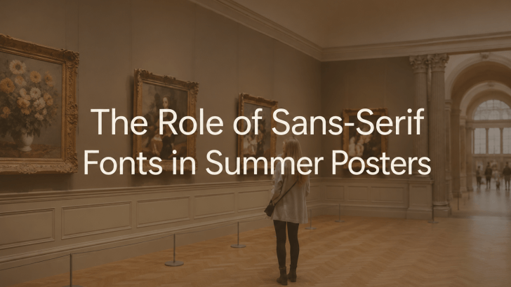
When designing seasonal marketing materials, many creative designers struggle with one common problem: their posters are visually appealing but fail to convey their message quickly. Bright colors, tropical imagery, and summer-themed illustrations may grab attention, but if the typography is difficult to read, the overall design becomes less effective. This is where sans-serif fonts in summer posters play a crucial role.
Sans-serif fonts have become a popular choice for summer campaigns because they combine readability, modern aesthetics, and versatility. Whether you’re promoting a beach festival, fashion collection, travel destination, or seasonal event, sans-serif typography helps create a clean and engaging visual experience.
Today, many successful summer posters rely on sans-serif fonts to balance bold visuals with clear communication. In this article, we’ll explore why sans-serif fonts work so well in summer designs, where they are most effective, and how designers can implement them successfully.
Why Use Sans-Serif Fonts in Summer Designs?
Typography is one of the first things people notice when viewing a poster. While decorative fonts may look attractive, they often become difficult to read when combined with colorful summer imagery. Sans-serif fonts solve this problem by providing clarity without sacrificing style.
Clean and Modern Appearance
One of the main reasons designers choose sans-serif fonts is their clean structure.
Unlike serif fonts, sans-serif typefaces do not include decorative strokes at the ends of letters. This creates a more streamlined appearance that feels:
- Modern
- Fresh
- Minimalist
- Contemporary
These qualities align perfectly with many summer design themes.
Better Readability
Summer posters are often displayed in environments where people only have a few seconds to absorb information.
Examples include:
- Social media feeds
- Event boards
- Outdoor advertisements
- Travel brochures
- Digital banners
Sans-serif fonts remain readable even at smaller sizes or when placed over colorful backgrounds.
Works Well with Bold Imagery
Summer marketing often relies on:
- Beach photography
- Tropical illustrations
- Festival graphics
- Fashion photography
- Vibrant color palettes
Sans-serif typography complements these visuals rather than competing with them.
Versatile Across Different Campaigns
Another advantage is flexibility.
Sans-serif fonts can work equally well for:
- Luxury summer campaigns
- Casual travel promotions
- Music festivals
- Fashion launches
- Tourism marketing
This versatility makes them a valuable tool for designers.
Best Applications for Summer Posters
1. Art Exhibitions and Festivals
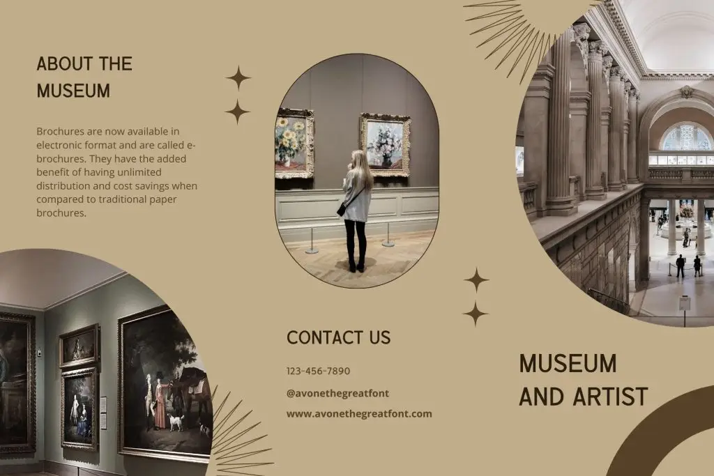
Summer is often filled with cultural events, music festivals, art fairs, and museum exhibitions.
These events require typography that can:
- Capture attention quickly
- Remain readable from a distance
- Communicate event details clearly
Sans-serif fonts excel in this environment because they create strong visual hierarchy without overwhelming the design.
2. Fashion Campaigns

Fashion brands frequently launch summer collections featuring lightweight fabrics, seasonal colors, and vacation-inspired styling.
Modern fashion marketing often favors:
- Minimalist layouts
- Editorial aesthetics
- Large photography
- Clean typography
Sans-serif fonts support this approach beautifully. They allow fashion imagery to remain the focal point while reinforcing a contemporary and sophisticated brand identity.
3. Travel and Tourism Promotions
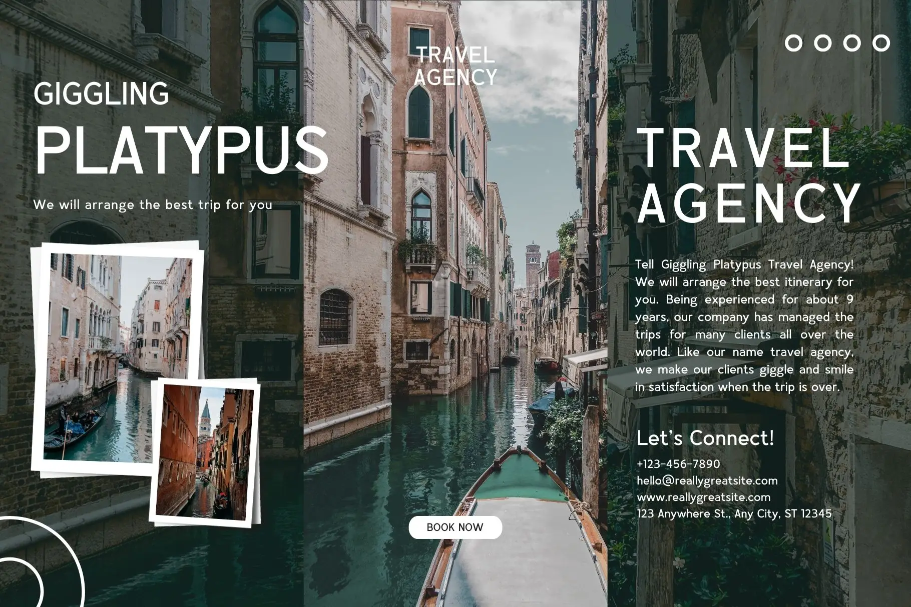
Travel marketing is one of the strongest applications for sans-serif typography. Tourism campaigns need to communicate information quickly while inspiring excitement and exploration.
Examples include:
- Destination posters
- Resort advertisements
- Travel packages
- Summer getaway campaigns
Sans-serif fonts help maintain readability across different formats, from printed brochures to digital ads.
Benefits of Sans-Serif Fonts in Summer Marketing
Strong Visual Hierarchy
Summer campaigns often contain multiple pieces of information:
- Event names
- Dates
- Locations
- Promotional offers
- Calls to action
Sans-serif fonts help organize this content effectively.
Designers can create hierarchy through:
- Weight variations
- Font size differences
- Spacing adjustments
Mobile-Friendly Design
Many summer campaigns are viewed primarily on mobile devices. Sans-serif fonts generally perform better on digital screens because their simple letterforms remain clear at smaller sizes.
This makes them ideal for:
- Instagram promotions
- Facebook ads
- TikTok graphics
- Mobile websites
Timeless Appeal
Unlike some decorative fonts that quickly become outdated, sans-serif typography remains relevant year after year.
Tips for Implementing Sans-Serif Fonts in Summer Posters
Use Large Headlines
Summer posters compete for attention. Large sans-serif headlines help communicate the primary message immediately.
Focus on:
- Short headlines
- Strong contrast
- Clear hierarchy
Pair with Vibrant Color Palettes
Sans-serif fonts work exceptionally well with summer-inspired colors such as:
- Coral
- Turquoise
- Sunshine yellow
- Ocean blue
- Tropical green
These combinations create energetic and visually appealing compositions.
Keep Supporting Text Simple
Avoid using multiple decorative fonts within the same design. A strong sans-serif headline paired with a simple supporting font often produces the best results.
Create Breathing Room
White space is just as important as typography.
Giving text room to breathe improves:
- Readability
- Visual hierarchy
- Overall aesthetics
Test Across Different Formats
Summer campaigns often appear in multiple formats:
- Posters
- Social media graphics
- Brochures
- Digital ads
Always test typography across different sizes and devices to ensure consistency.
Related Articles You May Like
If you’re interested in summer typography and poster design, continue reading: Summer Poster Design Trends: Typography Techniques That Capture Attention.
You can also read: Best Travel Fonts for Posters, Brochures, and Tourism Branding for travel marketing, tourism promotions, destination branding, and seasonal advertising.

Conclusion
The role of sans-serif fonts in summer posters goes far beyond aesthetics. These fonts help solve one of the biggest challenges in seasonal design: communicating information clearly while maintaining visual appeal.
Their clean structure, excellent readability, and versatility make them ideal for a wide range of applications, including art exhibitions, festivals, fashion campaigns, and travel promotions. By combining sans-serif typography with strong hierarchy, thoughtful spacing, and vibrant summer visuals, designers can create posters that not only look beautiful but also deliver stronger marketing results.