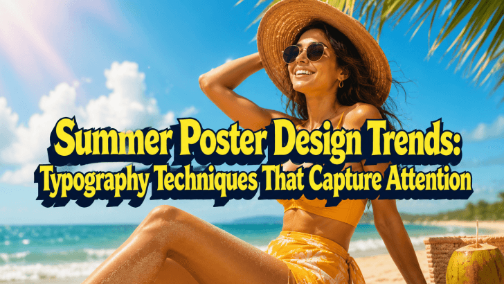
Understanding current summer poster design trends can help designers create visuals that stand out in a crowded marketplace. Many summer-themed posters struggle with the same problem: despite using bright colors, beautiful photography, and seasonal illustrations, they still fail to grab attention. Often, the issue lies in typography.
Typography is one of the most powerful elements in poster design. It determines how quickly viewers understand the message, how they perceive the brand, and whether they stop scrolling or keep moving. During summer campaigns, typography becomes even more important because designers compete against countless seasonal promotions, travel advertisements, event announcements, and retail sales campaigns.
Whether you’re creating posters for tourism, beach events, summer sales, cafes, resorts, or social media campaigns, choosing the right typography can dramatically improve the effectiveness of your design.
In this article, we’ll explore the latest summer poster design trends, recommended fonts, practical use cases, and poster inspiration that can help elevate your next seasonal campaign.
Why Typography Matters in Summer Poster Design
Summer marketing is built around emotion.
People associate summer with:
- Travel
- Adventure
- Relaxation
- Sunshine
- Outdoor activities
- Festivals
- Vacations
Typography helps communicate these emotions visually before someone reads the full message.
The Challenge of Summer Posters
Many summer posters become visually overwhelming because designers rely too heavily on:
- Bright colors
- Multiple illustrations
- Complex layouts
- Decorative effects
Without strong typography, these elements compete for attention instead of working together.
The Role of Typography
Good typography helps:
- Create hierarchy
- Improve readability
- Guide attention
- Strengthen branding
- Increase memorability
The most successful summer posters often use typography as the central visual element rather than treating it as an afterthought.
Summer Poster Design Trends in 2026
Several typography trends continue to dominate summer-themed marketing materials.
Large Display Headlines
Oversized typography remains one of the most effective ways to capture attention.
Large headlines help:
- Improve visibility
- Increase impact
- Create stronger hierarchy
This trend works especially well for event posters and promotional campaigns.
Playful Typography
Summer is associated with fun and freedom. Designers increasingly use expressive fonts that communicate energy and positivity.
Popular characteristics include:
- Rounded letterforms
- Organic shapes
- Friendly personalities
- Casual aesthetics
Editorial-Inspired Layouts
Many modern summer campaigns combine bold typography with clean editorial layouts. This approach creates a more premium and contemporary appearance.
High-Contrast Typography
Strong contrast between typography and background imagery improves readability and visual impact. This trend is particularly useful for travel and tourism posters.
Recommended Fonts for Summer Posters
Choosing the right typeface is essential for creating an engaging seasonal design. Below are three fonts that work exceptionally well for summer-themed posters.
1. Fagheto
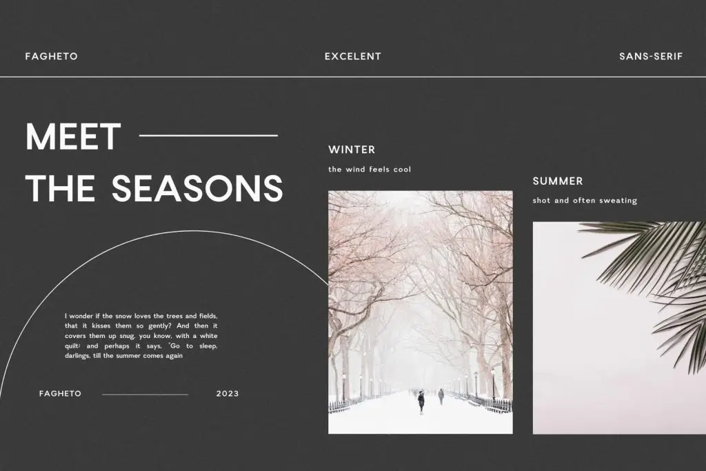
Fagheto combines strong visual presence with modern styling, making it ideal for bold summer campaigns. Its energetic personality helps create attention-grabbing headlines without sacrificing readability.
2. Cllerista
Cllerista offers elegant character with a relaxed and stylish appearance. This font works beautifully for premium summer promotions, beach resorts, and lifestyle brands.
3. Vacation
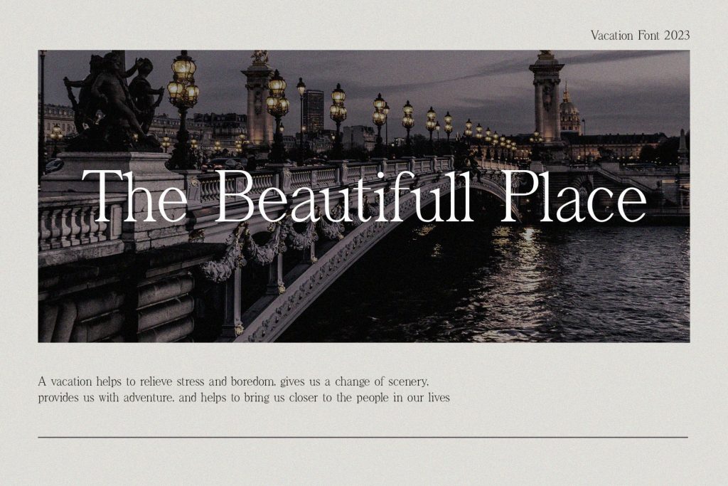
Vacation is designed to capture the excitement and freedom associated with travel and seasonal adventures. Its playful personality immediately communicates a summer atmosphere.
Best Use Cases for Summer Fonts
Different summer campaigns require different typography approaches. Understanding where each font performs best helps improve design effectiveness.
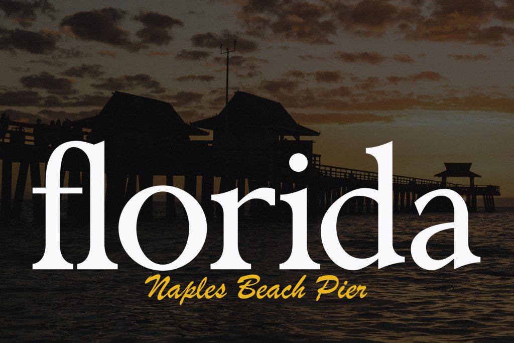
Travel Posters
Tourism campaigns benefit from typography that inspires exploration and excitement.
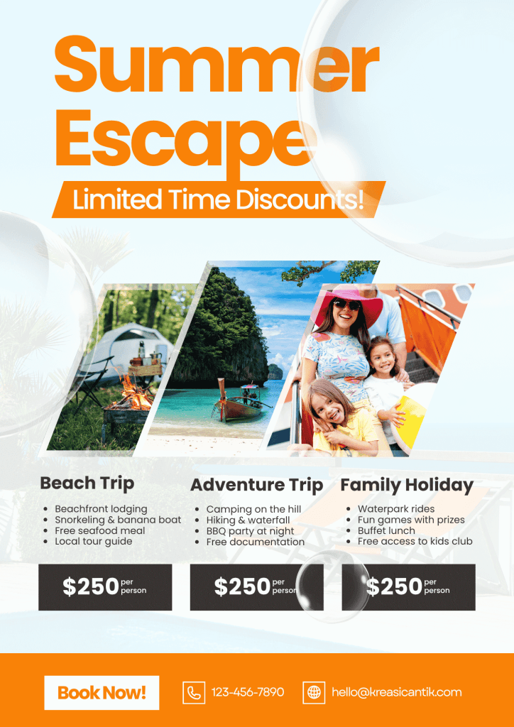
Summer Sale Promotions
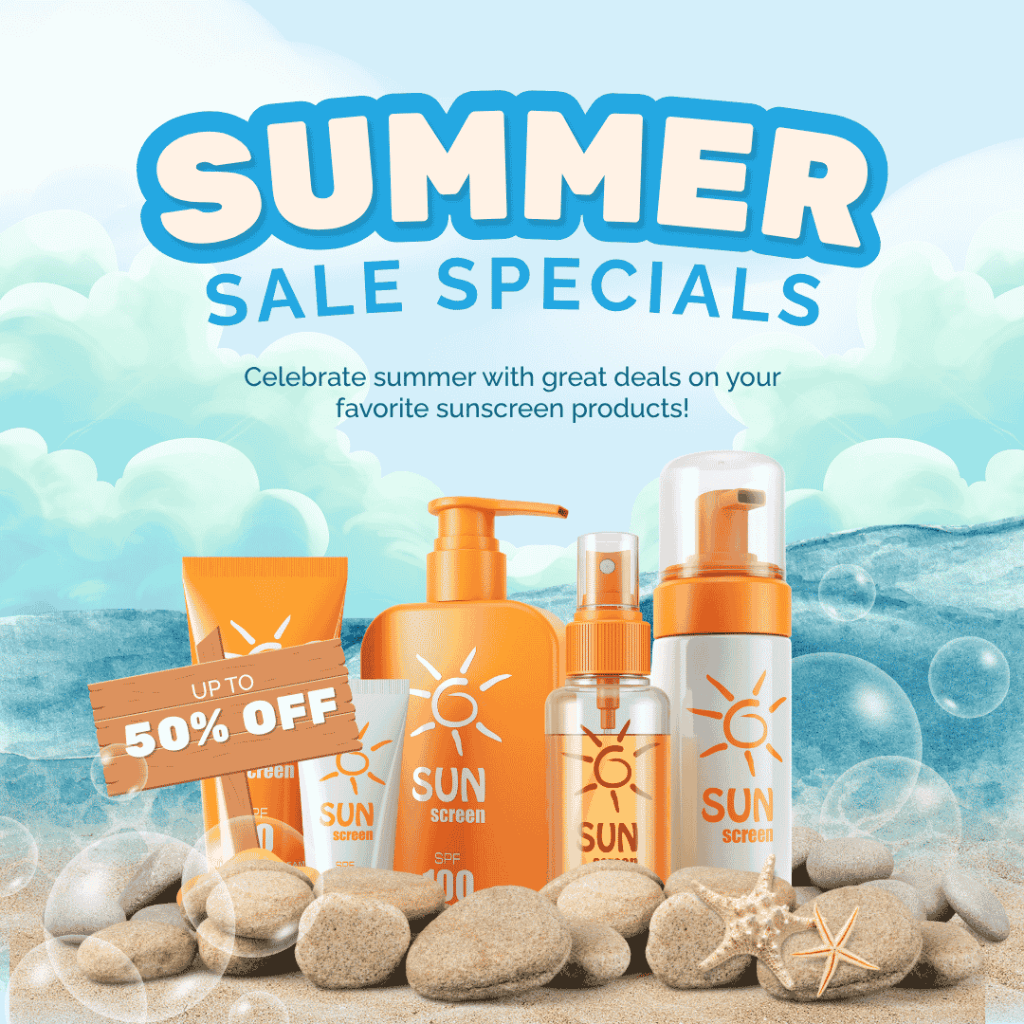
Retail campaigns need bold typography that attracts immediate attention.
Summer font works exceptionally well for:
- Seasonal discounts
- Flash sales
- Limited-time offers
Beach Events and Festivals
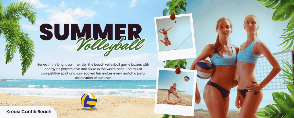
Event posters require typography that feels energetic and memorable.
Resort and Hospitality Marketing
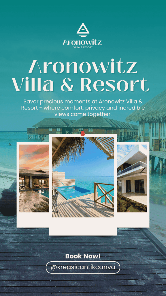
Luxury resorts often benefit from elegant typography that communicates relaxation and sophistication.
Social Media Summer Campaigns
Typography used on Instagram, Facebook, and TikTok must remain readable on smaller screens.
Typography Techniques That Capture Attention
Beyond choosing the right font, several techniques can improve poster performance.
Create Clear Hierarchy
Use different font sizes to establish visual priority.
For example:
- Event name → largest
- Date and location → medium
- Additional information → smaller
This helps viewers understand information quickly.
Limit Font Usage
Using too many fonts creates confusion.
Most successful posters use:
- One primary display font
- One supporting text font
Consistency improves professionalism.
Use Contrast Effectively
Typography should stand out against the background.
Methods include:
- Light text on dark imagery
- Dark text on bright backgrounds
- Color overlays
- Typography shadows
Embrace White Space
Not every area needs decoration. Allowing typography room to breathe often increases impact.
Related Articles You May Like
If you’re interested in the psychology of summer fonts, you can read the article “The Psychology of Fonts in Summer Fashion Marketing.” You can also read the article Summer Fashion Fonts Trends Every Designer Should Know for more font references for summer-themed poster designs.
Conclusion
Following current summer poster design trends can help designers create more engaging and effective seasonal marketing materials. While colors, photography, and illustrations all play important roles, typography often determines whether a poster captures attention or gets overlooked.
Fonts such as Faghote, Cllerista, and Vacation provide distinctive personalities that align perfectly with summer themes. Whether you’re designing travel promotions, event posters, hospitality marketing materials, or seasonal sales campaigns, choosing the right typography helps communicate energy, excitement, and professionalism.
By combining strong typography with clear hierarchy, thoughtful layouts, and seasonal imagery, you can create summer posters that not only look beautiful but also deliver stronger marketing results. For more typography inspiration and premium font collections, visit Font Kingdom and discover fonts designed to make your seasonal campaigns stand out.