Condensed Sans Serif History: From Print Posters to Digital Branding

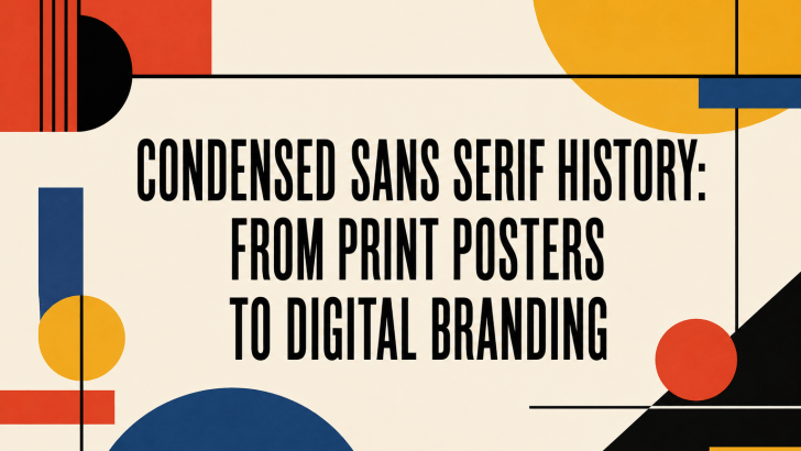
The condensed sans serif history reflects the evolution of modern typography itself. From bold advertising posters in the early 20th century to sleek digital branding today, condensed sans serif fonts have remained one of the most practical and visually impactful typography styles in design history. Designers continue to use condensed sans serif fonts because they …

Continue reading →

How to Use Condensed Sans Serif Fonts in Graphic Design

Understanding how to use condensed sans-serif fonts in graphic design can significantly improve the visual impact of your work. Typography is not just about style; it is about structure, readability, and communication. Condensed sans-serif fonts are widely used in modern design because they offer a clean look while saving space. However, using them incorrectly can …

Continue reading →

Condensed Sans Serif vs Regular Font: Key Differences Explained

Understanding the difference between condensed sans-serif vs regular fonts is essential for designers who want to create visually balanced and effective layouts. Typography is not only about choosing a beautiful font; it is about choosing the right structure, spacing, and proportion that match your design goals. Condensed sans-serif and regular fonts are commonly used in …

Continue reading →

Condensed Sans Serif Font Trends in 2026

Understanding condensed sans serif font trends in 2026 is essential for designers looking to create modern, clean, and impactful visuals. Typography continues to evolve, and condensed sans serif fonts are becoming increasingly popular in branding, digital design, and advertising. These fonts are known for their narrow letterforms, which allow designers to fit more text into …

Continue reading →