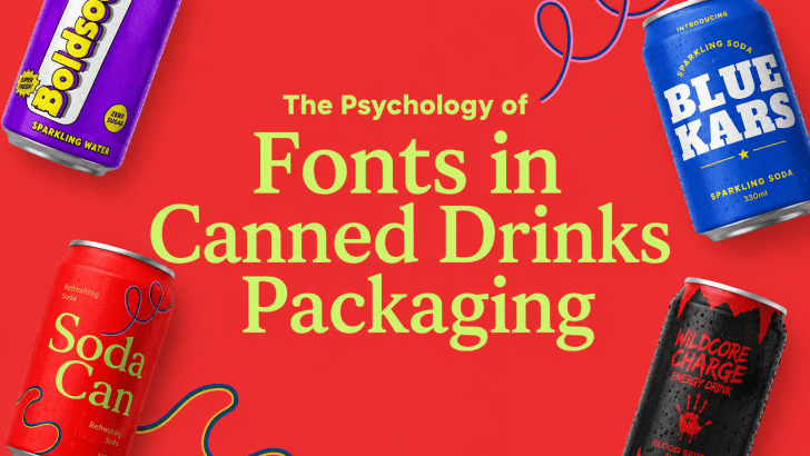
The psychology of fonts in canned drinks packaging has a powerful influence on how customers perceive beverages before they even take the first sip. In the competitive beverage industry, typography is much more than decoration. Fonts shape emotional reactions, communicate brand personality, and help products stand out on crowded store shelves and social media platforms.
When consumers look at canned drinks, they immediately form subconscious opinions based on typography styles. A bold retro font may feel nostalgic and energetic, while a clean minimalist font can make a beverage appear premium and modern. Typography becomes a visual language that communicates flavor, mood, and identity instantly.
In this article, we’ll explore how font psychology affects canned drinks packaging, why typography matters in beverage branding, and how designers use fonts strategically to influence customer behavior.
Why Typography Matters in Beverage Packaging
Typography is one of the most important elements in packaging design because it directly affects emotional perception.
Good typography can make a canned drink feel:
- Refreshing
- Energetic
- Fun
- Premium
- Healthy
- Experimental
In many cases, customers notice typography before they notice ingredients or flavor details. This is why beverage companies invest heavily in visual branding and font selection.
Packaging typography also helps:
- Improve shelf visibility
- Increase brand recognition
- Build emotional connection
- Differentiate products from competitors
Strong typography transforms ordinary packaging into memorable brand experiences.
How Font Psychology Works
Font psychology refers to the emotional and psychological responses people experience when seeing different typography styles.
Different fonts communicate different personalities.
Serif Fonts
Serif fonts often feel:
- Elegant
- Traditional
- Premium
- Trustworthy
These fonts are commonly used for:
- Luxury beverages
- Craft soda branding
- Premium sparkling water
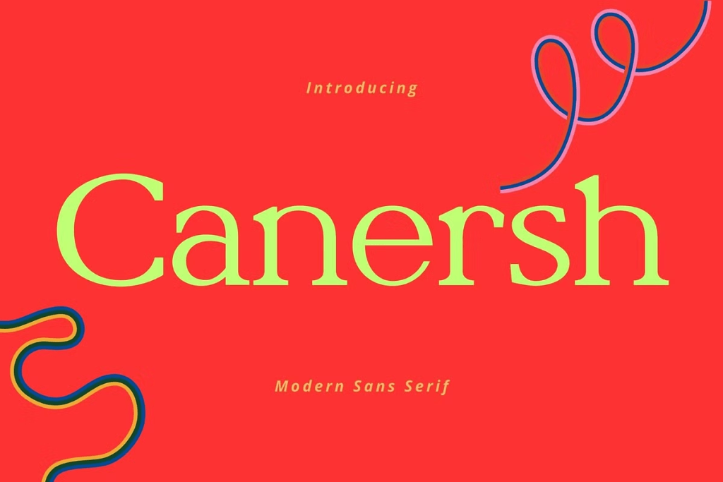
Sans-Serif Fonts
Sans-serif fonts feel:
- Modern
- Clean
- Minimal
- Professional
These fonts work well for:
- Healthy drinks
- Energy beverages
- Contemporary soda branding
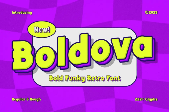
Display Fonts
Display fonts are expressive and attention-grabbing.
They often feel:
- Playful
- Bold
- Energetic
- Creative
Display typography is highly popular for:
- Youth-focused beverages
- Colorful soda packaging
- Seasonal drink campaigns
Script Fonts
Script typography feels:
- Personal
- Artistic
- Elegant
- Feminine
These fonts are often used for:
- Boutique drinks
- Summer beverages
- Lifestyle-focused branding
Emotional Impact of Fonts in Canned Drinks
Bold Fonts Create Energy
Large bold typography often makes canned drinks feel:
- More refreshing
- More exciting
- More flavorful
This is why energy drinks and soda brands frequently use oversized display fonts. Bold typography visually communicates intensity and excitement.
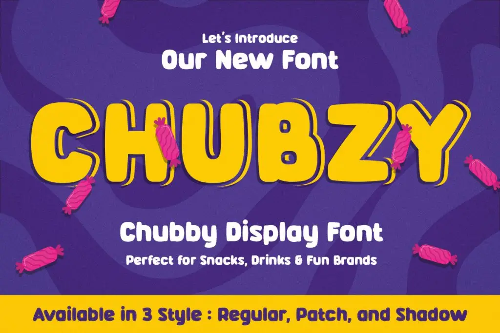
Rounded Fonts Feel Friendly
Rounded fonts psychologically feel:
- Softer
- Sweeter
- More approachable
This style works especially well for:
- Fruit sodas
- Bubble drinks
- Family-friendly beverages
Rounded typography creates positive emotional warmth.
Minimal Fonts Feel Premium
Minimalist typography creates:
- Luxury aesthetics
- Sophisticated branding
- Clean visual identity
Premium canned beverages often use minimalist typography, simple layouts, and neutral colors. This style communicates quality and refinement.
Typography and Color Psychology
Typography psychology becomes even stronger when paired with color psychology.
Red Typography
Red fonts feel:
- Energetic
- Bold
- Exciting
Perfect for cola and energy drink branding.
Yellow Typography
Yellow creates:
- Cheerfulness
- Warmth
- Playfulness
Commonly used for citrus beverages and tropical drinks.
Blue Typography
Blue fonts feel:
- Refreshing
- Clean
- Cool
Popular for sparkling water and refreshing soda branding.
Black Typography
Black typography communicates:
- Premium quality
- Sophistication
- Boldness
Luxury canned beverages often use black typography for a stronger visual impact.
How Typography Influences Buying Decisions
Customers often make beverage purchasing decisions very quickly.
Typography affects:
- Product memorability
- Emotional appeal
- Brand trust
- Shelf visibility
A unique font can make a canned beverage feel trendier, more appealing, or more luxurious compared to competing products.
This emotional influence is especially important for:
- Younger audiences
- Social-media-driven products
- Limited edition beverages
Typography helps brands build stronger emotional connections with consumers.
Popular Typography Trends in Canned Drinks Packaging
Retro Typography
Retro-inspired fonts remain extremely popular because they create nostalgia and emotional familiarity.
Retro beverage typography often feels:
- Fun
- Authentic
- Memorable
Many modern soda brands use vintage-inspired fonts to create emotional storytelling.
Bold Oversized Fonts
Large typography dominates modern beverage packaging because it improves:
- Visibility
- Readability
- Branding impact
Oversized typography is especially effective on slim cans and minimalist layouts.
Minimalist Typography
Minimal branding trends continue growing in:
- Sparkling water packaging
- Health drinks
- Premium beverages
Minimal typography creates a sophisticated, modern aesthetic that appeals to lifestyle-focused consumers.
Experimental Fonts
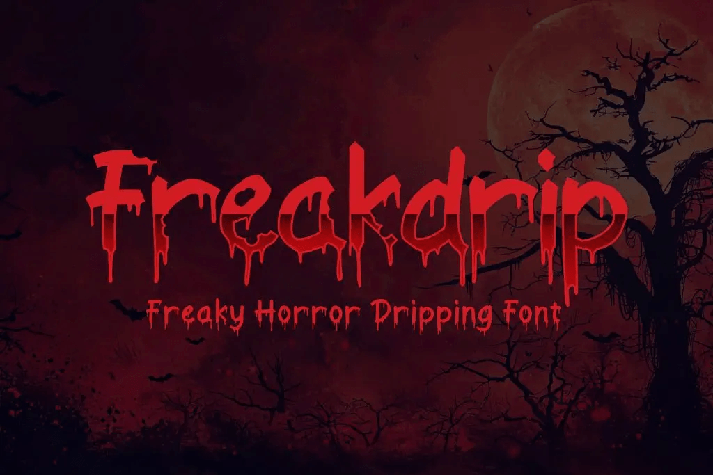
Many modern beverage brands now use:
- Distorted typography
- Dripping effects
- Hand-drawn lettering
- 3D typography
Experimental fonts help products feel more creative and culturally relevant.
Common Typography Mistakes in Beverage Packaging
1. Using Hard-to-Read Fonts
Decorative typography may look attractive, but it should remain readable on curved can surfaces.
Customers should instantly recognize:
- Brand names
- Flavor variants
- Product type
Readability always comes first.
2. Poor Typography Hierarchy
Without proper hierarchy, packaging can feel confusing.
Good beverage packaging clearly organizes:
- Product name
- Flavor
- Supporting information
Typography hierarchy improves both aesthetics and usability.
3. Too Many Font Styles
Using too many fonts creates visual clutter.
Most successful packaging designs use:
- One display font
- One supporting font
Consistency strengthens brand identity.
Tips for Choosing Fonts for Canned Drinks
Match Typography with Brand Personality
Ask:
- Is the drink playful?
- Premium?
- Energetic?
- Healthy?
- Experimental?
Typography should visually represent those qualities.
Test Fonts on Real Packaging
Fonts may look different once applied to:
- Curved cans
- Printed labels
- Social media ads
Always preview typography on realistic mockups before production.
Focus on Emotional Storytelling
Great beverage typography creates emotional experiences, not just attractive visuals. Customers remember how packaging makes them feel.
Looking for soda can packaging font inspiration? Explore soda branding fonts in Best Fonts for Soda Can Packaging and Marketing.
The Future of Beverage Typography
Typography trends continue evolving alongside digital culture and social media.
Future trends include:
- Animated typography
- Variable fonts
- Experimental retro styles
- AI-generated typography
- Interactive packaging design
As branding becomes increasingly visual, typography will continue playing a major role in canned drink marketing.
Brands that understand the psychology of typography can create stronger emotional engagement and a more memorable packaging experience.
Conclusion
The psychology of fonts in canned drinks packaging shows how typography deeply influences customer emotions, purchasing decisions, and brand perception. Fonts are not simply decorative elements, but they become part of the beverage experience itself.
Whether using bold retro typography, minimalist sans-serif fonts, playful rounded styles, or experimental display fonts, the right typography helps canned drinks stand out in competitive markets.
Great beverage branding combines typography, color, emotion, and storytelling into one memorable visual experience.