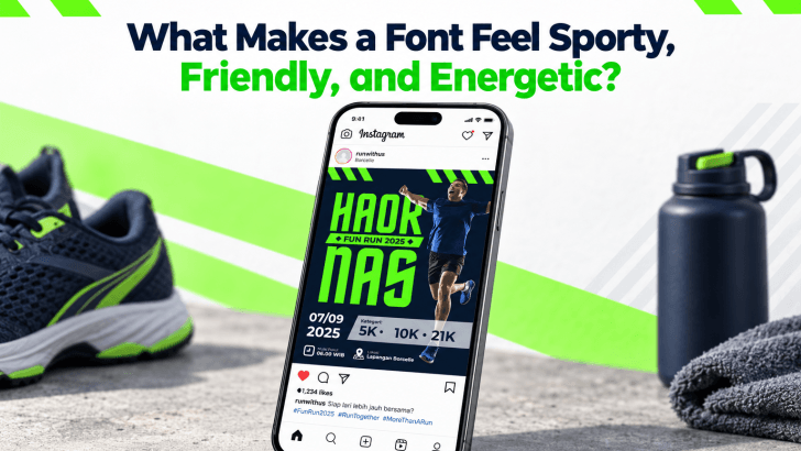
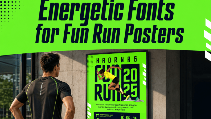
What Makes a Font Feel Sporty, Friendly, and Energetic?

Understanding what makes a font feel sporty, friendly, and energetic helps designers choose typefaces that match a campaign’s emotion instead of selecting a font only because it looks attractive. Every typeface has visual signals that affect perception. Weight, shape, spacing, curves, slant, and letter width can all influence whether a design feels fast, approachable, powerful, …
Continue reading →

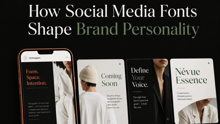
How Social Media Fonts Shape Brand Personality

Understanding how social media fonts shape brand personality can help brands create posts that feel more consistent, recognizable, and emotionally relevant. On platforms such as Instagram, TikTok, Pinterest, and Facebook, typography often works alongside photography, color, and layout to communicate a brand’s tone within seconds. A bold display font can make a brand feel energetic, …

Continue reading →

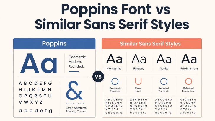
Poppins Font vs Similar Sans Serif Styles

Comparing Poppins font vs similar sans serif styles can help designers decide whether to keep a familiar geometric look or move toward a more distinctive visual identity. Poppins is popular for its clean shapes, balanced proportions, and flexible weights, but many modern sans serif fonts offer a similar sense of clarity with different personalities. The …

Continue reading →

How to Replace Poppins Without Losing a Clean Modern Look

Learning how to replace Poppins without losing a clean modern look is useful when you want a fresher brand identity without changing the overall visual direction. Poppins is popular because its geometric shapes, balanced proportions, and clean sans serif structure work well across websites, logos, social media, and packaging. However, using a different typeface can …

Continue reading →