Handwritten typography in graphic design has always carried something that digital type can struggle to reproduce: a sense of human presence. Long before designers worked with vector tools and font libraries, letters were drawn, painted, carved, and written by hand. That history still influences the way handwritten styles are used today, especially in branding, packaging, posters, and editorial design.
Handwritten Typography Began Before Digital Design
Before movable type and modern printing systems became widespread, written communication depended heavily on handwriting and lettering. Scribes, sign painters, and craftspeople developed distinctive letterforms based on tools, materials, and cultural traditions. The appearance of a letter could change depending on whether it was created with a quill, brush, chalk, or carved surface.
These early forms of lettering were functional, but they also carried personality. Small irregularities revealed the movement of the hand and the pressure of the writing tool. Those imperfections later became some of the qualities designers intentionally looked for when trying to make visual communication feel more personal.
Printing Changed the Role of Handwritten Lettering
The rise of printing introduced greater consistency and repeatability to typography. Standardized typefaces made it easier to reproduce large amounts of text, which gradually separated everyday handwriting from formal printed communication. However, hand lettering never completely disappeared.
Instead, it found new roles in signs, advertisements, posters, packaging, and decorative work. Designers often turned to hand-drawn lettering when mechanical type felt too rigid. This contrast helped handwritten typography maintain its emotional and expressive value.
Hand Lettering Became a Visual Signature
During the growth of commercial advertising, custom lettering gave businesses a way to look different from competitors. Shop signs, product labels, and promotional posters often featured letters designed specifically for one application. Because the lettering was unique, it could become part of a brand’s visual identity.
This idea is still relevant today. Many designers choose handwritten fonts because they can add warmth, individuality, or informality to a project. The goal is rarely to imitate historical handwriting exactly, but rather to recreate the sense of personality associated with handmade lettering.
Handwritten Typography Moved Into Graphic Design
As graphic design developed into a professional discipline, typography became a central part of visual communication. Modernist design often favored clean and systematic type, but expressive lettering continued to appear in areas where emotion and individuality mattered more. Music posters, magazine covers, packaging, and cultural graphics frequently used handwritten forms to break away from strict visual systems.
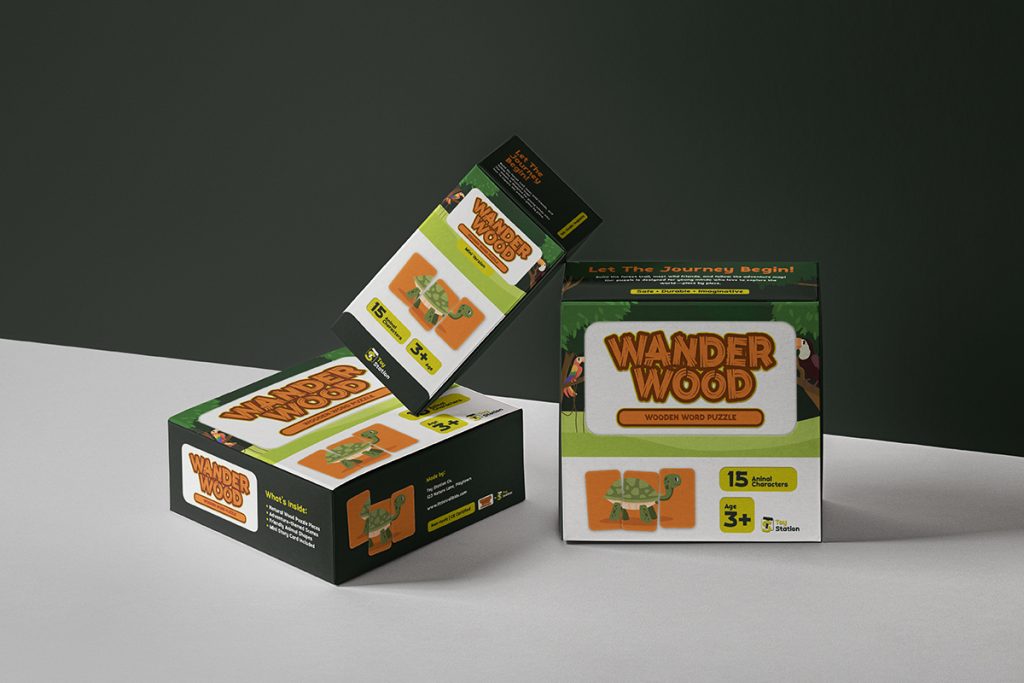
This tension between structured typography and expressive lettering is part of what makes handwritten styles so useful. They can disrupt an otherwise clean composition and introduce a more human tone. For designers, that contrast can help a message feel less corporate and more approachable.
Digital Fonts Made Handwriting Easier to Use
Desktop publishing changed the way designers accessed handwritten typography. Instead of creating every letter manually, designers could use digital fonts inspired by brush writing, signatures, markers, and casual handwriting. This made expressive typography faster and more accessible.
However, convenience also created a new challenge. Because handwritten fonts became widely available, some styles were used too often or applied without enough consideration. A font that feels authentic in one project can easily feel forced in another.
Why Handwritten Fonts Returned to Modern Design
As digital design became cleaner and more standardized, many brands started looking for ways to feel more human. Handwritten typography offered an effective contrast to polished interfaces and geometric sans-serif fonts. Its imperfections could make a visual identity feel warmer, more personal, and less automated.
This renewed interest explains why expressive lettering continues to appear in contemporary branding and social media design. If you want to explore this shift in more detail, read The Comeback of Handwritten Fonts in Modern Design, where we look at why designers are bringing handmade typography back into current visual trends.
Handwritten Typography Creates Emotional Tone
Typography does more than communicate words. It also shapes the way those words feel. A handwritten typeface can suggest friendliness, creativity, intimacy, spontaneity, or craftsmanship depending on its structure.
For example, a loose marker-style font may work well for youth-focused graphics, while an elegant script can support beauty or lifestyle branding. Designers should evaluate the emotional message of the letterforms rather than choosing a handwritten font simply because it looks decorative.
Imperfection Can Be an Advantage
One reason handwritten typography remains appealing is that it does not always look perfectly controlled. Slight variations in shape, baseline, and stroke width can make lettering feel more natural. In a visual world dominated by grids and precise digital interfaces, those imperfections can stand out.
That does not mean every irregular typeface is effective. Designers still need to consider readability, spacing, and hierarchy. The most useful handwritten fonts combine expressive character with enough structure to work in a professional layout.
Handwritten Fonts Are Not Suitable for Every Project
Handwritten typography works best when it supports the message. Using it for long paragraphs, technical information, or highly formal communication can make content harder to read. It usually performs better in headlines, short quotes, packaging accents, logos, or supporting text.
Context should guide the decision. Before adding a handwritten style to a project, designers should ask whether the font strengthens the intended tone. For practical guidance, see Handwritten Fonts: When and How to Use Them in Graphic Design, which explores suitable applications and common mistakes.
Modern Designers Can Mix Handwritten and Clean Type
Handwritten typography does not need to dominate the entire composition. In many modern layouts, it works best as an accent paired with a clean sans serif or serif typeface. This creates contrast while keeping the design organized.
For example, a handwritten headline can add personality while a neutral sans serif handles body text. The combination gives designers both expression and readability. This approach is especially useful in branding systems that need to feel creative without becoming visually chaotic.
Final Thoughts
The history of handwritten typography in graphic design shows why this style continues to survive changes in technology and visual trends. From traditional lettering to digital fonts, its strongest quality has always been the ability to make communication feel human. That quality remains valuable in branding, packaging, editorial design, and social media.
For designers, the key is not simply choosing a font that looks handwritten. The typeface should support the message, audience, and visual identity of the project. When used with intention, handwritten typography can bring personality and emotion to designs that might otherwise feel too polished or predictable.
