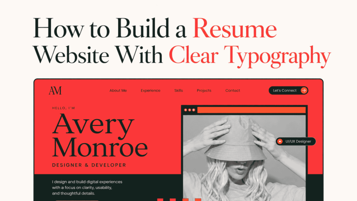
Learning how to build a resume website with a clear typography hierarchy can help you present your experience in a way that feels professional, organized, and easy to scan. Recruiters and potential clients often review a website quickly, so they should be able to identify your name, role, skills, work history, and contact details without searching through a crowded layout.
Typography creates that structure. The right fonts, sizes, weights, and spacing guide visitors from the most important information to supporting details. A clear system can also give your online resume more personality than a traditional document while keeping it practical.
Why Typography Hierarchy Matters on a Resume Website
A resume website usually contains several levels of information. These may include a personal introduction, professional summary, experience, education, selected projects, skills, testimonials, and contact details. Without a clear hierarchy, every section may appear equally important. Visitors may struggle to understand where one topic ends and another begins.
Typography solves this problem by creating visible differences between page titles, section headings, job titles, dates, descriptions, and supporting labels. It helps visitors scan first and read more deeply when a section catches their interest.
Plan the Resume Website Structure First
Before choosing a font, decide which sections the website needs. A simple structure usually works better than a complicated one.
Start With a Focused Hero Section
The hero section should introduce your name, profession, and main value in a few lines. You can also include a short CTA, such as “View My Work,” “Download Resume,” or “Contact Me.” Keep the introduction direct. A recruiter should understand what you do within a few seconds.
Organize Experience Clearly
List your most relevant or recent experience first. Use job titles as prominent headings, then place the company name, dates, and short descriptions underneath. Avoid writing long paragraphs for every role. Two or three concise points can make achievements and responsibilities easier to review.
Include Selected Work
A resume website can show more evidence than a traditional resume. Add selected projects, case studies, campaign results, or client work when they support your application.
For more ideas on presenting creative projects consistently, explore Art Portfolio for Websites, PDFs, and Printed Lookbooks.
Create a Simple Typography Scale
A clear type scale gives every text element a defined role. You do not need many different sizes to create contrast.
Main Page Title
Use the largest type size for your name or primary statement. On desktop, a range of 48 to 72 pixels may create a strong introduction, depending on the font and layout. Scale it down for mobile screens so it does not break into awkward lines.
Section Headings
Section headings such as “Experience,” “Selected Work,” and “Education” can range from 28 to 40 pixels. Keep the same size and style throughout the website. Consistency allows visitors to recognize each new section immediately.
Body Text
Body text usually works well between 16 and 20 pixels. It should remain comfortable for project descriptions, work summaries, and personal statements. Use enough line spacing so paragraphs do not feel dense. A line height between 1.4 and 1.7 can create a more relaxed reading experience.
Supporting Information
Dates, locations, categories, and short labels may use a slightly smaller size. However, avoid shrinking important details below a comfortable reading level. Use lighter weight or softer contrast to make supporting information secondary instead of making it extremely small.
Font Recommendations for Resume Websites
The following fonts can support different professional identities, from minimal and polished to creative and expressive.
1. Gafhote

2. Gavoline
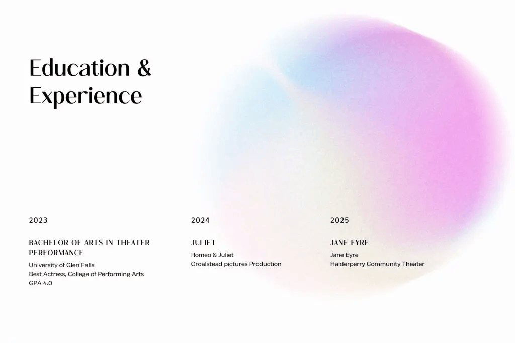
3. Govers
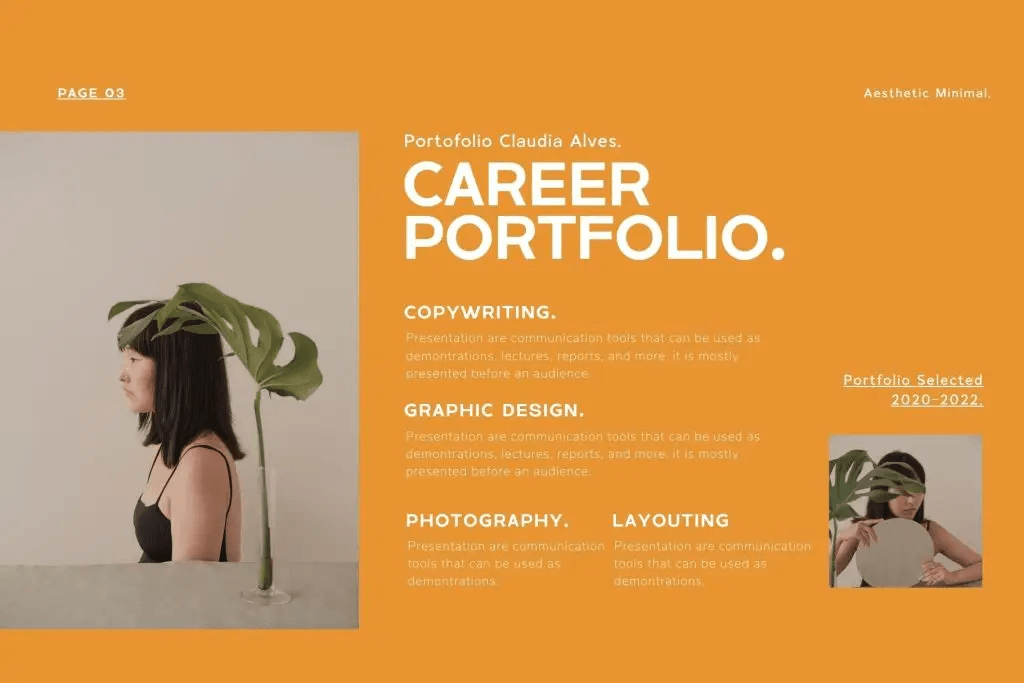
4. Tracey Jodgey
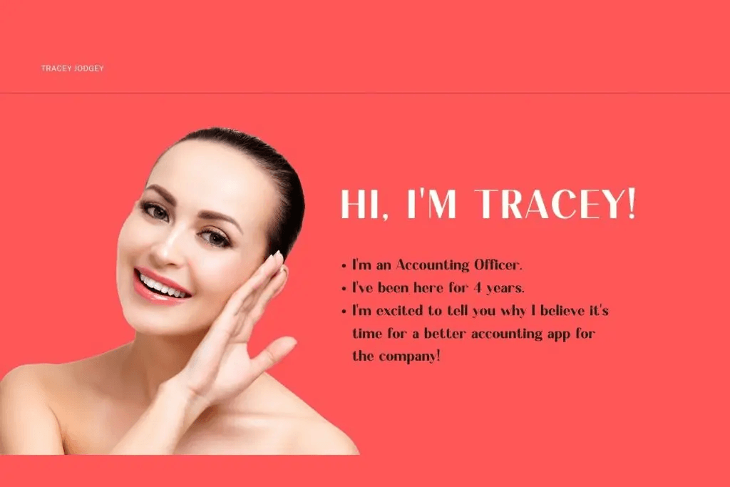
5. Berlyna
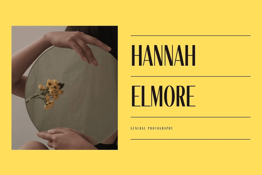
6. Keneth
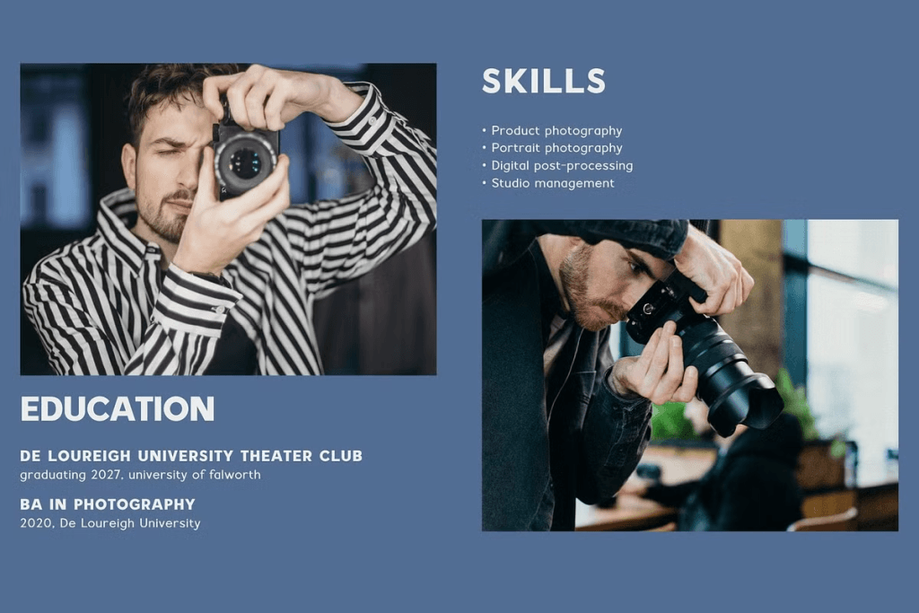
7. Glareso
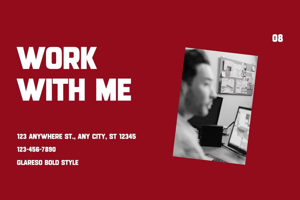
8. Burnrock
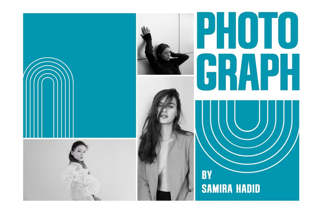
9. Kestila
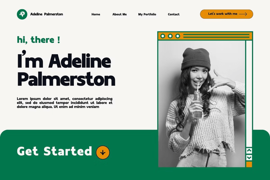
10. Canersh
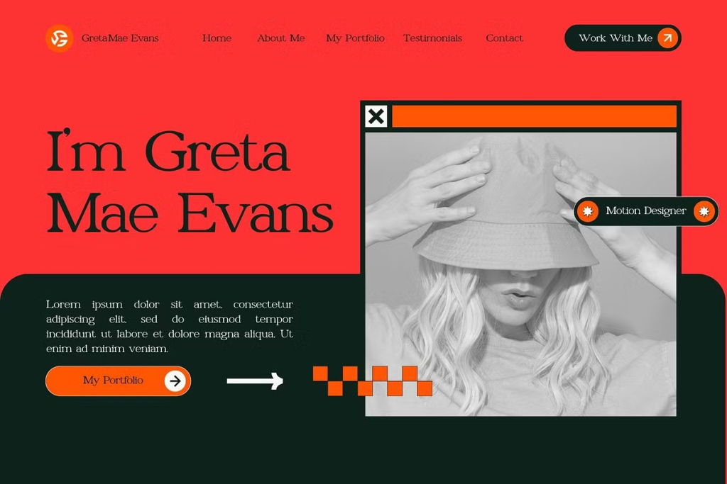
Pair Display Fonts With Readable Body Text
Many of the recommended fonts are most effective in headlines or short text. Using them for every paragraph may make the website harder to read. Choose one expressive font for your name and major headings. Then use a neutral serif or sans serif for work descriptions, dates, buttons, and navigation.
Two font families are usually enough. This creates contrast without making the website feel inconsistent. For more practical options, read Best Font for Website Design in 2026 before finalizing your pairing.
Make the Typography Responsive
A typography hierarchy should remain clear on desktop, tablet, and mobile screens. Use responsive font sizing so large headlines scale down naturally.
Check whether job titles wrap correctly and whether dates remain connected to the right roles. Buttons should also stay easy to tap, while paragraphs should not extend too close to the edges.
Always test the website at its actual viewing size. A design that looks balanced while zoomed in may contain text that is too small for normal use.
Keep the Resume Website Consistent
Use the same heading style, spacing rules, body font, and button treatment across every page. Consistency helps the site feel professional and allows visitors to focus on your experience.
A clear hierarchy does not need to feel plain. Fonts such as Berlyna, Canersh, and Tracey Jodgey can create an elegant identity, while Burnrock, Govers, and Kestila can support a bolder professional style.
