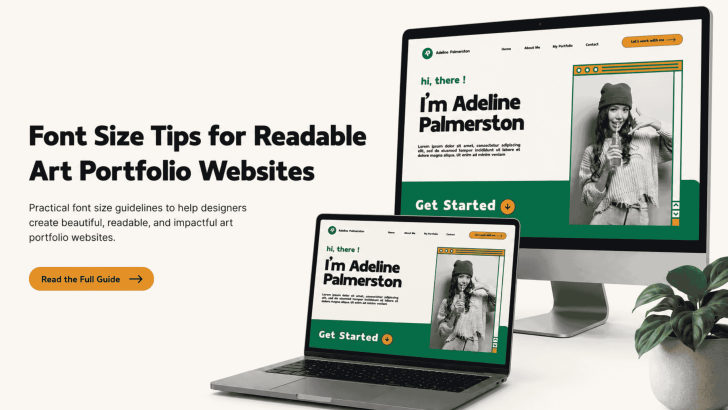
Applying the right font size tips for readable art portfolio websites can help visitors explore your work without feeling distracted or overwhelmed. While strong images attract attention, readable typography keeps potential clients, art directors, and collaborators engaged with project descriptions, artist statements, and contact information.
A font may look beautiful in a design mockup, but it still needs to perform well on different screens. Text that appears balanced on a desktop can become too small on a phone. On the other hand, oversized typography may compete with artwork and create an uncomfortable reading experience.
The best portfolio websites use a clear font hierarchy, consistent spacing, and flexible sizes that adapt to each device.
Why Font Size Matters in an Art Portfolio
An art portfolio is not only a digital gallery. It also explains your creative process, skills, services, and professional experience. Visitors often scan a portfolio before deciding whether to open a project or contact the artist. Therefore, titles must be easy to identify, while supporting text should remain comfortable to read.
Small text can make a portfolio feel difficult to navigate. It may also create accessibility problems for visitors with visual limitations. Meanwhile, overly large text can reduce whitespace and push important images below the fold. A balanced font size system helps the artwork and written content support each other.
Recommended Font Sizes for Portfolio Websites
There is no single font size that works for every design. However, several practical ranges can help you create a strong starting point.
Body Text
For desktop screens, body text usually works well at 16-20 pixels. A size of 18 pixels can feel especially comfortable for project descriptions, case studies, and artist statements. Avoid using 12 or 13 pixels for important paragraphs. These sizes may appear clean in a layout editor, but they can be difficult to read on high-resolution screens. Line height also matters. Set the line height between 1.4 and 1.7 times the font size to give each sentence enough breathing space.
Main Headings
Main page headings can range from 40 to 72 pixels, depending on the layout. Large headings work well on portfolio homepages, project covers, and artist introduction sections. However, the heading should not obscure the artwork or require visitors to scroll too far before reaching the main content. Keep the number of words limited and use a size that supports the page composition.
Section Headings
Section headings often work well at 28-40 pixels. These headings can introduce areas such as selected work, about the artist, services, exhibitions, and contact information. Use consistent sizing across each section. This approach helps visitors understand the structure of the website more quickly.
Captions and Supporting Text
Image captions, dates, categories, and project details can use sizes between 14 and 16 pixels. Make sure the color contrast remains strong enough for comfortable reading. Supporting text should appear secondary, but it should never become invisible. A slightly lighter weight or softer color is usually better than reducing the font size too much.
How to Create a Clear Typography Hierarchy
A good hierarchy makes each level of information visually different. Visitors should immediately recognize the page title, project name, description, and caption.
1. Limit the Number of Font Sizes
Using too many sizes can make the website feel inconsistent. Create a simple scale for the main heading, section heading, body text, and caption. For example, you might use 56 pixels for the main heading, 32 pixels for section headings, 18 pixels for body text, and 15 pixels for captions. This structure creates enough contrast without adding unnecessary complexity.
2. Use Font Weight Carefully
Font weight can strengthen hierarchy without changing the size. A medium or bold weight can make project titles stand out, while regular weight keeps body text comfortable. Avoid using bold text for every element. Too much emphasis can make the page feel crowded and reduce the impact of important headings.
3. Add Enough Whitespace
Readable typography depends on the space around it. Give headings enough margin above and below, and avoid placing long paragraphs too close to images. Whitespace allows viewers to focus on one element at a time. It can also make a portfolio feel more professional and carefully curated.
Font Size Tips for Mobile Portfolio Design
Many visitors will open an art portfolio from a smartphone. Therefore, responsive typography should be part of the design process from the beginning.
Body text should usually remain at least 16 pixels on mobile. Smaller text may force visitors to zoom, especially when reading detailed project descriptions. Main headings can scale down to around 32 or 40 pixels, depending on the screen width. Section headings may work between 24 and 30 pixels.
Test the portfolio on several devices instead of relying only on the desktop preview. Check whether headings break into awkward lines, paragraphs become too wide, or captions appear too small.
Font Recommendations for Art Portfolio Websites
The right font size must also be paired with a typeface that matches the artist’s visual identity.
1. Sterla
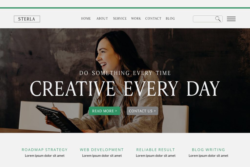
2. Monna Kalingga
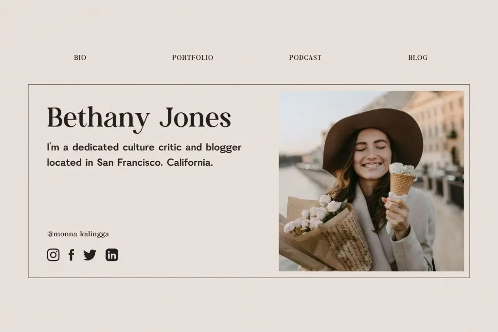
3. Canersh
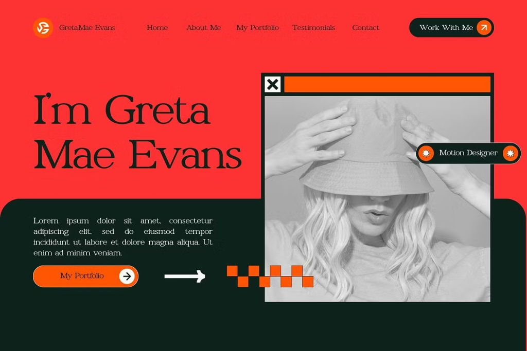
4. Kestila
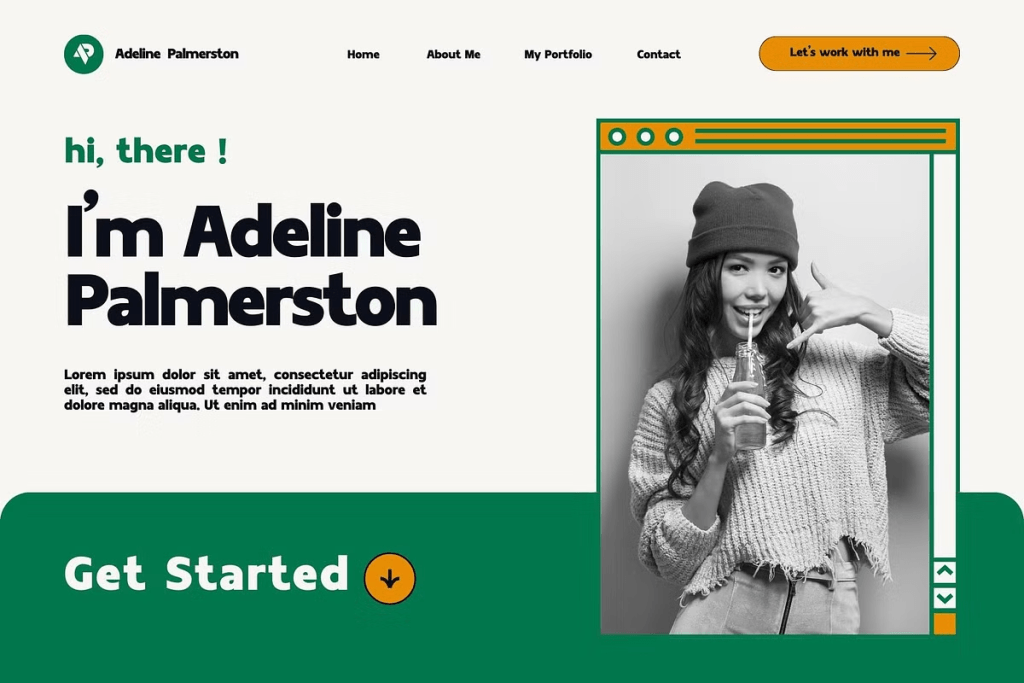
5. Karens

Test Font Sizes Before Publishing
Before launching the website, review every page on desktop, tablet, and mobile. Ask whether the text feels easy to scan, whether headings support the artwork, and whether important information is visible without zooming.
You should also test different lighting conditions and screen brightness levels. Good typography should remain readable even when the display is not set to maximum brightness.
For more ideas on building a consistent presentation across digital and print formats, explore Art Portfolio for Websites, PDFs, and Printed Lookbooks. Then, discover current typography directions in Creative Portfolio Font Trends Every Designer Should Know and choose a font system that makes your creative work easier to view, understand, and remember.
