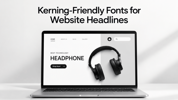
Choosing kerning-friendly fonts for website headlines can make a major difference in how polished and readable a page feels. Headline typography needs more than a strong font style because the spacing between letters also affects rhythm, balance, and visual clarity. When kerning feels natural, headlines become easier to scan and more professional without requiring excessive manual adjustments.
Good kerning is especially important on websites because headlines often appear at large sizes. Small spacing problems that look harmless in body text can become obvious when a font is enlarged. That is why designers should understand how a typeface behaves before using it across hero sections, landing pages, portfolios, or editorial layouts.
Why Kerning Matters in Website Headlines
Kerning controls the space between specific pairs of letters. Some combinations, such as AV, WA, To, or Yo, often need more attention because their shapes can create awkward gaps. A typeface with balanced built-in kerning usually makes headline design easier and more consistent.
This becomes more important when typography is the main visual element on a page. A clean headline can create hierarchy before users even begin reading the content below it. If the spacing feels uneven, the design may look unfinished even when the font itself is attractive.
For a deeper explanation of the concept, read What Is Kerning in Typography? A Complete Guide for Designers. That guide explains how kerning works and why designers should pay attention to individual letter pairs rather than relying only on tracking.
What Makes a Font Kerning-Friendly?
A kerning-friendly font usually has balanced character widths and carefully designed spacing relationships. The letters should feel connected without looking crowded, especially in common headline combinations. Good kerning also reduces the amount of manual correction needed during the design process.
However, kerning quality should not be judged from a single word. Test several headlines with different combinations of uppercase and lowercase letters. This helps reveal whether the font remains consistent across real website content.
Look at Letter Shapes, Not Just Style
Certain letterforms naturally create more spacing challenges than others. Diagonal letters such as A, V, W, and Y often interact differently with round characters like O or C. Strong type design considers these relationships instead of treating every letter as an isolated shape.
Designers should also check punctuation and numbers. Website headlines often include dates, prices, statistics, or short phrases with symbols. A well-designed font should maintain visual balance across all of these combinations.
1. Beatrice

Beatrice can work well for website headlines that need an elegant and bold appearance. Its letterforms create a strong visual rhythm, making it suitable for bold hero text and editorial-style sections. The font can feel expressive without immediately overwhelming the layout.
2. Fishera

Fishera offers elegance and precision, making it useful for websites that want typography to become part of the visual identity. Its character shapes can give headlines clean, versatile letterforms. This makes it especially useful for portfolios, fashion-related pages, or visually driven brands.
3. Getfabio

Getfabio can be a useful option for designers who want an elegant headline style with a bold sans-serif font that’s designed to elevate designs with sophistication and style. Try testing Getfabio in both title case and uppercase. Some fonts behave differently depending on capitalization, especially in larger headlines. Comparing several formats helps reveal which version produces the most balanced spacing.
4. Glibby
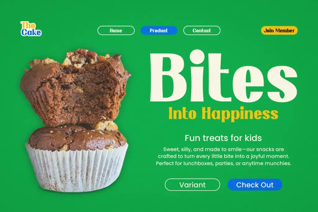
Glibby can bring a more fun or unique mood to website headlines. This makes it useful for creative projects that do not want to feel overly formal. A strong headline font like this can help establish tone before users engage with the rest of the page.
5. Maktron

Maktron can suit websites that need sophistication and boldness visual direction. Its versatile letter shapes make it useful for hero sections, campaign pages, and design portfolios. When used at larger sizes, it can create immediate impact without relying on extra graphic elements.
How to Test Kerning Before Choosing a Font
Start with real website content instead of placeholder text. Create several sample headlines using different letter combinations, lengths, and capitalization styles. This gives you a more realistic picture of how the font will perform in the final layout.
Next, view the typography at both desktop and mobile sizes. A headline that looks balanced on a large screen may feel crowded when scaled down. Responsive testing helps ensure that the spacing remains visually consistent across devices.
Kerning and Font Size Work Together
Kerning does not exist separately from font size. Larger text makes spacing relationships more noticeable, while smaller headlines may hide minor issues. Designers should therefore evaluate both size and spacing at the same time.
If you are also refining readability across a portfolio or creative website, read Font Size Tips for Readable Art Portfolio Websites. The article explores how font scale affects hierarchy, readability, and the overall browsing experience.
Avoid Over-Kerning Your Headlines
Manual kerning can improve typography, but too much adjustment can make words feel unnatural. The goal is not to make every gap identical. Instead, the spacing should feel visually balanced based on the shape of each letter.
Trust your eye as well as the font settings. Sometimes a technically equal space can still look uneven because letters have different structures. Small visual corrections usually work better than aggressive adjustments.
Final Thoughts
Choosing kerning-friendly fonts for website headlines can make web typography feel cleaner, more intentional, and easier to read. Fonts such as Beatrice, Fishera, Getfabio, Glibby, and Maktron offer different visual personalities, but each should be tested with real content before becoming part of a website system. Spacing, size, capitalization, and layout all influence how well a headline performs.
The best headline typography is rarely about choosing the most decorative font. It comes from finding a typeface that supports the visual direction while maintaining clear spacing and hierarchy. When kerning works naturally, the website feels more polished before users even notice why.
