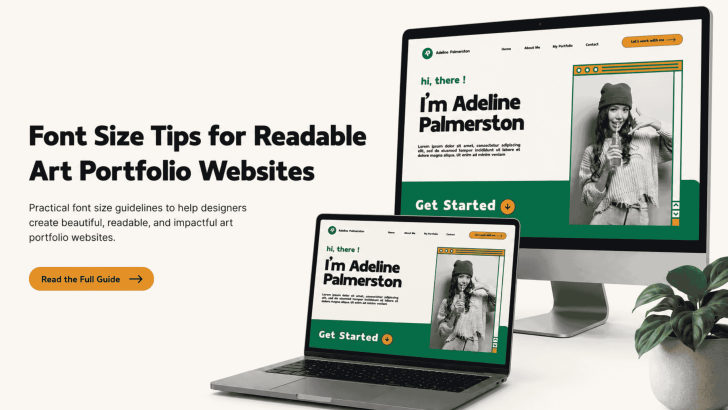
Font Size Tips for Readable Art Portfolio Websites

Applying the right font size tips for readable art portfolio websites can help visitors explore your work without feeling distracted or overwhelmed. While strong images attract attention, readable typography keeps potential clients, art directors, and collaborators engaged with project descriptions, artist statements, and contact information. A font may look beautiful in a design mockup, but …
Continue reading →

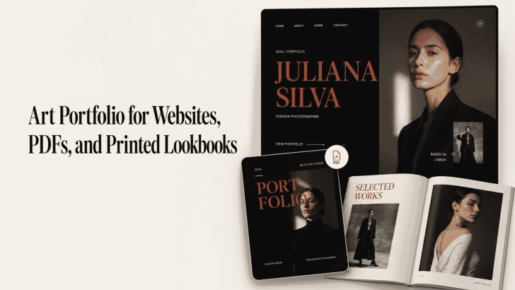
Art Portfolio for Websites, PDFs, and Printed Lookbooks

Creating an art portfolio for websites, PDFs, and printed lookbooks requires more than arranging attractive images on a page. Typography also affects how viewers understand your style, follow project descriptions, and remember your creative identity. A website portfolio needs clear and responsive text. Meanwhile, a PDF must remain readable across different screen sizes, and a …

Continue reading →