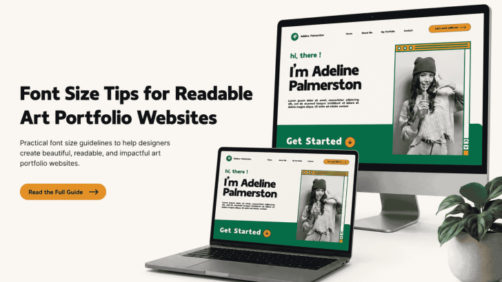
Font Size Tips for Readable Art Portfolio Websites

Applying the right font size tips for readable art portfolio websites can help visitors explore your work without feeling distracted or overwhelmed. While strong images attract attention, readable typography keeps potential clients, art directors, and collaborators engaged with project descriptions, artist statements, and contact information. A font may look beautiful in a design mockup, but …
Continue reading →

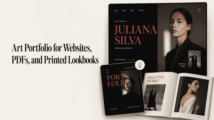
Art Portfolio for Websites, PDFs, and Printed Lookbooks

Creating an art portfolio for websites, PDFs, and printed lookbooks requires more than arranging attractive images on a page. Typography also affects how viewers understand your style, follow project descriptions, and remember your creative identity. A website portfolio needs clear and responsive text. Meanwhile, a PDF must remain readable across different screen sizes, and a …

Continue reading →

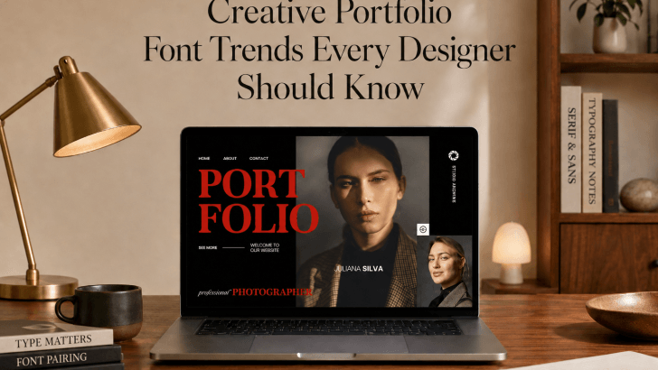
Creative Portfolio Font Trends Every Designer Should Know

Understanding creative portfolio font trends is becoming increasingly important for designers who want to stand out in a competitive creative industry. Whether you’re a graphic designer, illustrator, photographer, UI designer, branding specialist, or creative director, your portfolio is often the first impression potential clients or employers have of your work. While many designers focus heavily …

Continue reading →

How to Make a Portfolio for Designers Using Custom Fonts

Creating a strong portfolio for designers is one of the most important steps in building a successful design career. A well-structured portfolio shows your creativity, skills, and professional identity. However, many designers overlook one key element that can make their portfolio stand out: typography. Using custom fonts in your portfolio design can give your work …

Continue reading →