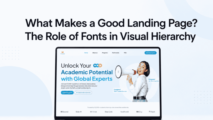
Understanding what makes a good landing page starts with knowing how visitors process information. Before reading every sentence, people usually scan the headline, supporting text, visuals, benefits, and call-to-action button. Fonts help organize these elements and show users where to look first.
A landing page may include strong images and persuasive copy. However, the message can still feel confusing when all text elements use the same size, weight, or style. A clear typographic hierarchy makes the page easier to scan, understand, and trust.
For businesses, creative services, mobile apps, and digital products, the right font system can also strengthen brand identity. It turns separate sections into one consistent and professional experience.
What Makes a Good Landing Page for Visitors?
A good landing page gives visitors relevant information without creating unnecessary friction. Its headline should match the advertisement, search result, email, or social media post that brought people to the page.
The page should also focus on one primary goal. That goal might be to purchase a product, book an appointment, download an app, join a mailing list, or request a consultation.
Every design choice should support that action. Typography, images, buttons, colors, and spacing must work together instead of competing for attention.
How Fonts Create Visual Hierarchy
Visual hierarchy determines the order in which visitors notice and understand content. Fonts support this hierarchy through size, weight, style, spacing, and contrast.
1. Headline Fonts Capture Attention
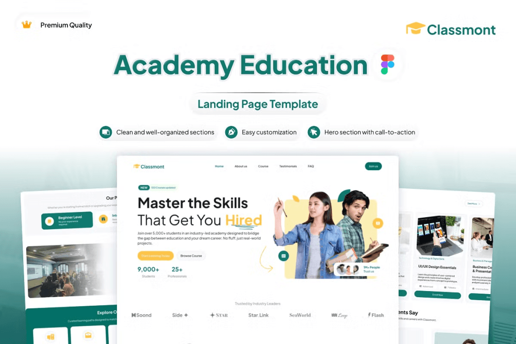
The main headline should be the most noticeable text on the page. It introduces the offer and gives visitors a reason to continue.
A display font can add personality to this section. For example, an elegant serif may suit a luxury brand, while a bold sans serif can support a modern app or technology company.
However, the headline must remain readable. A highly decorative font may look impressive in a mockup but become difficult to understand on smaller screens. Keep the wording short and test the typeface across desktop and mobile devices.
2. Subheadings Explain the Value
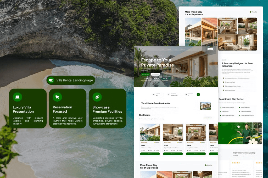
Subheadings support the main message by adding context. They can explain the benefit, target audience, or main difference between the offer and its competitors.
Use a smaller size than the main headline, but make it more prominent than body text. A medium font weight often works well because it creates emphasis without competing with the headline.
Clear subheadings also help visitors scan longer pages. They divide the content into manageable sections and make specific information easier to find.
3. Body Fonts Improve Readability
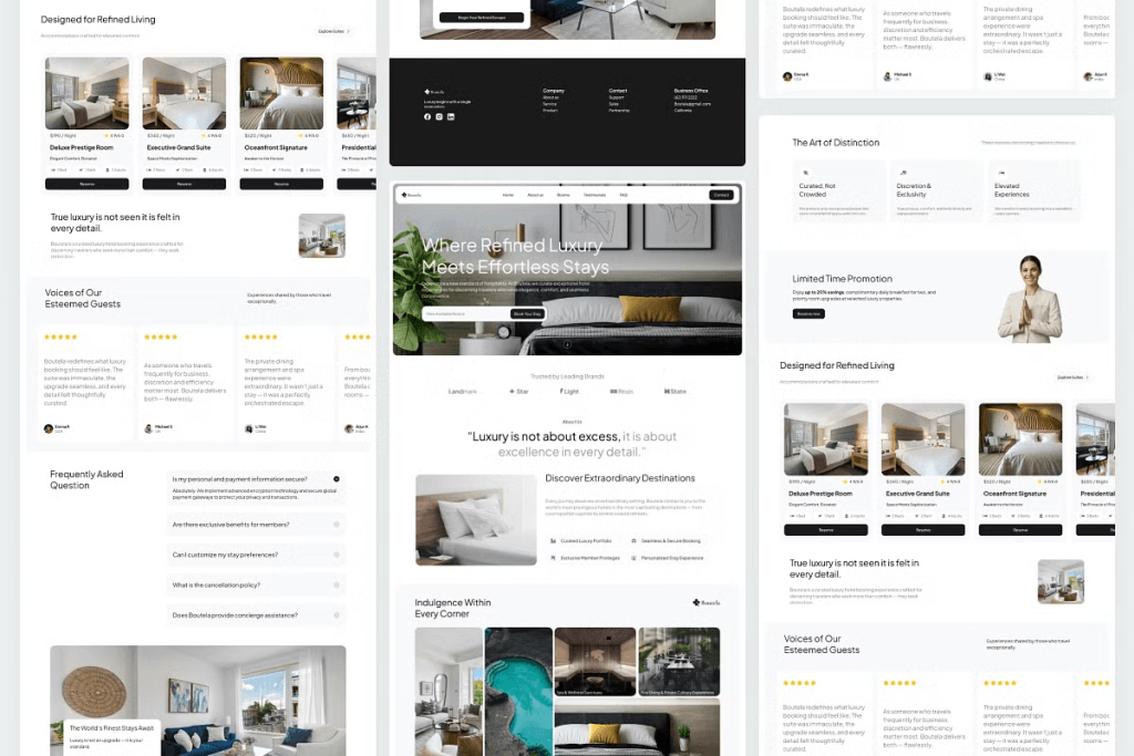
Body text explains features, benefits, processes, and important details. Therefore, it should use a clean and readable font.
Avoid using decorative typefaces for long paragraphs. They may slow down reading and distract visitors from the message. A simple serif or sans serif usually provides a more comfortable experience.
Body text should also have enough line spacing. Dense paragraphs can make the page feel overwhelming, even when the copy is useful. Keep paragraphs short and add whitespace between sections.
4. Button Fonts Guide Action

Call-to-action buttons are among the most important elements on a landing page. Their labels should be brief, specific, and easy to read.
Use phrases such as “Start Free Trial,” “Book a Consultation,” “Explore Programs,” or “Download the App.” These labels explain what happens after the visitor clicks.
Button text should have enough contrast against the background. Avoid thin weights, tiny sizes, or excessive letter spacing that makes the action difficult to recognize.
Font Pairing for Landing Page Design
Many landing pages use two complementary typefaces. One font creates personality, while the other supports readability.
Pair Display Fonts With Simple Body Fonts
A serif, script, or expressive display font can work well for headlines. Pair it with a cleaner font for paragraphs, forms, FAQs, and navigation. The contrast should feel intentional. Avoid combining two highly decorative fonts because they may compete with each other.
Keep the Brand Personality Consistent
The font pairing should match the product and audience. A financial service may need typography that feels stable and dependable. A creative platform can use a more expressive headline style, while a wellness brand may benefit from softer letterforms. Consistency helps visitors understand the brand before they consciously evaluate every design detail.
Common Typography Mistakes on Landing Pages
One common mistake is using too many fonts. A page with several unrelated typefaces can feel inconsistent and unprofessional.
Another mistake is choosing style over readability. Thin text, low contrast, and very small font sizes may look minimal, but they can make important information difficult to access.
Designers should also avoid long lines of text. Narrower text columns are often easier to read, especially on large desktop screens.
Finally, typography must adapt to mobile devices. Headings should scale down smoothly, paragraphs should remain readable, and button labels should not wrap awkwardly.
Test the Visual Hierarchy Before Launching
Before publishing the landing page, scan it without reading every word. Notice which element attracts your attention first. Ideally, you should see the headline, main visual, value proposition, and CTA in a clear order.
Next, test the page on different screen sizes. Check whether headings break naturally, paragraphs remain comfortable, and buttons stay visible.
You can also ask someone unfamiliar with the business to review the page. If they can explain the offer and identify the next step within a few seconds, the hierarchy is probably working.
Build a Landing Page That Feels Clear and Credible
What makes a good landing page is not decoration alone. A strong page combines relevant messaging, readable content, helpful visuals, trustworthy information, and a clear conversion path.
Fonts make those elements easier to understand. Through size, weight, spacing, and style, typography shows visitors what to read first and where to go next.
Ready to review the complete user experience beyond typography? Explore Which Attributes Describe a Good Landing Page Experience? to learn how relevance, performance, mobile design, trust signals, and clear calls to action can turn a polished layout into a more effective landing page.
