Understanding creative portfolio font trends is becoming increasingly important for designers who want to stand out in a competitive creative industry. Whether you’re a graphic designer, illustrator, photographer, UI designer, branding specialist, or creative director, your portfolio is often the first impression potential clients or employers have of your work.
While many designers focus heavily on visuals, case studies, and project selection, typography is often what ties everything together. The right font can make a portfolio feel modern, professional, memorable, and aligned with your creative identity. On the other hand, poor font choices can weaken even the strongest projects.
As portfolio design trends continue evolving, typography plays a larger role than ever before. In this article, we’ll explore current font trends shaping creative portfolios and discuss how designers can use typography strategically to elevate their presentation.
Why Typography Matters in Portfolio Design
A portfolio is more than a collection of projects. It is a personal brand experience. Typography helps communicate who you are as a designer before visitors even start reviewing your work.
Typography Creates First Impressions
Research consistently shows that users form visual opinions within seconds.
When visitors open your portfolio, they immediately notice:
- Layout structure
- Typography style
- Visual hierarchy
- White space
- Overall aesthetic
Fonts influence whether your portfolio feels:
- Modern
- Creative
- Professional
- Minimalist
- Experimental
- Premium
This makes typography a critical part of portfolio design.
Typography Supports Storytelling
Every portfolio tells a story.
Good typography helps organize content and guide visitors through:
- Project introductions
- Design processes
- Case studies
- Results
- Personal branding
Without a clear typography system, even outstanding work can feel difficult to navigate.
The Evolution of Creative Portfolio Typography
Portfolio design has changed significantly over the last decade. Previously, many designers favored highly decorative typography to demonstrate creativity. Today, trends have shifted toward cleaner, more strategic font choices.
From Decorative to Purposeful
Modern portfolios prioritize clarity and user experience.
Designers increasingly choose typography that:
- Enhances readability
- Supports visual hierarchy
- Strengthens branding
- Improves accessibility
The goal is no longer to impress with flashy fonts but to communicate effectively.
The Influence of Digital Platforms
Creative portfolios are now primarily viewed online.
As a result, typography must perform well across:
- Desktop screens
- Tablets
- Smartphones
- High-resolution displays
This has encouraged the adoption of versatile and highly readable font styles.
Current Creative Portfolio Font Trends
Several typography trends are dominating portfolio design in 2026.
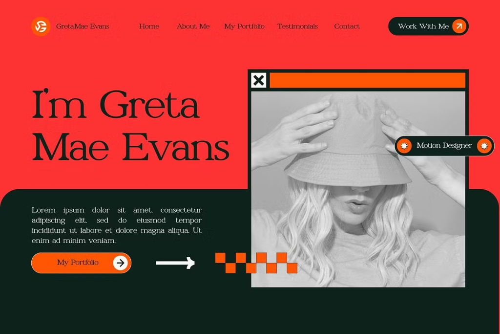
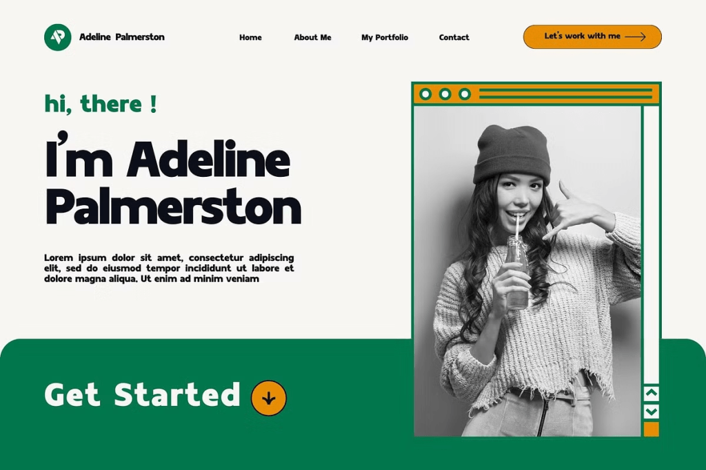
1. Minimal Sans Serif Typography
Clean sans serif fonts continue to lead portfolio design trends.
Designers appreciate them because they:
- Feel modern
- Improve readability
- Work across devices
- Support minimalist layouts
This trend aligns with the growing preference for simple and distraction-free portfolio experiences.
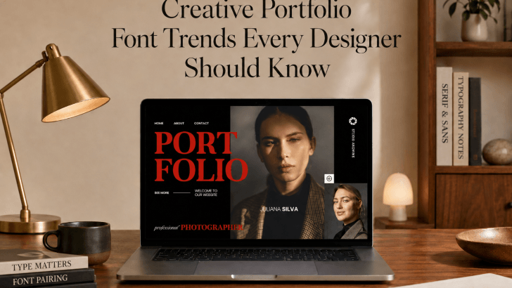
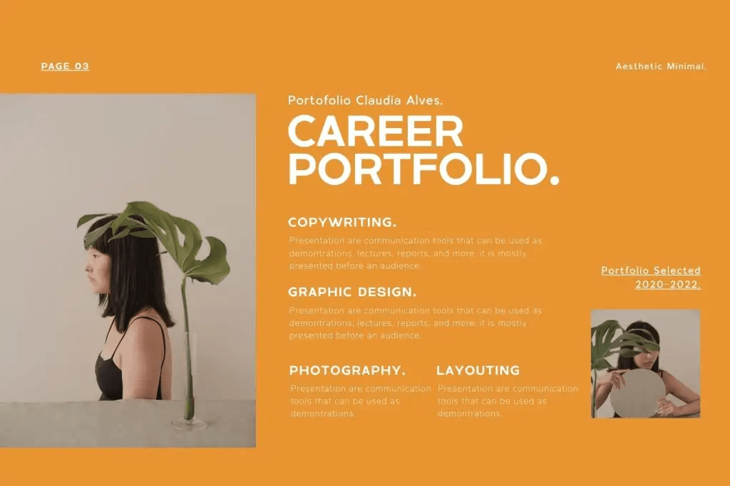
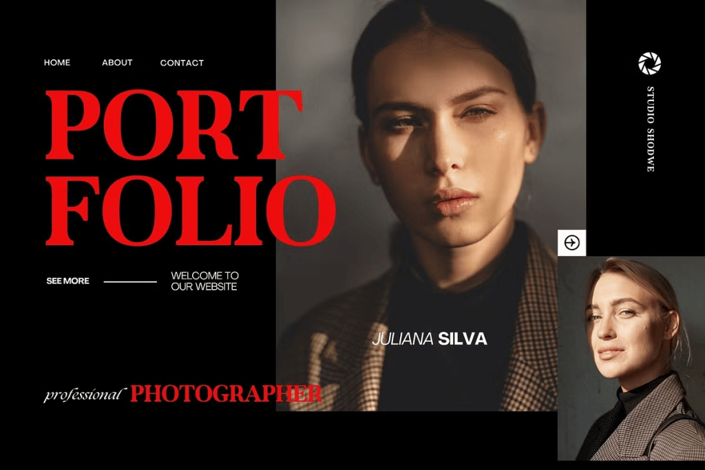
2. Editorial-Inspired Typography
Many designers borrow inspiration from fashion magazines and editorial publications.
Characteristics include:
- Large headlines
- Dramatic typography contrast
- Elegant spacing
- Strong hierarchy
Editorial typography helps portfolios feel more sophisticated and professional.
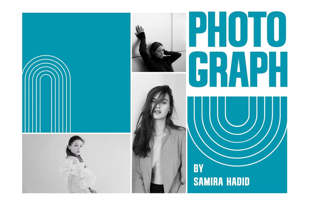
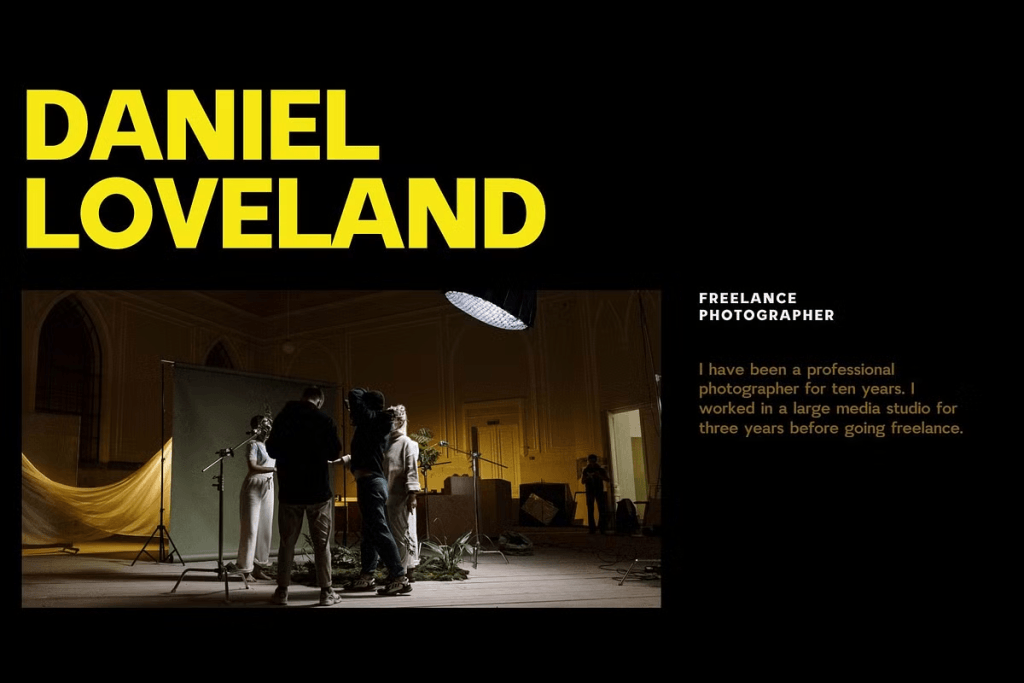
3. Expressive Display Fonts
While body text remains clean and readable, many designers use expressive display fonts for:
- Hero sections
- Portfolio titles
- Landing pages
- Personal branding
This creates a memorable first impression while maintaining usability.
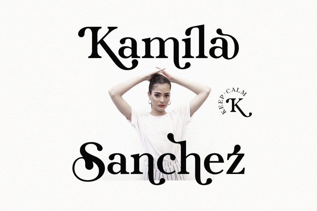
4. Ligature and Signature Fonts
Creative professionals increasingly use ligature fonts to establish distinctive personal brands.
These fonts provide:
- Unique visual identity
- Elegant aesthetics
- Strong recognition
- Creative personality
For personal portfolios, ligature typography often helps designers differentiate themselves from competitors.
How to Choose Fonts for Your Portfolio
Following trends is helpful, but choosing fonts should always support your goals and audience.
1. Define Your Creative Identity
Start by asking:
- What type of designer am I?
- What clients do I want to attract?
- What personality should my portfolio communicate?
Different typography styles communicate different messages.
2. Prioritize Readability
No matter how creative a font appears, readability should remain the priority.
Visitors should easily navigate:
- Project descriptions
- Case studies
- Contact information
- Testimonials
Typography should enhance the user experience rather than create obstacles.
3. Limit Font Combinations
Most successful portfolios use:
- One primary font
- One secondary font
- One accent font (optional)
Using too many fonts often creates visual inconsistency.
Typography Trends Across Creative Disciplines
Different design fields often favor different typography styles.
Graphic Designers
Graphic designers frequently combine:
- Minimal sans serif fonts
- Editorial typography
- Experimental display fonts
Brand Designers
Branding portfolios often emphasize:
- Sophisticated typography systems
- Luxury-inspired fonts
- Consistent visual hierarchy
Illustrators
Illustrators may choose typography that complements their artistic style while remaining readable.
UI and UX Designers
UI designers typically prefer:
- Functional typography
- Clean sans serif systems
- Accessibility-focused design
Understanding your audience helps determine the most appropriate font direction.
Recommended Fonts for Creative Portfolios
If you’re exploring font options for your portfolio, the following fonts can help create a strong visual identity.
1. Burnrock
2. Canersh
3. Gafhote

4. Gavoline
5. Glareso

6. Govers
7. Jariest
8. Karens

9. Kefhila Serif
10. Keneth
11. Kestila
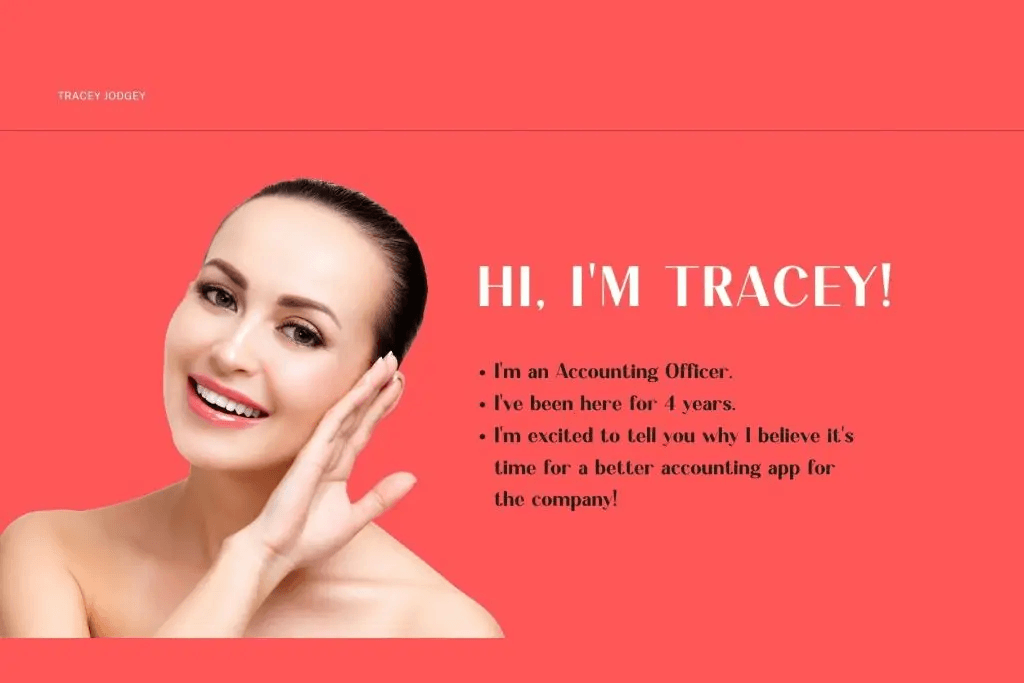
12. Tracey Jodgey
13. The Cilla

14. Tuner
15. Yasmen

Conclusion
Understanding current creative portfolio font trends can help designers build stronger, more effective portfolio experiences. Typography influences how visitors perceive professionalism, creativity, and attention to detail.
By choosing fonts strategically, prioritizing readability, creating strong hierarchy, and maintaining consistency, designers can present their work more effectively and attract the right opportunities.
Whether you’re building your first portfolio or refreshing an existing one, thoughtful typography remains one of the most powerful tools for creating a memorable and professional presentation.