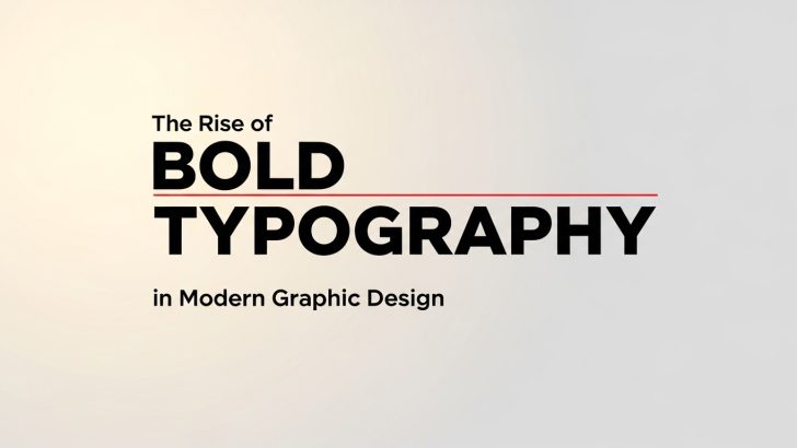
The rise of bold typography in modern graphic design has transformed the way designers communicate visually. In today’s fast-paced digital world, capturing attention quickly is more important than ever. Bold typography has become a powerful tool for creating strong visual impact, conveying confidence, and delivering clear messages.
From social media graphics to branding and web design, bold fonts are now everywhere. Designers use them not only to stand out but also to express personality and strengthen brand identity. In this article, we will explore why bold typography is gaining popularity, its characteristics and benefits, and how to use it effectively in modern design.
Why the Rise of Bold Typography in Modern Graphic Design Matters
The rise of bold typography in modern graphic design is closely related to how people consume content today. With limited attention spans and constant exposure to visual information, designs must be clear and impactful within seconds.
Bold typography helps achieve this by:
- Grabbing attention instantly
- Making messages easier to read
- Creating a strong visual hierarchy
- Enhancing brand recognition
In crowded digital spaces like Instagram, websites, and advertisements, bold fonts make content stand out from the competition.
Characteristics of Bold Typography in Modern Graphic Design
Bold typography has several defining features that make it effective in modern design.
1. Thick and Heavy Letterforms
Bold fonts use thicker strokes, making the text more prominent and visible from a distance.
2. High Contrast and Visibility
Bold typography creates a strong contrast, especially when combined with simple backgrounds.
3. Minimal but Impactful
Even with fewer design elements, bold typography can dominate a layout and communicate clearly.
4. Strong Personality
Bold fonts often convey confidence, power, and modernity.
If you are looking for bold fonts, you can read this article: 5 Best Bold Fonts for Digital Design That Stand Out.
The Rise of Bold Typography in Modern Graphic Design Trends
Digital-First Design
Most designs today are created for screens. Bold typography ensures readability across devices, especially on mobile screens.
Minimalist Layouts
Modern design often uses minimal elements. Bold typography replaces complex visuals by becoming the main focal point.
Social Media Influence

Platforms like Instagram and TikTok favor eye-catching visuals. Bold typography helps stop users from scrolling.
Branding Evolution

Brands are shifting toward simpler but stronger identities. Bold fonts help create memorable and recognizable branding.
Benefits of Using Bold Typography in Modern Graphic Design
The rise of bold typography in modern graphic design is not just a trend; it offers real advantages.
1. Strong Visual Impact
Bold fonts immediately capture attention and create a powerful first impression.
2. Improved Readability
Large and thick text is easier to read, especially on small screens.
3. Clear Communication
Bold typography simplifies messaging by focusing on key information.
4. Versatility
Bold fonts work well across different mediums, including:
- Posters
- Websites
- Social media
- Branding
How to Use Bold Typography in Modern Graphic Design
Using bold typography effectively requires balance and strategy.
1. Use Bold Fonts as a Focal Point
Bold typography works best when it becomes the main visual element.
Tips:
- Highlight key messages
- Use large font sizes
- Keep surrounding elements simple
2. Combine with Minimal Design Elements
Avoid clutter when using bold typography.
- Use simple backgrounds
- Limit color palette
- Focus on contrast
This ensures the typography remains the center of attention.
3. Pair with Other Font Styles
Combining bold fonts with lighter fonts creates balance.
Example:
- Bold font → Headline
- Regular font → Body text
This pairing improves readability and visual hierarchy.
4. Use Proper Spacing
Spacing plays a key role in bold typography.
- Increase letter spacing if needed
- Use enough line height
- Avoid overcrowding
Good spacing makes bold text easier to read.
5. Match with Brand Personality
Bold typography should reflect your brand identity.
- Strong bold fonts → Corporate or tech brands
- Playful bold fonts → Creative or youth brands
- Elegant bold fonts → Fashion or luxury brands
The Future of Bold Typography in Modern Graphic Design
The rise of bold typography in modern graphic design is expected to continue as digital content grows. Designers are experimenting with:
- Variable fonts
- Animated typography
- 3D text effects
- Interactive design
Bold typography will remain a key element in creating engaging and modern visual experiences.
Conclusion
The rise of bold typography in modern graphic design reflects the need for clarity, impact, and strong visual communication. Bold fonts help designers capture attention, improve readability, and build powerful brand identities.
When used correctly, bold typography can transform simple designs into compelling visual statements. By combining bold fonts with proper spacing, minimal elements, and thoughtful pairing, designers can create modern and effective designs.
One Comment