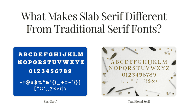
What Makes Slab Serif Different From Traditional Serif Fonts?

Understanding what makes slab serif different from traditional serif fonts can help designers choose typography with the right personality for branding, editorial layouts, packaging, websites, and advertising. Both styles belong to the serif family, but they communicate very different moods. Traditional serif fonts tend to feel refined and literary, while slab serifs often look stronger, …
Continue reading →

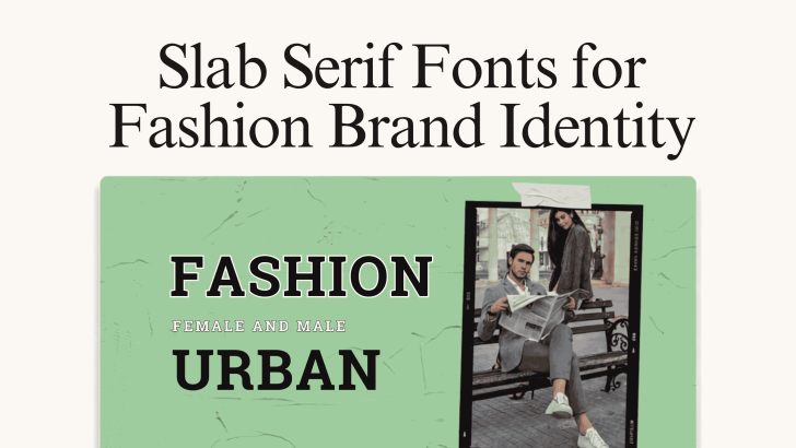
Slab Serif Fonts for Fashion Brand Identity

Choosing slab serif fonts for fashion brand identity can give a clothing or lifestyle brand a stronger, more recognizable visual personality. With their bold serifs, structured shapes, and confident presence, slab serif fonts can work particularly well for fashion labels that want to feel expressive without relying on overly decorative typography. Fashion branding appears across …

Continue reading →

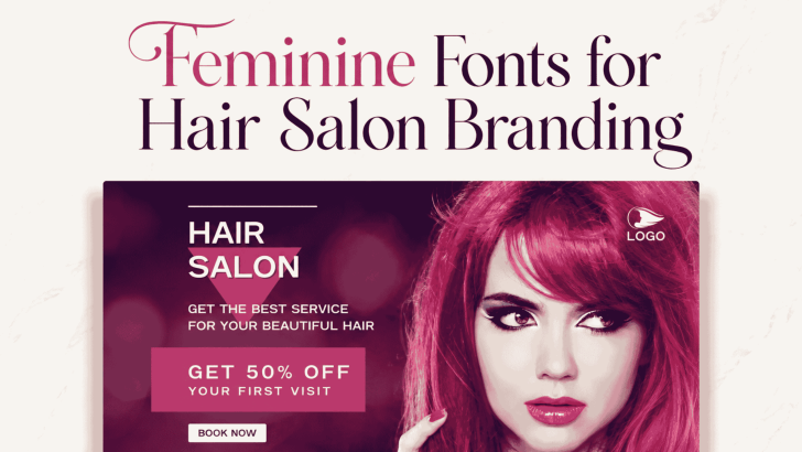
Feminine Fonts for Hair Salon Branding

Choosing the right feminine fonts for hair salon branding can completely change how clients perceive a beauty business. Before someone books an appointment, they may first discover the salon through Instagram, a storefront sign, a promotional poster, or a website. Typography helps shape that first impression by communicating whether the salon feels elegant, modern, playful, …

Continue reading →

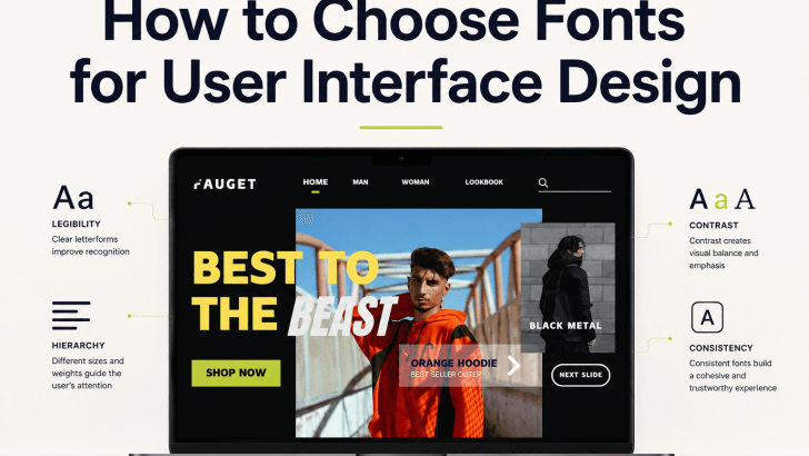
How to Choose Fonts for User Interface Design

Choosing fonts for user interface design is not only about finding a typeface that looks modern. A UI font needs to help users read labels, understand navigation, complete forms, scan content, and recognize important actions without unnecessary effort. The right typography can make an interface feel clear and professional, while the wrong choice can make …

Continue reading →

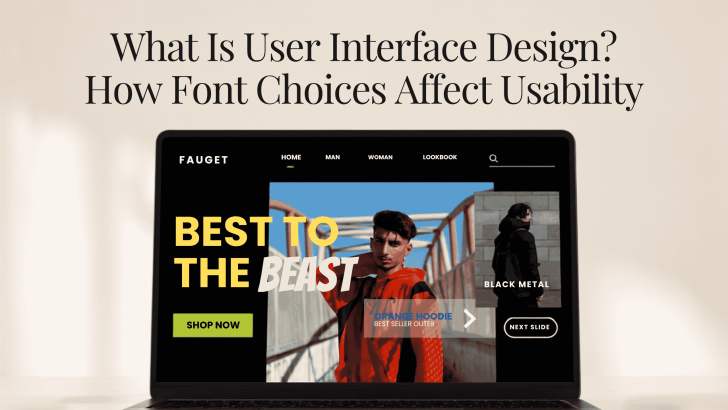
What Is User Interface Design? How Font Choices Affect Usability

If you are asking what is user interface design, the simplest answer is that it is the process of shaping how people interact with digital products through screens, controls, content, and visual elements. Buttons, menus, icons, forms, colors, spacing, and typography all work together to help users understand what to do next. Font choices are …

Continue reading →

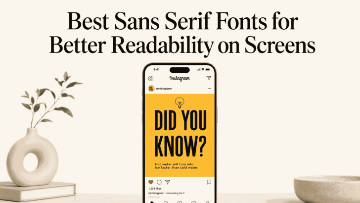
Best Sans Serif Fonts for Better Readability on Screens

Choosing the best sans serif fonts for better readability on screens can make websites, apps, landing pages, and digital ads easier to use. Sans serif fonts are often preferred for screen-based design because their letterforms tend to look clean, simple, and direct. However, readability still depends on more than the font itself. Size, spacing, weight, …

Continue reading →