Best Sans Serif Fonts for Better Readability on Screens

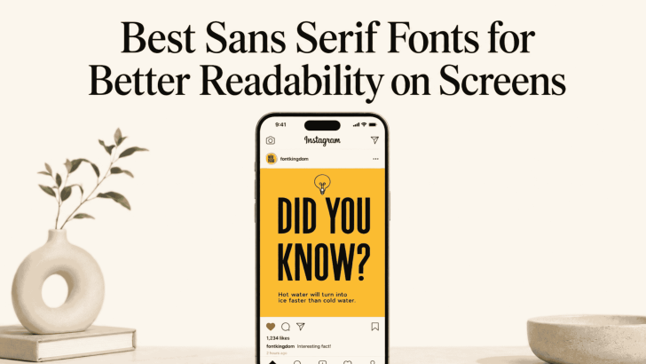
Choosing the best sans serif fonts for better readability on screens can make websites, apps, landing pages, and digital ads easier to use. Sans serif fonts are often preferred for screen-based design because their letterforms tend to look clean, simple, and direct. However, readability still depends on more than the font itself. Size, spacing, weight, …
Continue reading →

Legibility vs Readability: What Is the Difference in Typography?

Understanding legibility vs readability in typography helps designers choose fonts that look attractive and communicate clearly. Although people often use these terms interchangeably, they describe two different parts of the reading experience. Legibility focuses on how easily readers can recognize individual letters and words. Readability describes how comfortably they can understand a complete sentence, paragraph, …

Continue reading →