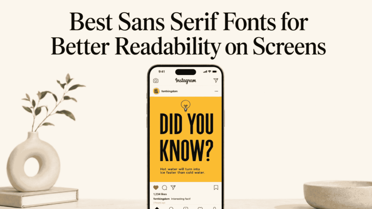
Choosing the best sans serif fonts for better readability on screens can make websites, apps, landing pages, and digital ads easier to use. Sans serif fonts are often preferred for screen-based design because their letterforms tend to look clean, simple, and direct. However, readability still depends on more than the font itself. Size, spacing, weight, contrast, and layout also influence how comfortably people can read digital content.
For brands, designers, and marketers, this matters because users often scan before they read. A typeface that feels clear at a glance can help visitors understand navigation, product information, headlines, and calls to action more quickly.
Why Sans Serif Fonts Work Well on Screens
Sans serif fonts do not include the small finishing strokes found in serif typefaces. This cleaner construction can make letterforms feel more open, especially at smaller sizes. On websites and apps, that simplicity often supports menus, buttons, body text, and interface labels.
Modern screens can display many font styles clearly, so serif fonts are not automatically difficult to read. Still, sans serif typefaces remain popular because they fit naturally into digital interfaces and responsive layouts.
They are also versatile. A single sans serif family may include several weights, allowing designers to build hierarchy without introducing too many unrelated fonts.
What Makes a Sans Serif Font Readable?
Clear Letterforms
Characters should be easy to distinguish from one another. Letters such as “I,” “l,” and “i” should not look almost identical, especially in smaller text. Clear differences help readers process words more quickly. Open counters are also helpful. Letters such as “a,” “e,” and “o” can become harder to recognize when their inner spaces are too tight.
Balanced X-Height
A larger x-height can make lowercase text feel more visible on a screen. This is especially useful for paragraphs, captions, navigation, and mobile interfaces. However, the font should still maintain balanced proportions. Extremely large lowercase forms can make the text feel heavy or crowded when used in long passages.
Multiple Useful Weights
A strong sans serif family should offer enough weight variation for different roles. Regular can work for body text, medium for navigation, and bold or semibold for headings.
Best Sans Serif Fonts for Better Readability on Screens
Different sans serif styles can create different reading experiences. Some feel softer and more natural, while others are structured, compact, or more expressive. Here are five styles worth considering for websites, apps, landing pages, and other screen-based designs.
1. Clean Humanist Sans Serif

A clean humanist sans serif combines simple letterforms with subtle organic details. This style often feels approachable and natural, making it suitable for educational websites, portfolios, healthcare platforms, and content-heavy pages.
Its open shapes can also help improve letter recognition at smaller sizes. Use it for body text, navigation, forms, and supporting information where readability is the main priority.
2. Ligature Sans Serif
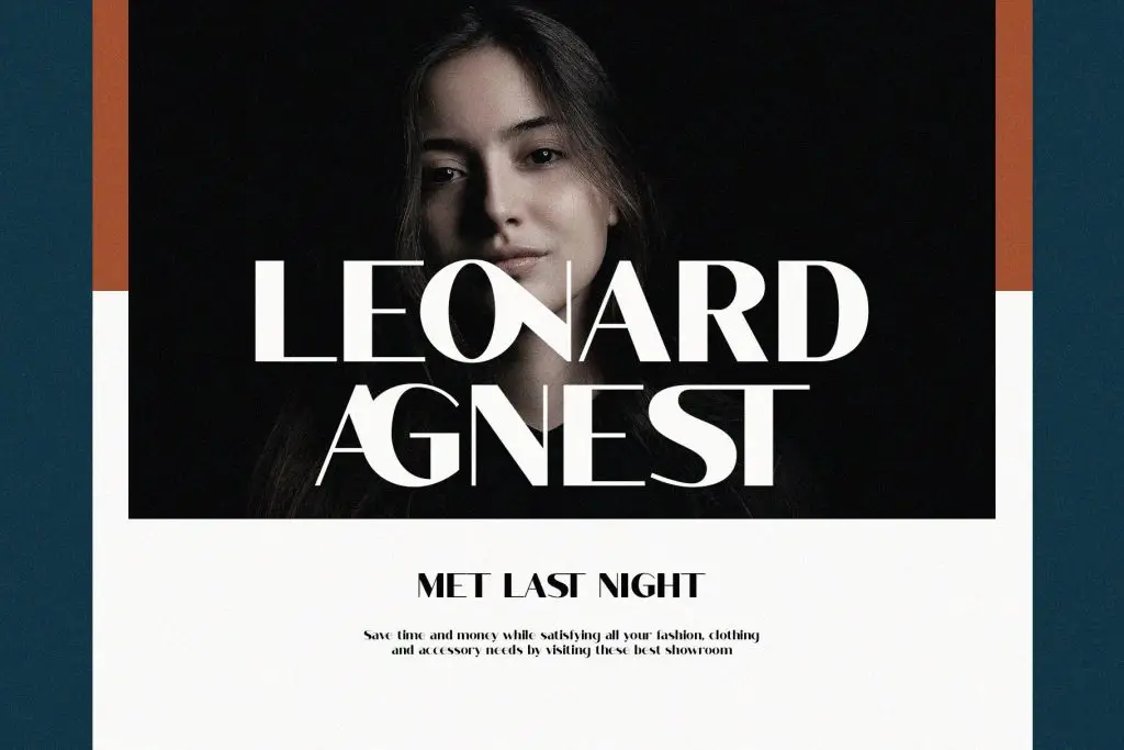
A ligature sans serif introduces connected or specially designed letter combinations while keeping the overall structure modern and clean. This gives digital typography a more distinctive personality without making it feel overly decorative.
It works especially well for branding, hero headlines, creative websites, and short display text. For longer paragraphs, use ligatures carefully so the content remains quick and comfortable to read.
3. Modern Sans Serif

A modern sans serif offers clean proportions, balanced spacing, and a polished contemporary appearance. It is a versatile choice for technology websites, fashion brands, SaaS platforms, online stores, and professional portfolios.
This style can work across headings, buttons, navigation, and body text when the letterforms remain clear. Multiple font weights also make it easier to create hierarchy without introducing another font family.
4. Rounded Sans Serif

Rounded sans serif fonts feature softer corners and curved letterforms to create a friendly, approachable visual tone. They are useful for lifestyle brands, wellness platforms, casual apps, children’s products, and creative businesses.
Despite their softer appearance, readability should still come first. Choose rounded fonts with open counters and clear lowercase letters when using them for smaller text on screens.
5. Condensed Sans Serif

A condensed sans serif uses narrower letterforms, allowing more text to fit into limited horizontal space. Its compact structure can create strong headlines without taking over the entire layout.
This style works especially well for banners, promotional graphics, navigation labels, category titles, and mobile interfaces. However, condensed fonts are generally better for short text than long paragraphs because narrow letters can become tiring when used extensively.
Pair Sans Serif Fonts With Serif Typefaces
A sans serif does not need to work alone. Pairing it with a serif can create stronger visual hierarchy and add more personality to a website. For example, use an elegant serif for hero headlines and a clean sans serif for paragraphs, buttons, and navigation. This creates contrast while keeping the supporting content comfortable to read.
The key is choosing fonts with compatible proportions and visual weight. To explore this approach in more depth, read How to Pair Modern Sans Serif Fonts with Serif Typefaces.

One Comment