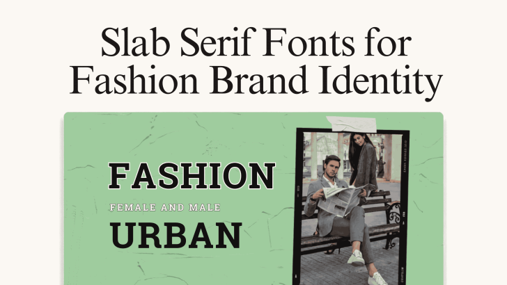
Choosing slab serif fonts for fashion brand identity can give a clothing or lifestyle brand a stronger, more recognizable visual personality. With their bold serifs, structured shapes, and confident presence, slab serif fonts can work particularly well for fashion labels that want to feel expressive without relying on overly decorative typography.
Fashion branding appears across many touchpoints, including logos, clothing labels, social media campaigns, lookbooks, packaging, websites, advertisements, and seasonal collections. Because of this, the chosen typeface needs enough character to become memorable while remaining flexible across different layouts. Slab serif fonts can provide that balance by combining the structure of serif typography with the visual impact of display lettering.
What Are Slab Serif Fonts?
Slab serif fonts are recognized by their strong, block-like serifs. Unlike traditional serif fonts, which may use delicate or tapered strokes, slab serifs often have thicker and more noticeable endings. This structure gives them a confident appearance. Depending on the design, a slab serif can feel vintage, editorial, playful, urban, sophisticated, or contemporary.
For fashion brands, that versatility is valuable. One slab serif may complement a youthful lifestyle campaign, while another can support an editorial-inspired clothing collection. The surrounding photography, colors, spacing, and supporting fonts determine how the typography ultimately feels.
Why Slab Serif Fonts Work for Fashion Brand Identity
Fashion typography needs to communicate personality quickly. Customers may only see a campaign for a few seconds while scrolling through social media or browsing an online shop. A strong slab serif can create an immediate focal point.
They Give Headlines More Presence
The heavier serifs help large headlines stand out against photography, textures, and colorful backgrounds. This makes slab serif fonts useful for collection names, advertisements, website banners, and campaign graphics. For example, a short phrase such as “New Collection” or “Urban Fashion” can become a key visual element rather than simply supporting copy.
They Can Feel Editorial
Slab serif fonts can also bring a magazine-inspired quality to fashion branding. Their strong shapes work naturally with image grids, collages, large photographs, and structured layouts.
This can make them particularly useful for lookbooks, fashion catalogs, brand presentations, and campaign landing pages. For more ideas on typography in longer-form fashion layouts, explore Fashion Fonts for Lookbooks, Catalogs, and Editorial Layouts.
They Create Strong Brand Recognition
Distinctive typography can become part of the identity itself. When a brand consistently uses the same slab serif for campaign titles, packaging, and social graphics, customers may begin to recognize the style even before noticing the logo. The key is consistency. Use the font for specific roles rather than applying it randomly across every text element.
Best Slab Serif Fonts for Fashion Brand Identity
Karens and Feriska offer two different approaches to slab serif typography. Based on the attached examples, each font can support a distinct fashion branding style.
1. Karens for Colorful Lifestyle and Fashion Branding
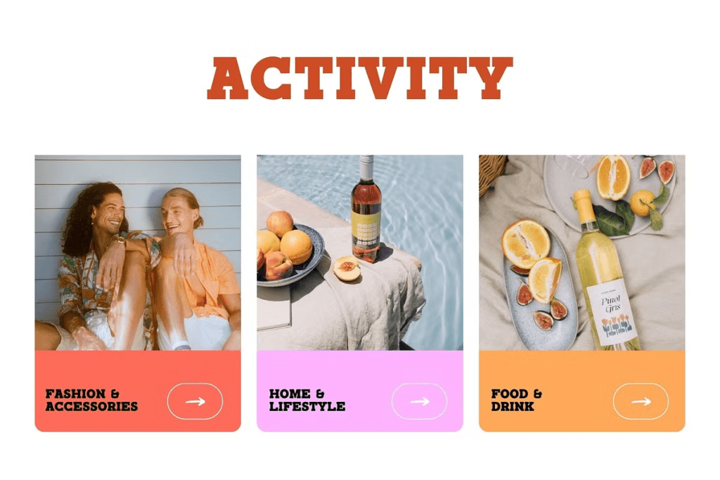
Karens has a bold slab serif personality that immediately commands attention. Its thick serifs and strong uppercase structure complement colorful photography and bright blocks of coral, pink, and orange without getting lost in the composition.
This makes Karens a good choice for fashion and lifestyle brands that want to feel energetic, approachable, and visually expressive. It can work particularly well for fashion accessories, summer collections, casual apparel, lifestyle products, and social media campaigns aimed at younger audiences. Karens also pairs effectively with photography-heavy layouts. This balance can be useful for lookbook category pages, website banners, campaign posters, and editorial social posts.
Because the typeface already carries strong personality, use it strategically. Headlines, collection names, product categories, and short promotional phrases are ideal applications. For descriptions, prices, navigation, and product details, pair Karens with a simpler sans serif.
2. Feriska for Urban and Editorial Fashion Identity
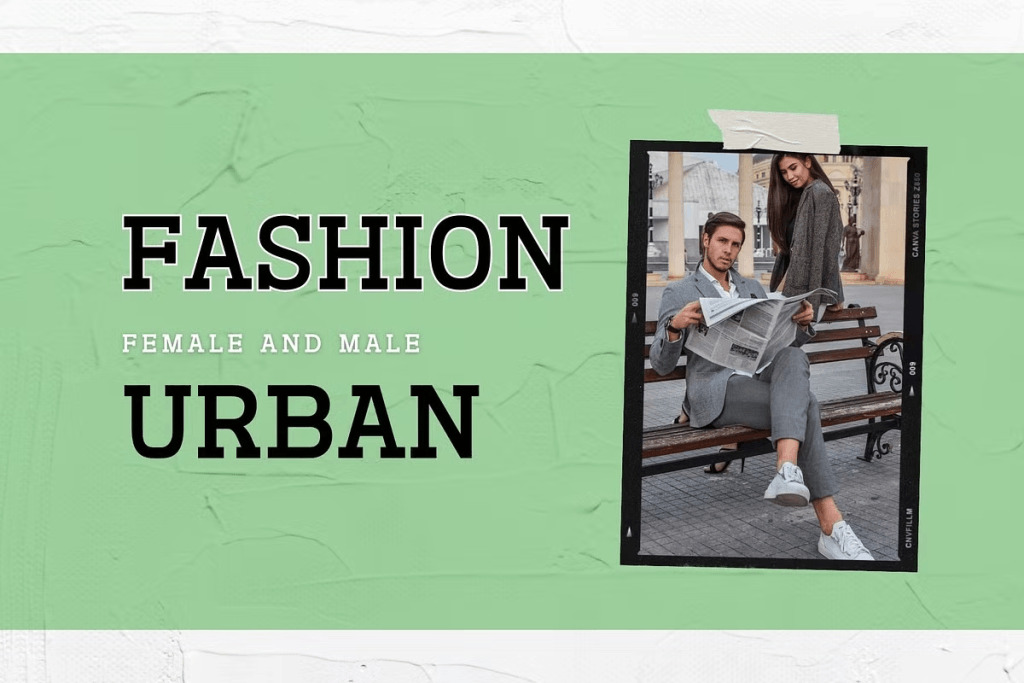
Feriska creates a more editorial and urban impression. The overall result feels youthful but curated. This makes Feriska suitable for streetwear collections, contemporary fashion campaigns, urban apparel, editorial promotions, and independent clothing brands.
Feriska can work particularly well when paired with film-frame imagery, textured backgrounds, collage elements, and minimalist fashion photography. Use it for collection names, website hero sections, posters, apparel campaign graphics, or lookbook covers where the typography needs to feel visually confident.
Build a More Memorable Fashion Identity
Slab serif fonts for fashion brand identity can provide the boldness of display typography while maintaining the recognizable structure of serif letterforms. They are especially effective for fashion brands that want their typography to become a visible part of the overall visual identity.
Karens brings a playful and energetic character that works well with colorful lifestyle campaigns. Feriska offers a more urban, editorial direction that complements street-style imagery and contemporary clothing collections.
Whichever style you choose, give the font a specific role and keep supporting typography simple. Test it across print and digital applications before finalizing the branding system.

One Comment