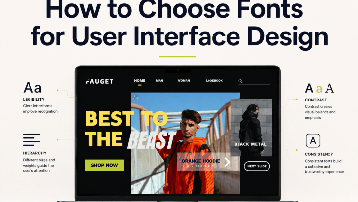
Choosing fonts for user interface design is not only about finding a typeface that looks modern. A UI font needs to help users read labels, understand navigation, complete forms, scan content, and recognize important actions without unnecessary effort. The right typography can make an interface feel clear and professional, while the wrong choice can make even a beautiful layout frustrating to use.
For websites, mobile apps, dashboards, e-commerce platforms, and digital products, font selection should support usability first. Brand personality still matters, but it should never come at the cost of readability or accessibility.
1. Start With Readability
The first thing to consider is whether the font remains easy to read across different screen sizes. A typeface may look impressive in a large hero heading but perform poorly in navigation menus or form labels.
Check the Letterforms
Look closely at characters such as uppercase “I,” lowercase “l,” and the number “1.” If they look almost identical, users may have difficulty reading certain words or data.
Open counters are also helpful. Letters such as “a,” “e,” “o,” and “p” should remain clear at smaller sizes. Fonts with clean shapes and balanced proportions often perform better in interface environments.
Test the X-Height
A generous x-height can improve the visibility of lowercase text. This is especially useful for buttons, menus, captions, and body copy on mobile screens.
However, do not judge a font only by technical characteristics. Always test it with real content because different typefaces can behave differently at the same font size.
2. Match the Font to Its UI Role
Not every text element needs the same visual treatment. A clear interface gives each font style a specific job.
Use Expressive Fonts for Headings
A more distinctive font can work well for hero sections, page titles, or major section headings. These elements are usually larger, so the font’s personality becomes easier to appreciate. Keep the wording short. Decorative details are more effective in a headline than in a long paragraph.
Use Clear Fonts for Functional Text
Navigation, body copy, buttons, forms, pricing, and instructions should prioritize clarity. A clean sans serif often works well because it remains straightforward at smaller sizes.
If you use two font families, let the more expressive one handle branding and the simpler one handle interface functions. This keeps the design interesting without reducing usability.
3. Build a Clear Typography Hierarchy
A good UI should tell users what to read first, second, and third. Font size, weight, and spacing help create this order.
Create a Simple Type Scale
Instead of choosing random sizes for every section, create a consistent scale. For example, a UI might use a large size for the page title, a medium size for section headings, regular body text, and slightly smaller supporting labels. The exact values depend on the font and device. What matters is that each level feels clearly different.
Use Font Weight Carefully
Bold and semibold weights can highlight headings, buttons, and key information. Regular weights are usually more comfortable for body text. Avoid making every element bold. If too many items compete for attention, the interface becomes harder to scan.
For more guidance on creating this structure, explore Font Pairing for Websites That Need a Clear Visual Hierarchy. The same principles can help organize typography across complex interface layouts.
4. Consider Accessibility
Accessibility should be part of font selection from the beginning. A stylish typeface is not useful if some users struggle to read it.
Avoid Extremely Thin Weights
Thin fonts can disappear on small screens, especially when the contrast is weak. Choose a weight that remains clear under different lighting conditions and on different display qualities.
Maintain Strong Contrast
Text should stand out from the background. Light gray body text on white may look elegant but can be difficult to read. Important information such as buttons, prices, error messages, and form labels should have strong contrast so users can identify them quickly.
Allow Text to Scale
Users may increase text size through browser or device settings. The interface should remain usable when this happens. Test whether buttons grow properly, whether headings wrap naturally, and whether text overlaps other interface elements.
5. Test Fonts on Mobile Screens
Mobile usability can reveal problems that are easy to miss on desktop. A font may feel spacious on a large screen but cramped on a phone. Check whether menu labels remain clear, buttons have enough room, and paragraphs do not become too dense. Large headings should also scale down without creating awkward line breaks. Do not reduce every text size dramatically just to fit more content. Readability should remain a priority even when space is limited.
6. Pay Attention to Line Height and Spacing
Good UI typography depends on the space around the letters as much as the font itself.
Set Comfortable Line Height
Body text needs enough vertical space to remain easy to follow. A line height around 1.4 to 1.7 times the font size is often a useful starting point. Very tight spacing can make paragraphs feel crowded. Excessive spacing can make each line feel disconnected.
Use Letter Spacing With Restraint
Slightly wider tracking can work well for uppercase labels or short navigation items. However, too much letter spacing can make words harder to recognize. For body text, use subtle adjustments and test them with full sentences.
7. Choose a Font Family With Useful Weights
UI projects often need several levels of emphasis. A font family with regular, medium, semibold, and bold styles gives designers more flexibility without introducing unrelated typefaces.
This can help maintain consistency across headings, navigation, buttons, cards, and forms. It also makes future interface updates easier because the visual system already has clear rules.
8. Test Real Interface Content
Do not evaluate a font using only sample words or alphabet previews. Test it with actual interface content. Try product names, prices, dates, error messages, long menu labels, button text, and paragraph copy. A font that looks beautiful in a poster-style preview may perform very differently inside a dashboard or checkout form.
You should also test different languages if the product serves an international audience. Make sure the font supports the required characters and punctuation.
9. Keep Brand Personality in Mind
Usability does not mean every interface must use a neutral font. Typography can still communicate personality. A financial app may benefit from clean and stable letterforms. A creative platform can use a more expressive heading font. A wellness app may choose softer shapes that feel calm and approachable. The goal is balance. Let the font support the brand while keeping functional content easy to understand.
10. Make the Final Decision Based on Use
Learning how to choose fonts for user interface design means looking beyond appearance. A strong UI font should remain readable, responsive, accessible, and flexible across different components.
Start by testing letterforms and font sizes. Then build a clear hierarchy, review contrast, check mobile performance, and make sure the font family offers enough useful weights. Finally, test it with real content before applying it across the entire interface.
A good font should help users move through the product naturally. When typography supports hierarchy, readability, and interaction, the interface becomes easier to trust and easier to use.
