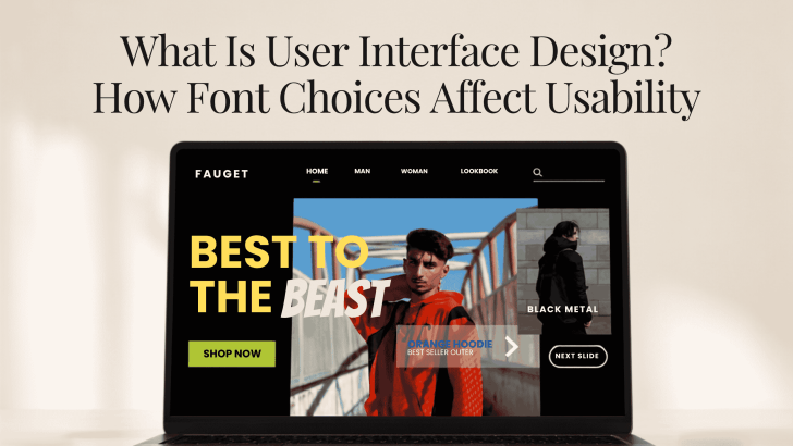
If you are asking what is user interface design, the simplest answer is that it is the process of shaping how people interact with digital products through screens, controls, content, and visual elements. Buttons, menus, icons, forms, colors, spacing, and typography all work together to help users understand what to do next. Font choices are especially important because users depend on text to navigate websites, read instructions, compare information, and complete actions.
A visually attractive interface can still feel frustrating when the typography is difficult to read. Small text, low contrast, inconsistent font sizes, or overly decorative typefaces can make simple tasks feel harder than they should be. Good UI design reduces that friction by making information clear, predictable, and easy to scan.
What Is User Interface Design in Practice?
User interface design focuses on the visual and interactive parts of a digital product. It can apply to websites, mobile apps, dashboards, e-commerce platforms, booking systems, learning platforms, and many other digital experiences.
A UI designer decides how information should appear on the screen and how different elements should relate to each other. For example, a primary button may need stronger contrast than a secondary action. A section title should stand out from body text. Navigation labels should remain clear at smaller sizes. Typography supports all of these decisions. It does more than make a page look polished. It gives structure to the interface and helps users understand which information matters most.
Why Fonts Matter in User Interface Design
Fonts influence how quickly users can read and process information. A suitable typeface can make an interface feel effortless, while a poor one can create hesitation.
Fonts Affect Readability
Readable text is essential in UI design because users often need to make decisions quickly. They may be scanning product descriptions, entering information into a form, checking prices, or reviewing instructions. A font with clear letterforms usually works better for body text and interface labels. Decorative fonts may still have a role, but they are better suited to short headlines or branded elements.
Font size also matters. Text that looks elegant on a large desktop screen may become too small on mobile. Responsive sizing helps maintain readability across different devices.
Typography Creates Visual Hierarchy
Visual hierarchy tells users what to notice first. Without it, every section can feel equally important. A simple hierarchy might include a large page title, medium section headings, regular body text, smaller supporting labels, and a clearly styled CTA. These differences guide the eye through the page naturally.
Use Size to Show Importance
Larger text usually signals higher importance. A hero headline should be more noticeable than a product description, while supporting details can remain smaller. However, the differences should feel intentional. If the headline is only slightly larger than the body text, users may not recognize the hierarchy immediately.
Use Weight With Purpose
Font weight can also create emphasis. Bold or semibold text works well for headings, navigation, and key information. Regular weight is usually better for longer paragraphs. Avoid making every element bold. Too much emphasis can make the interface feel visually noisy and reduce the impact of important elements.
If you are building a stronger hierarchy for digital layouts, read Font Pairing for Websites That Need a Clear Visual Hierarchy for more practical ways to separate headlines, supporting content, and body text.
Font Choices Can Improve Navigation
Navigation is one of the most practical areas where typography affects usability. Menu items, breadcrumbs, tabs, and buttons need to be easy to recognize. A highly decorative font can make navigation feel confusing, especially when labels are short and users need to scan them. Clean sans serif fonts are often effective because their shapes remain clear at small sizes.
Spacing is equally important. Navigation items should not feel crowded together, and letter spacing should not be so wide that words become difficult to identify. The goal is to help users understand where they are and where they can go next.
Typography Affects Buttons and Calls to Action

Buttons are small interface elements, but they often carry important actions. Labels such as “Shop Now,” “Book Appointment,” “Create Account,” or “Download” should be immediately clear. Use a readable typeface with enough contrast against the button background. Avoid thin font weights that disappear on smaller screens. CTA labels should also be direct. Clear wording makes the interaction more predictable and reduces uncertainty. Typography hierarchy can support this by making the primary action more visible than secondary options.
Fonts Influence Forms and Input Fields
Forms are common in checkout pages, registration screens, contact pages, and booking platforms. Good typography helps users complete them without confusion.
Keep Labels Clear
Field labels such as “Email Address,” “Phone Number,” or “Delivery Address” should remain visible and readable. Avoid replacing important labels with placeholder text only, especially when the placeholder disappears after typing.
Make Error Messages Easy to Notice
Error messages need enough contrast and clear wording. A user should immediately understand what went wrong and how to fix it. The font does not need to change, but weight, size, and placement can help distinguish the message from regular supporting text.
Responsive Typography Supports Mobile Usability
Many digital products are used primarily on smartphones. That means typography should work well in smaller spaces. Large desktop headlines may need to scale down. Body text should remain comfortable without requiring zooming. Buttons should have enough space around their labels, and navigation should not feel compressed.
Test the interface on different screen sizes instead of relying only on the desktop design. Small typography problems often become more obvious on mobile.
Font Pairing Should Support the Interface
Using more than one typeface can create personality, but it should never complicate the experience. A common approach is to use a distinctive font for major headings and a simpler sans serif for body text, buttons, and navigation. This creates contrast while keeping functional information easy to read.
Two font families are usually enough for most interfaces. Adding too many typefaces can make the layout feel inconsistent and harder to scan.
The same principle applies to landing pages, where typography often determines how quickly visitors understand the offer. For more guidance, explore What Makes a Good Landing Page? The Role of Fonts in Visual Hierarchy.
Accessibility Should Be Part of Font Selection
Good UI design should work for as many users as possible. Typography plays a major role in accessibility. Text needs sufficient contrast against the background. Font sizes should be comfortable, and letterforms should remain recognizable. Avoid relying on extremely thin weights or low-contrast color combinations simply because they look minimal.
Users should also be able to zoom or increase text size without breaking the layout. Responsive design should support these adjustments rather than treating them as exceptions.
Build Better Interfaces Through Better Typography
Understanding what is user interface design also means understanding how small visual decisions affect usability. Fonts influence readability, navigation, hierarchy, forms, buttons, and the overall confidence users feel while interacting with a digital product.
Choose typefaces that match the brand, but always test them in real interface situations. Check small labels, mobile screens, forms, and buttons instead of judging the font only from a large headline.
