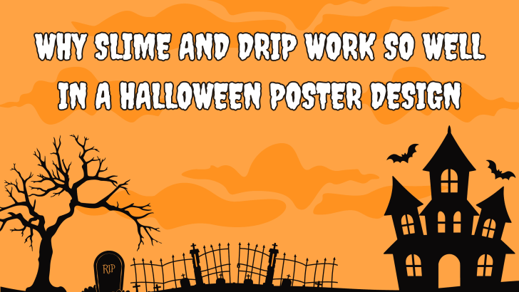
Why Slime and Drip Work So Well in a Halloween Poster Design

Using slime and drip in Halloween poster design is one of the easiest ways to make a layout feel instantly spooky, strange, and playful. These visual details suggest movement, mess, decay, and something slightly unnatural, which fits the mood of Halloween perfectly. They also work especially well in typography because they can transform simple letterforms …
Continue reading →

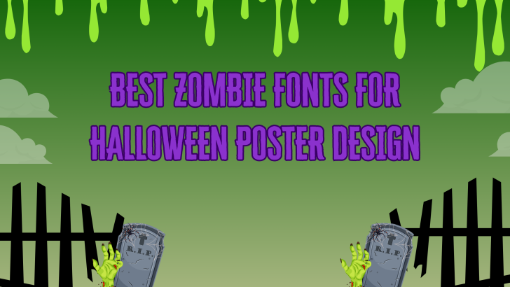
Best Zombie Fonts for Halloween Poster Design

The right zombie fonts for Halloween poster design can instantly add personality, energy, and seasonal impact. Zombie-inspired typefaces often combine bold shapes, dripping details, uneven edges, and exaggerated forms that feel playful rather than purely terrifying. This makes them especially useful for Halloween posters, party graphics, game promotions, and spooky social media content. Unlike traditional …

Continue reading →

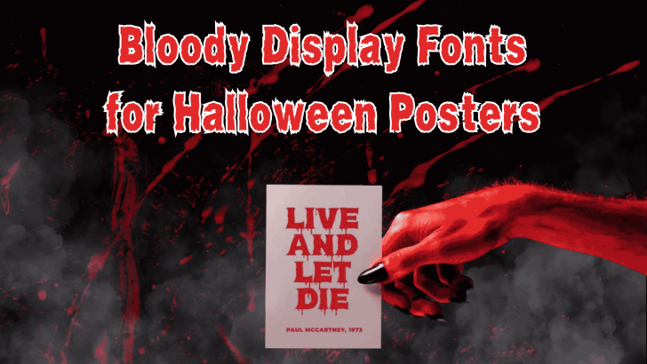
Bloody Display Fonts for Halloween Posters

Choosing the right bloody display fonts for Halloween posters can instantly make a design feel darker, more dramatic, and more immersive. Unlike ordinary display typefaces, bloody fonts often use dripping edges, distressed textures, irregular shapes, and exaggerated strokes to create a horror-inspired atmosphere. These visual details make them especially useful for Halloween promotions, haunted house …

Continue reading →

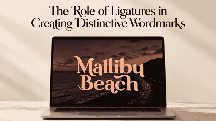
The Role of Ligatures in Creating Distinctive Wordmarks

Using ligatures in wordmark design can turn an ordinary sequence of letters into something more recognizable and distinctive. By connecting or reshaping specific character pairs, designers can create visual relationships that make a brand name feel custom rather than typeset straight from a font. When handled carefully, ligatures can add personality without making the wordmark …

Continue reading →

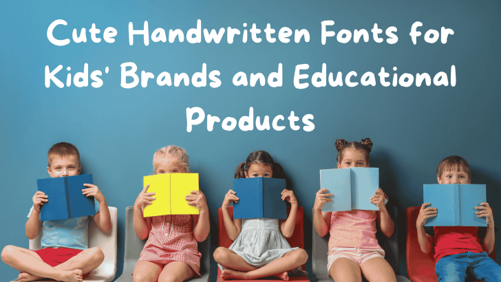
Cute Handwritten Fonts for Kids’ Brands and Educational Products

Choosing cute handwritten fonts for kids can instantly change the mood of a children’s brand or educational product. These fonts often feel more playful, personal, and approachable than rigid geometric typefaces. Used carefully, they can make worksheets, packaging, activity books, and learning materials feel warmer without sacrificing readability. The challenge is balancing personality and function. …

Continue reading →