The right zombie fonts for Halloween poster design can instantly add personality, energy, and seasonal impact. Zombie-inspired typefaces often combine bold shapes, dripping details, uneven edges, and exaggerated forms that feel playful rather than purely terrifying. This makes them especially useful for Halloween posters, party graphics, game promotions, and spooky social media content.
Unlike traditional horror fonts, zombie typography can sit somewhere between creepy and fun. That balance makes it work for a wider range of audiences, including teen events, family events, and entertainment brands. The key is finding a font that feels expressive without sacrificing readability.
What Makes a Zombie Font Feel Distinctive?
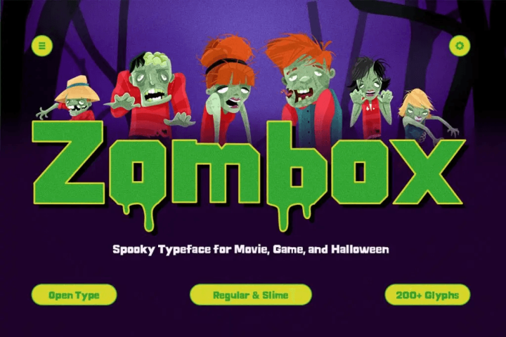
Zombie fonts usually rely on a few recognizable visual traits. Thick block lettering, slime-like drips, irregular shapes, and exaggerated proportions are common because they instantly suggest decay, monsters, or undead themes. These details help the typography communicate the concept before the audience even reads the full message.
A strong zombie font also has enough structure to remain legible. The letters can look distorted, but the basic forms still need to be clear. That combination of personality and readability is what makes these fonts effective for display use.
Bold Letterforms Work Best for Halloween Posters
Halloween posters often need a headline that can compete with illustrations, dark backgrounds, and decorative elements. Bold zombie fonts are useful because they create a large visual mass that remains easy to notice. Thick letters also make it easier to add outlines, shadows, textures, or contrasting colors.
The oversized green lettering works well because the structure stays simple even with dripping details. The font feels spooky, but it still has a playful personality. This makes it suitable for event posters, games, or seasonal campaigns that want horror without becoming too intense.
Dripping Details Add Character
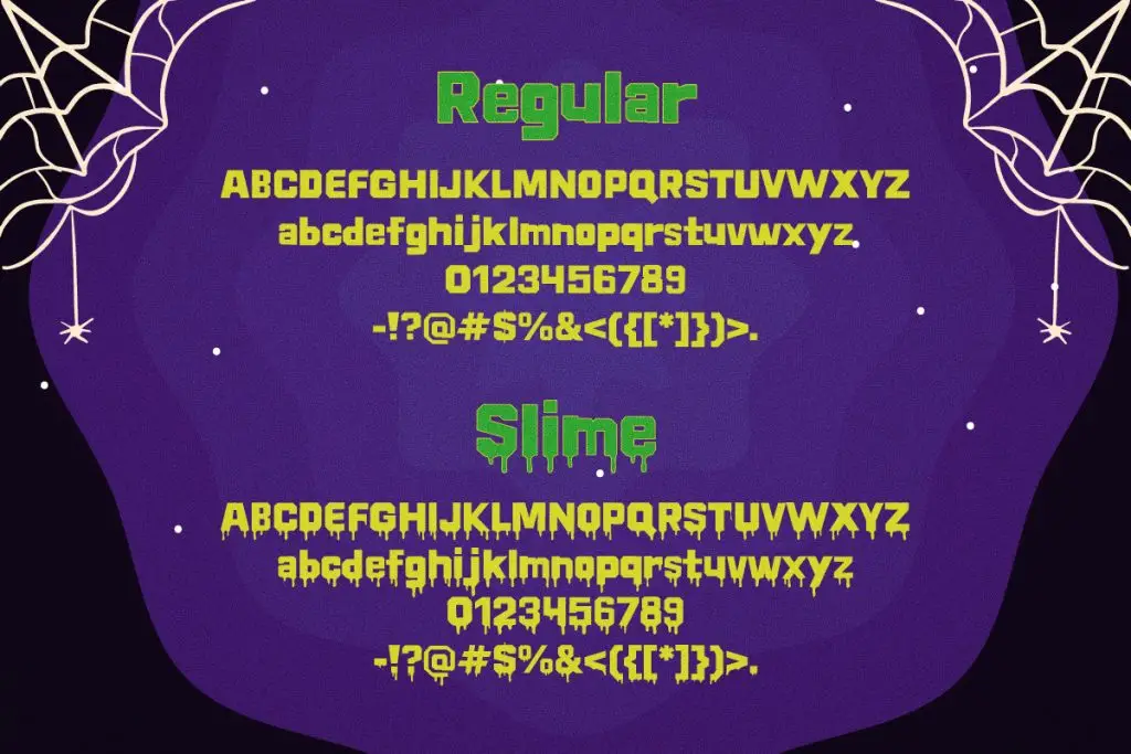
Drips are one of the easiest ways to make typography feel connected to zombies, slime, or monsters. They create a sense of movement and make the letters feel less static. However, these details work best when used selectively.
Too many drips can make the typeface feel messy and difficult to scan. A few well-placed extensions are enough to create the theme while keeping the word readable. Designers should always check how the font looks at smaller sizes before using it across multiple formats.
Color Plays a Big Role in Zombie Typography
Green is one of the most recognizable colors associated with zombie visuals. It suggests slime, decay, monsters, and supernatural themes without relying on realistic horror imagery. Purple, black, orange, and yellow can then support the palette and create stronger contrast.
Designers do not need to use every Halloween color at once. A controlled two- or three-color palette often feels more polished. The typeface should remain the strongest visual element rather than competing with too many effects.
Zombie Fonts for Halloween Poster Can Feel Fun, Not Just Scary
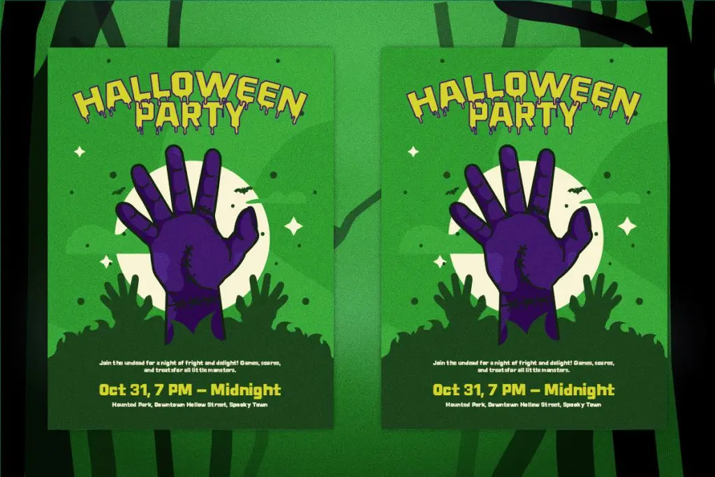
One of the strengths of zombie-inspired typography is its flexibility. It can work in horror graphics, but it can also feel playful when paired with bright green, yellow, orange, or purple. This makes it especially effective for Halloween party invitations or youth-oriented designs.
Pair Zombie Fonts with Simple Supporting Type
Because zombie fonts already contain a lot of visual character, supporting text should stay simple. Event details, dates, locations, and descriptions are usually easier to read in a clean sans serif. This creates contrast and prevents the layout from feeling overloaded.
The same principle works in digital design. Use the zombie font for the headline or short phrase, then rely on a cleaner font for body copy. This helps establish a clear hierarchy while keeping the theme strong.
Use the Display Font as the Main Attraction
Zombie fonts are most effective when they have one clear job. A title such as “Halloween Party,” “Zombie Night,” or “Creepy Cute” can carry the theme on its own. The rest of the design does not need to imitate the same style.
This restraint is important because too many novelty elements can weaken the design. One expressive font, a simple supporting typeface, and a controlled color palette are often enough to build a convincing Halloween composition.
Zombie Fonts Work Well for Social Media Design
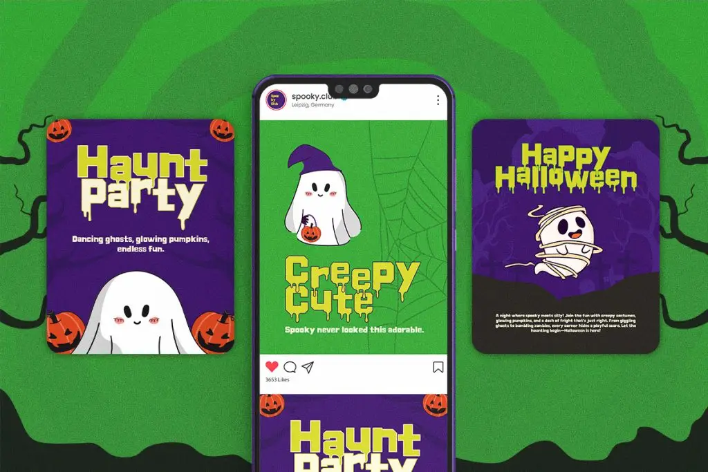
Halloween campaigns are rarely limited to posters. The same typography may need to appear in Instagram posts, stories, event announcements, and promotional graphics. Zombie fonts can help create a consistent seasonal identity across those formats.
Test the Font at Different Sizes
A zombie font may look impressive in a large poster headline but lose clarity when reduced. Dripping details and irregular edges can disappear, merge, or become distracting at smaller sizes. This is why scale testing is essential.
Try the same headline in a poster, square social post, and mobile story format. If the font stays recognizable across all three, it is more versatile. If not, reserve it for large display use and choose a simpler typeface elsewhere.
Avoid Making Every Element Spooky
A common mistake in Halloween design is making every part of the layout decorative. Zombie typography, spider webs, pumpkins, dripping effects, smoke, and distressed textures can quickly compete with one another. The result may feel chaotic rather than atmospheric.
The strongest designs usually have one dominant theme. Let the zombie font provide most of the personality, then use illustrations and color to support it. This creates a clearer and more professional composition.
Explore Other Horror Font Styles
Zombie fonts are only one part of Halloween typography. Designers can also explore gothic typefaces, creepy handwritten fonts, distressed lettering, or blood-inspired display fonts. Each direction creates a different type of mood.
If you want to explore a darker and more dramatic direction, read Bloody Display Fonts for Halloween Posters. That article focuses on dripping, blood-inspired, and slasher-style typography that works well for more intense horror visuals.
Final Thoughts
The best zombie fonts for Halloween poster design combine personality, readability, and a strong sense of theme. Bold shapes, dripping details, playful proportions, and bright color combinations can help a Halloween layout feel memorable without becoming too complicated. The style works especially well for posters, party graphics, game promotions, and social media campaigns.
The most effective approach is to let the zombie font lead the composition. Keep supporting typography simple, control the color palette, and test the font across different sizes. When those elements work together, zombie typography can create a Halloween design that feels spooky, fun, and visually distinctive.
