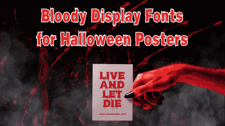
Choosing the right bloody display fonts for Halloween posters can instantly make a design feel darker, more dramatic, and more immersive. Unlike ordinary display typefaces, bloody fonts often use dripping edges, distressed textures, irregular shapes, and exaggerated strokes to create a horror-inspired atmosphere. These visual details make them especially useful for Halloween promotions, haunted house posters, party invitations, and spooky social media graphics.
However, a strong Halloween font should do more than simply look scary. It still needs to support the message, remain readable, and fit the overall design concept. When the typography and visual theme work together, even a simple poster can feel much more memorable.
Why Bloody Display Fonts Work So Well for Halloween
Halloween design relies heavily on atmosphere. Dark colors, eerie imagery, dramatic lighting, and theatrical typography all help create a sense of tension. Bloody display fonts support that mood because their visual language immediately suggests horror, danger, suspense, and classic slasher aesthetics.
This is especially effective in poster design, where the headline needs to grab attention quickly. A dripping or distressed typeface can communicate the theme before the viewer reads the rest of the copy. That makes the font part of the storytelling, not just a decorative element.

Look for Strong Dripping Details
One of the most recognizable features of bloody display fonts is the dripping effect. These details imitate liquid running from the edges of the letters, which makes the typography feel more dramatic and unsettling. When done well, the effect can instantly create a Halloween or horror-film mood.
The key is moderation. If every letter contains too many drips, the word can become visually noisy and difficult to read. Strong display fonts usually balance clean letterforms with carefully placed horror details.
Choose Bold Shapes for Better Impact
Halloween posters often need typography that remains visible from a distance. Thick, bold letterforms help the headline stand out against dark backgrounds, photographs, smoke effects, or textured graphics. This is why many horror display fonts use heavy strokes and large uppercase forms.
Bold shapes also make it easier to add textures, shadows, or color effects without weakening readability. A strong silhouette gives designers more freedom to experiment with visual treatment while keeping the headline recognizable.
Distressed Texture Adds a Vintage Horror Feel
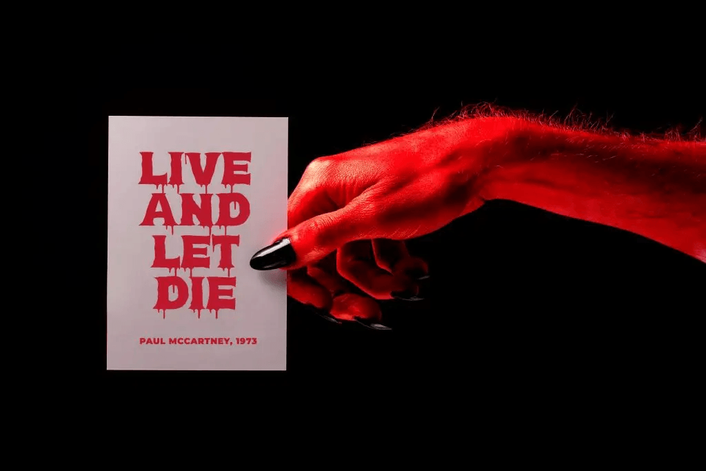
Not every bloody font needs literal dripping effects. Distressed edges, scratches, rough surfaces, and uneven forms can also create an eerie atmosphere. These details often reference old horror posters, VHS covers, grindhouse graphics, or retro slasher films.
This approach can feel more versatile than extreme gore-style lettering. It works well for Halloween posters that want a darker mood without becoming too graphic. Designers can combine distressed typography with muted red, black, cream, or off-white tones for a more cinematic look.
Use Texture Without Losing Readability
Texture should support the letterform, not destroy it. If the distressed effect removes too much of the character shape, the headline may become difficult to understand. This becomes especially important when the text is displayed at smaller sizes.
A good test is to reduce the design on screen. If the headline still reads clearly, the texture is probably balanced. If not, the font may work better only for short words or larger display settings.
Match the Font with the Right Visual Style
Bloody display fonts are most effective when the rest of the design supports the same visual direction. Dark photography, red lighting, smoke, candles, shadows, and horror props can reinforce the atmosphere. The font should feel like part of the scene rather than something placed on top of it.
Use Bloody Fonts Mainly for Headlines
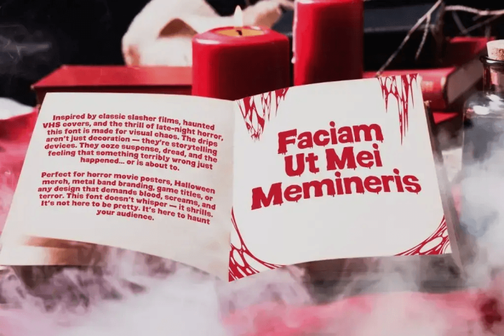
Bloody display fonts are designed to attract attention, not to handle long paragraphs. Their irregular shapes and decorative details can become tiring when used for body text. For that reason, they work best in headlines, event names, short quotes, or promotional phrases.
Create Contrast with Clean Supporting Type
A strong Halloween layout often combines one expressive font with one neutral typeface. The bloody display font creates the mood, while the clean font handles practical information. This keeps the composition dramatic without becoming chaotic.
Try using the horror font only for the main title and possibly one short subheading. Then use a clean, bold sans serif for everything else. This creates a clear hierarchy and makes the design easier to navigate.
Think Beyond Posters
Although bloody fonts are ideal for Halloween posters, they can also work across other seasonal materials. Designers can use them for party invitations, event flyers, social media promotions, merchandise, album covers, or horror-themed packaging. The same visual language can create consistency across a campaign.
They are also useful for fictional movie graphics or themed editorial projects. However, the application should always match the intensity of the font. A highly graphic dripping style may feel appropriate for a haunted attraction but excessive for a family-friendly Halloween event.
Use Color to Strengthen the Horror Mood
Red is the obvious choice for bloody typography, but it is not the only option. Deep burgundy, dark crimson, black, and faded red can create different levels of intensity. White or cream backgrounds can also make the lettering feel more vintage and theatrical.
For darker posters, bright red text creates strong contrast. On lighter layouts, darker red can feel more sophisticated while still keeping the horror association. The important thing is to maintain enough contrast for readability.
Avoid Overusing Horror Effects
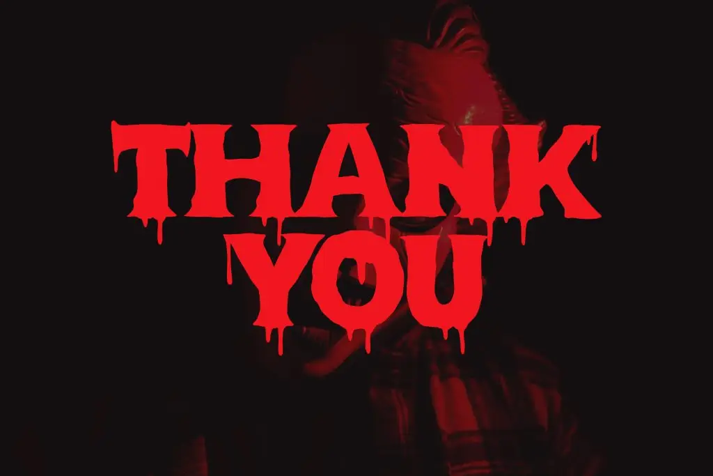
It is tempting to combine dripping fonts, blood splatters, smoke, scratches, shadows, and multiple textures at once. The problem is that too many effects can compete with each other and weaken the main message. Horror design still needs hierarchy.
Choose one or two strong effects and let the typography lead. A dramatic font often needs less decoration than expected. Restraint can make the final poster feel more intentional and professional.
Explore More Spooky Font Styles
Bloody display fonts are only one direction within Halloween typography. Designers can also explore gothic fonts, creepy handwritten styles, distressed serif fonts, and retro horror lettering. Each creates a different type of atmosphere.
If you want to compare more options, read Best Spooky Fonts for Halloween Design. That article can help you explore a broader range of spooky type styles and choose the right mood for your next Halloween project.
Final Thoughts
Using bloody display fonts for Halloween posters is an effective way to build atmosphere through typography. Dripping details, rough textures, bold shapes, and dramatic proportions can instantly make a design feel connected to horror and Halloween culture. The strongest results come from pairing expressive typography with clear hierarchy and supporting visuals.
The goal is not to make every element look frightening. Instead, let the display font carry most of the personality while the rest of the layout stays controlled. When the balance is right, a bloody font can turn a simple Halloween poster into a much stronger visual experience.

One Comment