What Makes a Font Feel Expensive in the Jewelry Industry?

Understanding what makes a font feel expensive in the jewelry industry is important for designers, jewelry business owners, and creative brands that want to build a premium visual identity. Jewelry is closely connected to beauty, emotion, craftsmanship, and status. Because of that, the font used by a jewelry brand can strongly influence how customers perceive …
Continue reading →

Tips for Creating a Luxury Jewelry Brand with Elegant Typography

Understanding the right approach to creating a luxury jewelry brand with elegant typography can help designers and business owners solve one of the biggest challenges in premium branding: making a brand look expensive, trustworthy, and emotionally desirable before customers even see the product in person. Jewelry is not only about material value. It is also …

Continue reading →

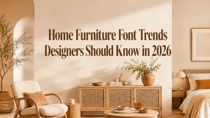
Home Furniture Font Trends Designers Should Know in 2026

Understanding home furniture font trends is important for designers, furniture brands, and creative businesses that want to build a stronger visual identity in 2026. Many furniture brands invest in product photography, interior styling, catalogs, and social media content, but their branding still feels generic because the typography does not match the quality of the products. …

Continue reading →

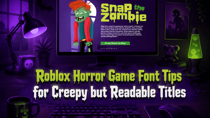
Roblox Horror Game Font Tips for Creepy but Readable Titles

Understanding Roblox horror game font tips can help designers, game creators, and thumbnail artists solve one common problem: making a title look scary without making it difficult to read. Many Roblox horror game visuals use dark colors, distorted letters, blood effects, and spooky illustrations, but the title often becomes unclear. When players cannot read the …

Continue reading →

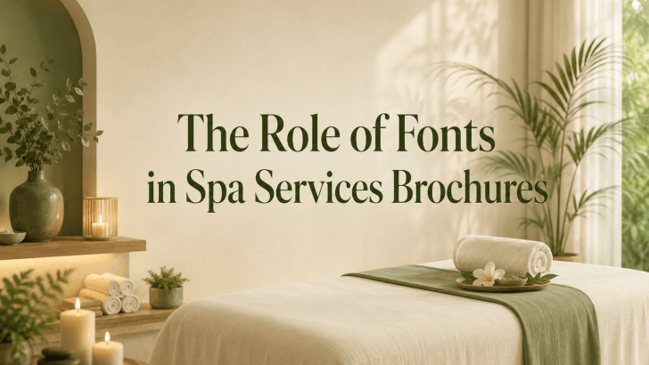
The Role of Fonts in Spa Services Brochures

Understanding the role of fonts in spa services brochures is essential for creating wellness marketing materials that feel clear, calming, and professional. Many spa brochures use beautiful photography, soft colors, and relaxing visual elements, but still fail to communicate effectively because the typography does not support the message. A spa brochure is more than just …

Continue reading →