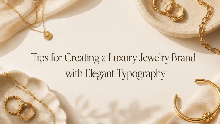
Understanding the right approach to creating a luxury jewelry brand with elegant typography can help designers and business owners solve one of the biggest challenges in premium branding: making a brand look expensive, trustworthy, and emotionally desirable before customers even see the product in person. Jewelry is not only about material value. It is also about beauty, symbolism, craftsmanship, and personal meaning.
Many jewelry brands invest in product photography, packaging, and social media visuals, but their typography still feels generic. As a result, the brand may look less premium than the jewelry itself. This is where elegant typography becomes important. The right font can make a jewelry brand feel refined, exclusive, romantic, modern, or timeless.
A luxury jewelry brand needs a visual identity that communicates quality from every touchpoint, including the logo, website, product cards, packaging, ads, and social media posts. Typography helps connect all of these elements into one polished brand experience.
Define Your Jewelry Brand Personality First
Before choosing fonts, define what type of luxury your jewelry brand represents. Not all luxury brands look the same.
Classic Luxury
Classic jewelry brands often use refined serif fonts, balanced spacing, and elegant layouts. This style communicates heritage, timeless beauty, and established quality.
It works well for:
- Fine jewelry
- Diamond collections
- Bridal jewelry
- Heritage-inspired brands
Modern Luxury
Modern jewelry brands usually prefer clean typography, minimal layouts, and strong white space. This approach feels sleek, contemporary, and confident.
It works well for:
- Minimalist jewelry
- Everyday luxury pieces
- Modern gold collections
- Designer jewelry brands
Romantic Luxury
Romantic jewelry brands may use elegant script fonts, soft serif fonts, or graceful ligature typography. This style feels emotional, feminine, and personal.
It works well for:
- Wedding jewelry
- Gift collections
- Personalized jewelry
- Handmade premium pieces
Artistic Luxury
Some jewelry brands focus on unique shapes, limited editions, or creative craftsmanship. These brands can use more distinctive display fonts while still maintaining readability and elegance.
Choose Elegant Fonts That Match the Brand
Choosing the right font is one of the most important steps in creating a luxury jewelry brand.
Serif Fonts for Timeless Elegance
Serif fonts are commonly used in luxury branding because they feel classic, refined, and trustworthy. Their small decorative strokes create a sense of craftsmanship and sophistication.
Use serif fonts for:
- Logos
- Collection names
- Website headlines
- Product lookbooks
- Packaging cards
A refined serif font can make a jewelry brand feel established and premium.
Sans-Serif Fonts for Modern Minimalism
Sans-serif fonts are ideal for jewelry brands that want a clean and contemporary appearance. They work especially well for minimalist brands that rely on strong photography, white space, and simple layouts.
Use sans-serif fonts for:
- Website navigation
- Product descriptions
- Social media captions
- Price details
- Care instructions
Sans-serif typography helps keep information clear without distracting from the jewelry.
Script Fonts for Romance and Personal Touch
Script fonts can add elegance, softness, and emotion. However, they should be used carefully. Overly decorative script fonts can become difficult to read, especially at small sizes.
Use script fonts for:
- Short taglines
- Signature-style logos
- Gift packaging
- Wedding collections
- Special campaign accents
The key is restraint. Script typography should feel delicate, not overwhelming.
Ligature Fonts for Custom-Looking Luxury
Ligature fonts are powerful for jewelry branding because they create a custom and refined appearance. Connected letterforms can make a logo or headline feel more unique and premium.
Ligature typography works well for:
- Luxury logos
- Editorial headlines
- Collection branding
- Social media campaign titles
- Lookbook covers
A well-chosen ligature font can help a jewelry brand stand out without needing a fully custom typeface.
Create a Strong Typography Hierarchy
Elegant branding is not only about choosing beautiful fonts. It is also about organizing typography clearly.
Logo Typography
The logo should be the most recognizable typography element. It needs to look polished, readable, and scalable across packaging, website headers, jewelry boxes, and social media profiles.
Headline Typography
Headlines should communicate the mood of the brand. They can be more expressive than body text, especially for collection launches or campaign pages.
Examples:
- The Bridal Collection
- Timeless Gold Essentials
- Crafted for Every Moment
- Jewelry That Tells Your Story
Body Text Typography
Body text should be simple and readable. Product descriptions, material details, shipping information, and care instructions need clarity. A luxury brand can feel elegant while still being practical.
Use Spacing to Create a Luxury Feel
Spacing is one of the most important elements in elegant typography. Luxury design often feels expensive because it gives elements room to breathe.
Letter Spacing
Slightly increased letter spacing can make uppercase text feel more refined. This works well for labels, navigation, collection names, and short headings.
Line Spacing
Comfortable line spacing improves readability and makes text feel more graceful. Avoid tight paragraphs because they can make the design feel crowded.
White Space
White space allows typography and product photography to stand out. It creates a calm, confident, and premium mood. In jewelry branding, less often feels more luxurious.
Match Typography with Product Photography
Jewelry photography is usually detailed and delicate. Typography should support the product, not compete with it.
Let the Jewelry Stay the Focus
Use typography to guide attention, but avoid covering important product details. A clean layout helps customers appreciate texture, shine, stones, and craftsmanship.
Use Contrast Carefully
Elegant typography needs enough contrast to remain readable. For luxury jewelry brands, common combinations include:
- Black text on ivory background
- Gold text on deep navy background
- White text on dark editorial photography
- Soft beige typography on warm neutral layouts
The contrast should feel refined, not harsh.
Maintain Consistency Across Brand Touchpoints
Website
Use consistent fonts for navigation, headlines, product names, descriptions, and calls to action.
Packaging
Typography on jewelry boxes, thank-you cards, product tags, and care cards should match the overall brand identity.
Social Media
Instagram posts, Pinterest graphics, and promotional ads should use the same typography system. This builds recognition over time.
Printed Materials
Lookbooks, brochures, certificates, and event invitations should reflect the same typographic mood.
Read Related Articles
For more inspiration, read “Elegant Fonts for Luxury Jewelry Branding” to explore font styles that can help jewelry brands look refined, premium, and memorable. This article is a great next step if you want to build a visual identity that feels elegant, trustworthy, and aligned with luxury customers.

Conclusion
Creating a luxury jewelry brand with elegant typography requires more than choosing a beautiful font. It involves understanding brand personality, selecting the right typeface style, building hierarchy, using spacing carefully, and maintaining consistency across every customer touchpoint.
Typography shapes how customers perceive quality, trust, craftsmanship, and emotional value. A refined serif font can communicate timeless elegance, a clean sans-serif font can create modern luxury, and a graceful ligature or script font can add a personal and romantic touch.
In jewelry branding, every detail matters. The right typography can make a brand feel more premium, more memorable, and more trustworthy. When used strategically, elegant typography becomes part of the luxury experience itself.
