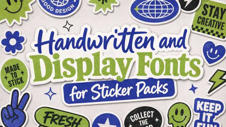
Choosing the right handwritten and display fonts for sticker packs can solve one of the biggest challenges in sticker design: making small visuals feel expressive, readable, and memorable. Many sticker packs look cute or colorful, but they fail to stand out because the typography feels generic, too thin, or difficult to read at small sizes.
Sticker design depends heavily on instant communication. Whether the sticker is used for digital messaging, planner decoration, packaging, journaling, branding, or merchandise, the text must deliver personality quickly. A short phrase like “Yay!”, “Mood,” “Best Day,” or “Spooky Night” can become much more engaging when paired with the right font.
This is why handwritten and display fonts are so useful for sticker packs. Handwritten fonts bring personality and a human touch, while display fonts create a strong visual impact. Together, they help designers create stickers that feel fun, emotional, bold, and marketable.
In this article, we will explore recommended fonts for sticker packs, the best use cases, practical implementation tips, and related articles that can help you build stronger typography-based sticker designs.
Why Fonts Matter in Sticker Pack Design
Sticker packs usually contain small design elements. Because of the limited space, every visual decision matters. The font must be readable, expressive, and aligned with the theme.
Fonts Create Personality
A sticker is often used to express emotion. Typography helps communicate that emotion even before the viewer reads the full phrase. For example, rounded handwritten fonts can feel cute and friendly. Bold display fonts can feel energetic and playful. Dripping or spooky fonts can instantly communicate horror, Halloween, or dark humor. This makes font choice essential for sticker packs that need a strong identity.
Fonts Improve Visual Appeal
Even simple sticker phrases can look more attractive with the right typography. A basic word like “Hello” can feel cheerful, elegant, spooky, or playful depending on the font. Good typography helps stickers become more visually appealing and more likely to be used, saved, or purchased.
Fonts Support Theme Consistency
A sticker pack usually works best when all elements feel connected. Consistent typography helps unify the set, even when the illustrations, colors, or phrases vary.
A strong font system can make the entire pack feel more professional.
Recommended Fonts for Sticker Packs
1. Chubzy
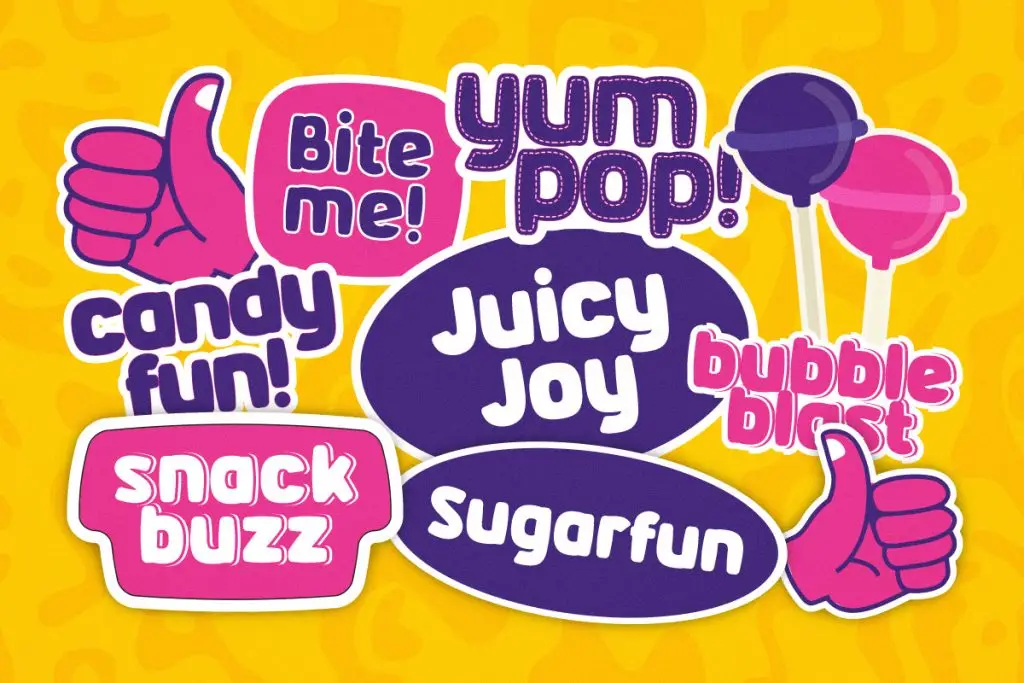
Best for:
- Candy stickers
- Kids stickers
- Bright and colorful sticker sets
2. Floomie
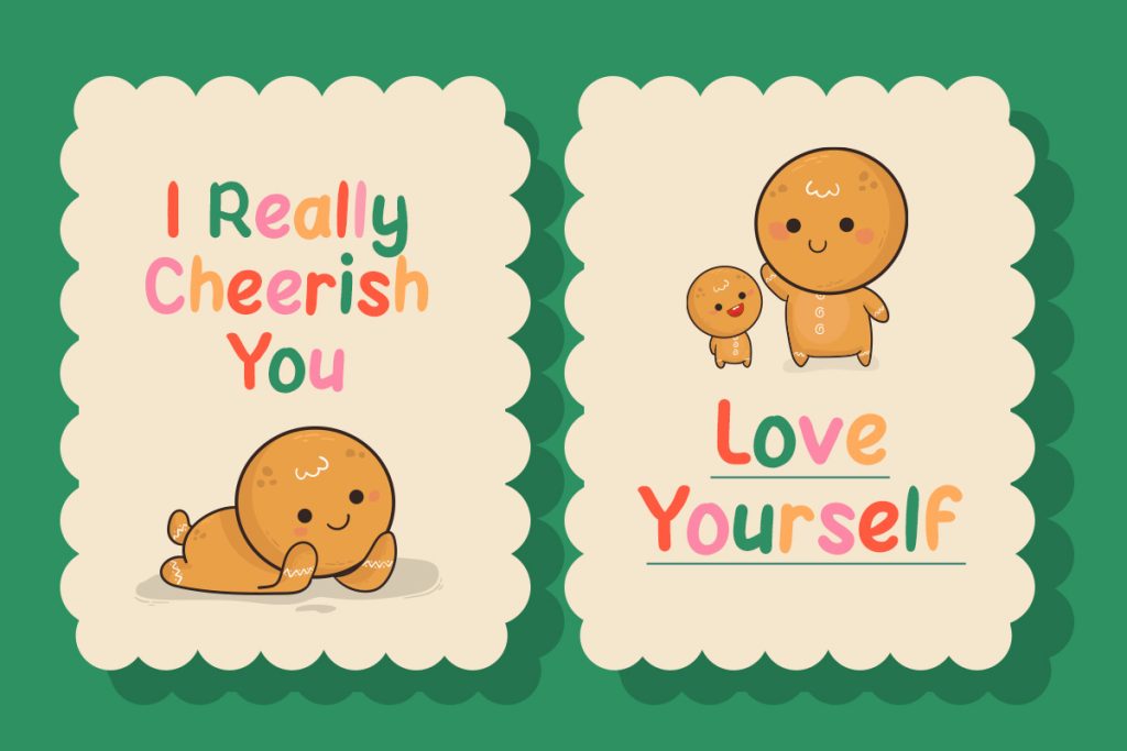
Best for:
- Cute sticker packs
- Kids-themed stickers
- Positive quote stickers
3. Blood Melt
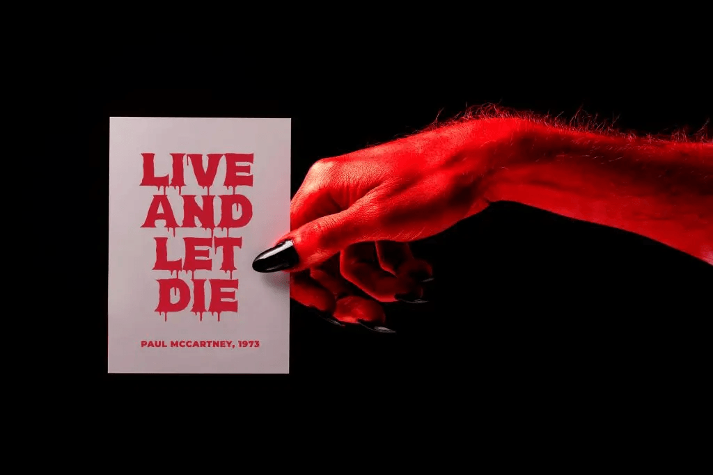
Best for:
- Halloween stickers
- Horror-themed packs
- Seasonal event designs
4. Glibby
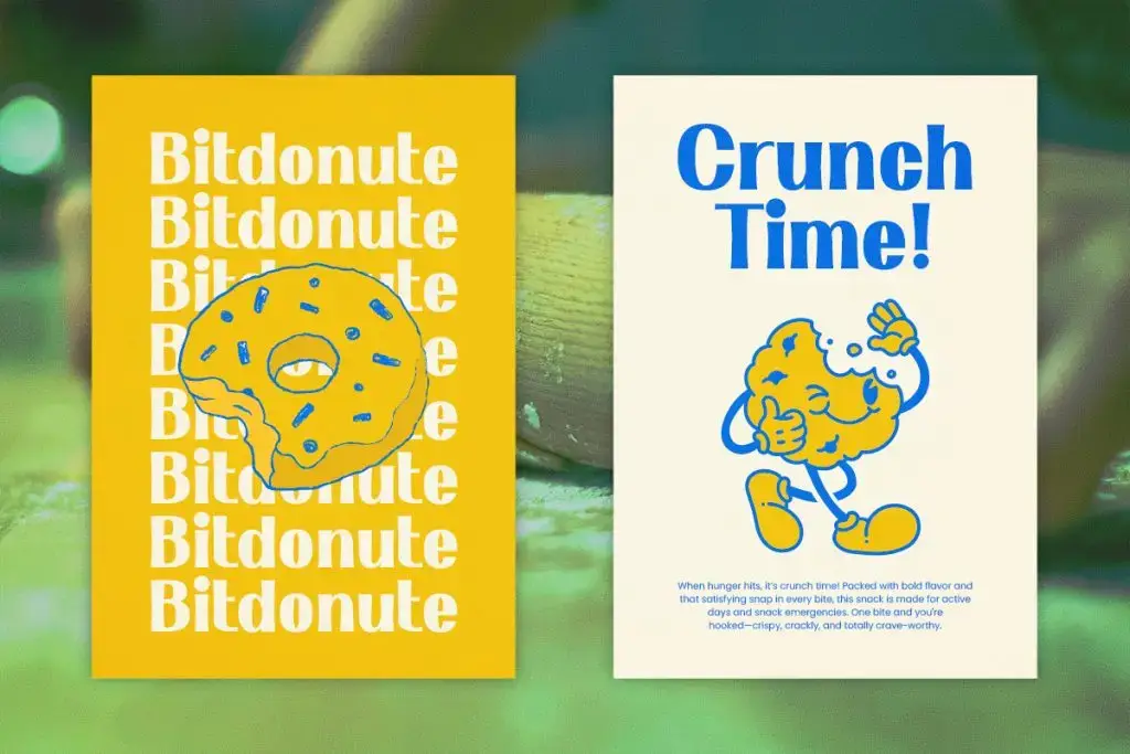
Best for:
- Dessert stickers
- Cute merchandise
- Casual quote stickers
5. Kinzle
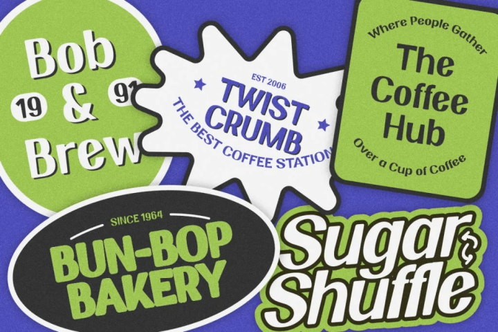
Best for:
- Cafe sticker packs
- Packaging stickers
- Small brand merchandise
Best Use Case
Handwritten and display fonts can be used across many types of sticker projects. The key is matching the font style to the sticker’s purpose.
Digital Sticker Packs
Digital stickers for messaging apps, social media, and online communities need fonts that remain readable on screens. Since users may view them at small sizes, bold handwritten or display fonts often work better than thin decorative fonts.
Planner and Journal Stickers
Planner stickers often include labels, reminders, mood phrases, and decorative words. Fonts should feel personal and friendly.
Packaging Stickers
Small businesses often use stickers for packaging, thank-you notes, product labels, and promotional inserts. Typography should feel branded and memorable.
Seasonal Sticker Packs
Seasonal themes need a strong visual identity. For Halloween or spooky campaigns, Blood Melt instantly communicates the theme. For summer, birthday, or celebration stickers, Glibby and Chubzy can create a fun and energetic mood.
Merchandise Stickers
Sticker packs are often sold as physical merchandise. For this use case, typography must be attractive enough to stand on its own and durable enough to remain readable after printing.
Display fonts are especially useful for short statement stickers, while handwritten fonts work well for emotional or casual phrases.
Tips for Implementation
1. Keep the Text Short
Sticker designs work best with short phrases. Long sentences can become difficult to read and may make the sticker feel crowded.
Use short phrases such as:
- Love This
- Happy Day
- Stay Spooky
- Snack Time
- Good Vibes
- Coffee First
Short copy allows the font personality to stand out.
2. Prioritize Readability at Small Sizes
Always test your sticker design at the actual size. A font may look beautiful in a large preview but become unclear when reduced.
For small stickers, choose fonts with:
- Strong shapes
- Clear spacing
- Bold strokes
- Simple letterforms
Avoid overly thin or highly detailed fonts for tiny sticker text.
3. Match Font Style with Sticker Theme
The font should support the sticker’s visual message. A horror font will not fit a cozy cafe sticker, and a cute, rounded font may not work for a dark thriller pack. Use font personality strategically.
4. Create Contrast with Color
Typography needs enough contrast against the sticker background. If the text blends into the illustration, the design loses impact.
Try combinations such as:
- Dark text on pastel backgrounds
- White text with bold outlines
- Bright text on dark backgrounds
- Shadow effects for separation
Contrast helps stickers remain visible across digital and printed formats.
5. Use Outlines and Shadows Carefully
Sticker typography often benefits from outlines because they improve readability and create a cut-out effect. However, avoid using too many effects at once. A clean outline or subtle shadow is usually enough.
6. Build a Consistent Font System
A sticker pack should feel like one collection. You can use one main font across the whole pack or combine two fonts carefully.
A simple system could be:
- One display font for bold expressions
- One handwritten font for softer phrases
This creates variety while maintaining consistency.
7. Consider Printing Requirements
If the sticker pack will be printed, make sure the font works well with cutting, scaling, and color reproduction. Check that thin details do not disappear and that decorative edges remain clean after printing.
Read Related Articles
If you want to understand when handwritten typography is most effective, read “Handwritten Fonts: When and How to Use Them in Graphic Design.”
You can also explore “Display Fonts for Snack Advertisements and Packaging” for a reference on food advertising and packaging.
Conclusion
Using handwritten and display fonts for sticker packs is one of the best ways to create designs that feel expressive, readable, and memorable. Stickers may be small, but their typography plays a big role in communicating emotion and personality.
By choosing fonts that match the sticker theme, keeping text short, testing readability, and creating a consistent font system, designers can build sticker packs that look professional and marketable. In sticker design, the right font does more than decorate the artwork. It helps the message feel alive.

One Comment