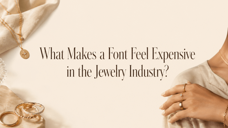
Understanding what makes a font feel expensive in the jewelry industry is important for designers, jewelry business owners, and creative brands that want to build a premium visual identity. Jewelry is closely connected to beauty, emotion, craftsmanship, and status. Because of that, the font used by a jewelry brand can strongly influence how customers perceive its value.
A jewelry brand may sell high-quality pieces, but if the typography looks generic, crowded, or poorly matched, the brand can feel less luxurious than the products themselves. On the other hand, a carefully chosen font can make a brand look refined, trustworthy, and desirable before customers even see the jewelry in person.
Typography is not only about decoration. In the jewelry industry, it helps communicate elegance, exclusivity, heritage, romance, and confidence. From logos and packaging to websites, product cards, social media posts, and lookbooks, the right font can make every brand touchpoint feel more polished.
Why Fonts Influence Luxury Perception
Luxury branding depends heavily on detail. Customers who buy jewelry often pay attention to subtle design choices. They notice the box, the logo, the photography, the website layout, and even the way product names are presented.
Fonts Create a First Impression
Before customers read a product description, they feel the visual mood of the brand. A font can make a jewelry brand feel classic, modern, romantic, artistic, or exclusive.
For example, an elegant serif font may suggest heritage and timeless beauty. A clean sans-serif font may communicate modern luxury. A graceful script font may create a romantic and personal impression. This first impression matters because jewelry is often purchased for meaningful moments. Customers want to feel that the brand understands quality and emotion.
Fonts Communicate Value Without Words
An expensive-looking font does not need to shout. In luxury branding, quiet confidence often feels more premium than loud decoration.
A refined font can communicate value through proportion, spacing, balance, and simplicity. These details help the brand feel intentional and carefully crafted, which aligns well with the jewelry industry.
What Makes a Font Feel Expensive?
Not every beautiful font feels expensive. A luxury font usually has specific visual qualities that support a premium impression.
1. Elegant Proportions
Expensive-looking fonts often have balanced proportions. The letters feel graceful, stable, and thoughtfully designed.
Why Proportion Matters
Jewelry itself is about proportion. The curve of a ring, the shape of a pendant, and the balance of a gemstone all affect how luxurious the piece feels. Typography works similarly. When letterforms are well-proportioned, the brand feels more polished. A font that looks awkward, uneven, or too casual may reduce the sense of quality.
2. Refined Letter Details
Small details can make a font feel more luxurious. Thin strokes, delicate serifs, soft curves, subtle contrast, and elegant ligatures can all create a premium mood.
Details Should Feel Controlled
Luxury typography should feel detailed but not excessive. If a font has too many decorative elements, it may look busy or outdated. The best expensive-looking fonts often use details with restraint. They are memorable without becoming difficult to read.
3. Strong Readability
A font cannot feel truly premium if it is hard to read. Luxury design may be artistic, but it still needs clarity.
Readability Builds Trust
Jewelry customers often need to read product names, material details, gemstone information, sizes, prices, care instructions, and certificates. If the typography is unclear, the brand may feel less professional. Readable typography helps customers feel more confident, especially when buying high-value products.
4. Generous Spacing
Spacing is one of the strongest signals of luxury. Expensive brands often use more white space, wider margins, and careful letter spacing.
White Space Creates Confidence
Crowded layouts can feel cheap because they look rushed or overloaded. Spacious layouts feel more intentional. In jewelry branding, white space allows the product and typography to breathe. It gives the design a calm, exclusive feeling.
Letter Spacing Adds Elegance
Slightly increased letter spacing can make uppercase typography feel refined. This works especially well for collection names, packaging labels, navigation menus, and logo lockups. However, spacing should be balanced. Too much letter spacing can make words harder to read.
5. Serif Fonts and Timeless Luxury
Serif fonts are often associated with luxury because they carry a sense of tradition, sophistication, and craftsmanship.
When to Use Serif Fonts
Serif fonts are ideal for:
- Fine jewelry logos
- Bridal collections
- Premium packaging
- Editorial lookbooks
- Heritage-inspired brands
- Luxury website headlines
A refined serif font can make a jewelry brand feel established and elegant.
Why Serif Fonts Work Well
Serif fonts often feel more formal and classic. Their small strokes create a sense of detail, which fits naturally with jewelry craftsmanship.
For brands that want to communicate timeless beauty, serif typography is a strong choice.
6. Sans-Serif Fonts and Modern Luxury
Not all luxury jewelry brands need serif fonts. Many modern jewelry brands use clean sans-serif typography to create a sleek and minimal identity.
When to Use Sans-Serif Fonts
Sans-serif fonts work well for:
- Minimalist jewelry brands
- Contemporary gold collections
- Everyday luxury pieces
- Online jewelry stores
- Clean packaging systems
- Modern campaign visuals
Why Sans-Serif Fonts Feel Premium
Sans-serif fonts can feel expensive when they are clean, balanced, and paired with strong spacing. They allow product photography and jewelry details to become the main focus.
This style is especially effective for brands that want to feel fresh, modern, and confident.
7. Script and Ligature Fonts for Emotional Luxury
Script and ligature fonts can add personality to jewelry branding. They are useful when a brand wants to feel romantic, artistic, or custom-made.
Script Fonts Add Romance
Script fonts can feel elegant and personal, especially for wedding jewelry, gift collections, and boutique branding. However, they should be used carefully.
Use script fonts for:
- Short taglines
- Signature-style logos
- Gift cards
- Romantic collection names
- Special campaign accents
Avoid using script fonts for long descriptions because they can reduce readability.
Ligature Fonts Add Custom Appeal
Ligature fonts can make a brand look more exclusive because the connected letterforms feel custom and refined. This is useful for luxury logos, collection titles, and editorial headlines.
A good ligature font creates distinction without needing a fully custom typeface.
How Typography Supports Jewelry Brand Trust
Customers Need Confidence
Jewelry purchases can be emotional and expensive. Customers want to feel confident that the brand is reliable, professional, and detail-oriented. Typography helps create this confidence. Clean product information, elegant headings, and consistent brand fonts all support a smoother buying experience.
Consistency Makes the Brand Feel Established
A jewelry brand should use typography consistently across every platform. This includes:
- Logo
- Website
- Packaging
- Product cards
- Certificates
- Social media posts
- Email newsletters
- Printed lookbooks
When typography is consistent, the brand feels more mature and recognizable.
Read Related Articles
Explore “Elegant Fonts for Luxury Jewelry Branding” to discover font styles that can make jewelry visuals look more refined, premium, and memorable. This article is a helpful guide if you want to choose typography that supports elegance and customer trust.
You can also read “Tips for Creating a Luxury Jewelry Brand with Elegant Typography” to learn how spacing, hierarchy, and font consistency shape a stronger luxury identity. It is a great next step for building a jewelry brand that feels polished, desirable, and high-end.
Conclusion
Knowing what makes a font feel expensive in the jewelry industry can help designers create stronger and more strategic visual identities. A luxury font is not only beautiful. It is balanced, readable, well-spaced, and aligned with the brand personality.
Serif fonts can communicate timeless elegance. Sans-serif fonts can create modern luxury. Script and ligature fonts can add romance, emotion, and custom appeal. However, the real luxury effect comes from how the font is used across the entire brand system.
In jewelry branding, every detail matters. When typography feels refined and consistent, it helps customers trust the brand, understand the value, and connect emotionally with the product. The right font does not simply make a jewelry brand look expensive. It helps the brand feel worthy of attention, desire, and investment.
