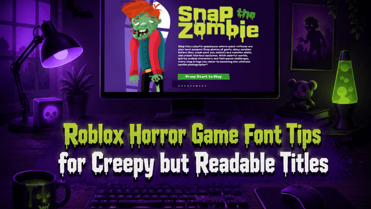
Understanding Roblox horror game font tips can help designers, game creators, and thumbnail artists solve one common problem: making a title look scary without making it difficult to read. Many Roblox horror game visuals use dark colors, distorted letters, blood effects, and spooky illustrations, but the title often becomes unclear. When players cannot read the title quickly, the design loses impact.
In horror game design, typography must do two things at once. It needs to create tension, fear, mystery, and curiosity. At the same time, it must stay readable across thumbnails, game icons, banners, social media posts, and promotional graphics. This balance is especially important for Roblox, where players often scroll quickly through many game options before deciding what to click.
A creepy title can attract attention, but a readable title helps players remember the game. The right font choice can make a horror game feel more immersive, professional, and memorable before the player even enters the experience.
Why Typography Matters in Roblox Horror Games
Roblox horror games rely heavily on first impressions. Before players read the description or watch gameplay, they usually see the title, thumbnail, and icon first. Typography helps communicate the mood instantly.
Fonts Create a Horror Atmosphere
A horror font can visually suggest danger, suspense, darkness, or mystery. Sharp edges may feel threatening. Irregular strokes may feel unstable. Dripping letters can suggest blood, slime, or supernatural horror. Rough textures can create an abandoned or haunted mood. These visual cues help players quickly grasp the genre.
Fonts Influence Click Interest
A strong title can make a game look more exciting and polished. If the font fits the horror concept, players may feel more curious to explore the game. However, if the font is too messy or unreadable, players may skip it because they cannot understand the title at first glance.
Fonts Build Game Identity
Successful Roblox horror games often have memorable visual branding. Typography becomes part of that identity. When the same font style appears in thumbnails, menus, update posts, and promotional materials, the game becomes easier to recognize.
Roblox Horror Game Font Tips for Better Titles
1. Keep the Title Short
Short titles are easier to remember and easier to design.
Examples of short horror-style titles include:
- Dark Doors
- Lost Hallway
- Haunted Shift
- Midnight Run
- The Basement
A short title gives the font more space to stand out. It also improves readability in Roblox thumbnails and icons.
2. Use Strong Contrast
Contrast is essential for horror typography. Many horror designs use dark backgrounds, so the title needs to stand out clearly.
Try combinations such as:
- White text on black background
- Light gray text with black outline
- Red text on dark gray background
- Pale yellow text on a deep blue background
Avoid using dark red text on a dark background without enough contrast. It may look spooky, but it can become hard to read.
3. Add Effects Carefully
Effects can improve atmosphere, but too many effects can ruin readability.
Use effects such as:
- Thin outline
- Subtle glitch
- Drop shadow
- Texture overlay
- Slight blur behind text
Avoid stacking too many effects at once. A title with glow, shadow, stroke, blood, distortion, and texture may look messy.
4. Make the Font Match the Game Theme
The font should match the type of horror experience.
For example:
- Haunted Mansion: gothic or elegant serif-inspired display font
- Monster chase: bold sharp display font
- Abandoned school: distressed or scratched font
- Psychological horror: shaky handwritten font
- Zombie survival: rough dripping horror font
When the font matches the theme, the game branding feels more intentional.
5. Test the Title at Thumbnail Size
Roblox visuals are often viewed in small sizes. A font that looks great on a large canvas may fail when used as a thumbnail. Always test your title at different sizes before finalizing it.
Ask:
- Can the title be read quickly?
- Does the horror mood remain clear?
- Is the title separated from the background?
- Are small details still visible?
If the answer is no, simplify the typography.
6. Use One Main Display Font
Avoid using multiple horror-themed fonts in a single title design. Too many styles can make the visual identity feel inconsistent.
A strong layout usually uses:
- One creepy display font for the title
- One simple sans-serif font for smaller text
This keeps the design dramatic but organized.
7. Control Letter Spacing
Some horror fonts have unusual spacing. If letters are too close, the word becomes harder to read. If they are too far apart, the title may lose impact. Adjust letter spacing manually when needed, especially for thumbnail text.
8. Use Color to Support the Story
Color can make typography feel scarier.
Popular horror typography colors include:
- Deep red for danger
- White for ghostly effects
- Gray for abandoned places
- Green for toxic or monster themes
- Purple for supernatural horror
- Yellow for eerie warning signs
Choose colors that support the game concept rather than using red for every horror design.
Best Use Cases for Creepy Roblox Fonts
Game Title and Logo
This is the most important use. The title should be memorable, readable, and aligned with the horror concept.
Thumbnail Design
Thumbnails need high-impact typography because players scroll quickly. Use large text, strong contrast, and limited words.
Game Icon
Icons are very small, so typography must be simple. In some cases, it is better to use only one word or initials.
Update Announcements
When announcing new chapters, monsters, maps, or events, use the same typography style to maintain brand recognition.
Social Media Promotion
TikTok, YouTube, and Instagram content can use horror typography for teasers, countdowns, and launch graphics.
Read Related Articles
For more seasonal typography inspiration, read “Best Spooky Fonts for Halloween Design” to explore fonts that create creepy, playful, and eye-catching visuals for horror-themed projects.
You can also continue with “Sticker Design Tips for Print, Packaging, and Merch” to learn how typography, layout, and print-ready details can make your sticker designs more professional and marketable.
Conclusion
Applying the right Roblox horror game font tips can help creators design titles that feel creepy, readable, and memorable. Horror typography should create fear and curiosity, but it should never make the title difficult to understand.
The best Roblox horror titles use strong contrast, clear hierarchy, theme-appropriate fonts, and controlled visual effects. Whether the game is about ghosts, monsters, abandoned places, cursed dolls, or survival challenges, typography helps shape the first impression.
A scary font can attract attention, but a readable scary font builds recognition. By balancing atmosphere with clarity, designers can create Roblox horror game titles that stand out, communicate the mood instantly, and invite players to click.
