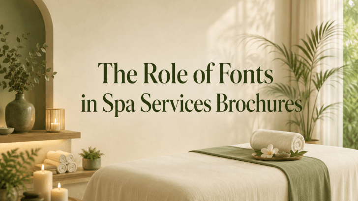
Understanding the role of fonts in spa services brochures is essential for creating wellness marketing materials that feel clear, calming, and professional. Many spa brochures use beautiful photography, soft colors, and relaxing visual elements, but still fail to communicate effectively because the typography does not support the message.
A spa brochure is more than just a list of treatments. It’s a brand experience, whether in print or digital. Before clients book a massage, facial, body treatment, or wellness package, they often interact with service information through the brochure. If the font is difficult to read, has poor letter spacing, or is inconsistent, the brochure may feel confusing rather than soothing.
Fonts help guide potential clients through the brochure. They create mood, organize information, support readability, and influence how professional the spa brand appears. In a wellness industry built around trust and comfort, typography can quietly shape the customer journey.
Why Fonts Matter in Spa Brochure Design?
Fonts play an important role because spa brochures need to balance beauty and function. They must look attractive while also helping clients understand services quickly.
1. Fonts Create the First Impression
The font on a spa brochure cover immediately communicates the brand’s personality. A clean sans-serif font can make a spa feel modern and professional. An elegant serif font can create a premium and timeless impression. A soft, handwritten font can make a brand feel personal and warm. This first impression matters because clients often judge the quality of a service before they experience it. If the typography looks polished, the brand feels more trustworthy.
2. Fonts Support the Spa Atmosphere
Spa branding usually aims to communicate calmness, balance, beauty, and care. Fonts help express those feelings visually.
A well-chosen font can make a brochure feel:
- Relaxing
- Clean
- Elegant
- Natural
- Premium
- Trustworthy
On the other hand, fonts that are too bold, sharp, crowded, or decorative may create visual tension. This can weaken the peaceful mood that spa brands usually want to build.
3. Fonts Improve Readability
One of the most practical roles of fonts in spa services brochures is readability. A brochure often includes service names, descriptions, prices, treatment duration, package details, benefits, and booking information. If clients cannot read these details easily, they may lose interest.
Clear Fonts Help Clients Compare Services
Many spa clients use brochures to compare treatment options. They may want to know the difference between aromatherapy massage, deep tissue massage, facial care, body scrub, or wellness packages. Readable fonts make this comparison easier. Clients can quickly scan categories, understand descriptions, and decide which service fits their needs.
Readability Supports Booking Decisions
A brochure should guide the reader toward action. Clear typography helps clients find important information such as phone numbers, website links, location, opening hours, and booking instructions. When this information is easy to find, the brochure becomes more effective as a conversion tool.
4. Fonts Build Visual Hierarchy
Visual hierarchy is the way design elements are arranged to show importance. In spa brochures, fonts help create this structure.
Main Headlines
The main headline usually appears on the brochure cover or opening section. It should be clear, attractive, and aligned with the spa brand identity.
Examples include:
- Signature Spa Treatments
- Relaxation Starts Here
- Wellness Services Menu
- Beauty and Balance Packages
A strong headline font attracts attention and introduces the mood of the brochure.
Service Categories
Service categories help organize the brochure. Examples include massage therapy, facial treatments, body care, spa packages, and wellness rituals. Using consistent typography for categories makes the brochure easier to navigate.
Body Text
Body text should be simple and readable. This is where clients read treatment descriptions, benefits, and details. For body text, avoid overly decorative fonts. A clean sans-serif or readable serif font usually works best.
5. Fonts Strengthen Spa Branding
Typography is part of brand identity. When the same font style appears across brochures, websites, social media, appointment cards, and signage, the brand becomes easier to recognize.
Consistency Builds Trust
Consistent typography makes a spa brand feel organized and professional. Clients may not consciously notice the font system, but they will feel the difference when everything looks connected.
A consistent font system can include:
- One font for headlines
- One font for body text
- One accent font for special offers or quotes
This creates a polished and memorable identity.
6. Fonts Reflect Brand Positioning
Different spa brands need different typography styles. A luxury spa may need elegant, refined fonts with generous spacing. A beauty clinic may prefer clean and modern sans-serif fonts. A holistic wellness studio may choose soft, natural typography. A boutique spa may use fonts with more personality. The font should match the experience the brand promises.
Tips for Using Fonts in Spa Brochures
Use Enough White Space
Spa brochures should feel calm and breathable. Avoid filling every area with text. White space helps typography feel more elegant and easier to read.
Limit Font Combinations
Using too many fonts can make the brochure feel messy. Two fonts are usually enough for a professional spa brochure.
A good combination could be:
- Elegant font for headings
- Clean sans-serif font for body text
Keep Text Size Comfortable
Small text can make service information difficult to read. Make sure treatment descriptions, prices, and booking details remain clear.
Match Font Weight to the Message
Use bold or semi-bold fonts for important information, such as service categories or promotional offers. Use lighter weights for calm and elegant sections.
Test the Brochure Before Publishing
Always review the brochure in its final format. A font may look good on screen but become difficult to read in print or on a folded brochure.
If you want to explore more typography ideas for wellness branding, read “Sans-Serif Fonts for Spa Service Brochures.” This article shares font recommendations that can help spa brochures feel clean, calming, and professional.
You can also read “Tips for Choosing Readable Fonts for Spa Service Brochures” to learn practical ways to improve readability, hierarchy, and visual clarity in brochure design.
Conclusion
Understanding the role of fonts in spa services brochures can help designers and spa brands create brochures that are both beautiful and effective. Fonts shape first impressions, improve readability, create visual hierarchy, and support a calming brand experience.
In spa branding, typography should never be treated as decoration only. It helps clients understand services, feel confident about the brand, and move closer to booking. By choosing readable fonts, maintaining consistency, using enough white space, and matching typography to the spa’s mood, designers can create brochures that feel professional, relaxing, and trustworthy.
A well-designed spa brochure does not simply present information. It creates a quiet sense of care before the client even enters the spa.