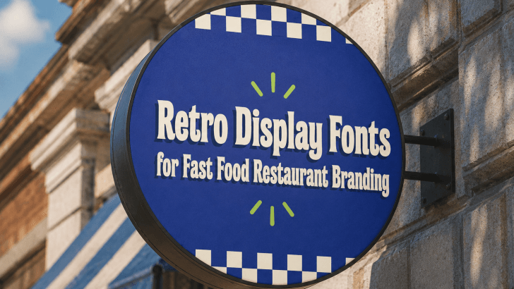
Using retro display fonts for fast food restaurant branding can help designers solve a key visual challenge: making food brands feel fun, memorable, and instantly recognizable in a crowded marketplace. Fast food restaurants often compete on taste, speed, price, and personality. However, without strong typography, even a colorful visual identity can feel forgettable.
Retro display fonts are powerful because they bring character. They can make a toast shop feel playful, a burger brand feel nostalgic, or a coffee corner feel bold and familiar. Based on the visual references, this style works especially well with chunky lettering, rounded shapes, strong shadows, bright green and purple color palettes, checkerboard patterns, sticker-like layouts, and expressive menu headlines.
The goal is not only to look vintage. The goal is to create a brand identity that feels warm, fun, and easy to remember. For fast food branding, typography should make people feel hungry, curious, and excited to try the product.
Why Retro Display Fonts Work for Fast Food Branding
Retro display fonts are designed to grab attention. They usually have bold shapes, unique curves, playful proportions, and a strong visual personality.
They Create Instant Recognition
Fast food branding needs to be seen quickly. Customers may notice a sign from the street, a menu from a counter, or a social media post while scrolling. A strong display font helps the brand stand out in seconds.
They Make the Brand Feel Fun
Fast food is often connected to comfort, cravings, casual dining, and quick enjoyment. Retro typography supports that feeling because it looks friendly and energetic. Rounded display fonts, thick letterforms, and playful spacing can make the brand feel approachable. This is useful for restaurants that want to attract families, young customers, students, or social media audiences.
They Support Nostalgia
Retro design often evokes classic diners, old-school menus, vintage packaging, and playful food advertisements. This nostalgic feeling can make a fast food brand feel more familiar and emotionally engaging. However, the best retro branding still feels fresh. The references show a modern retro direction by combining vintage-inspired typography with bold colors, clean layouts, and digital-friendly compositions.
Best Use Case Based on the Visual References
1. Menu Design
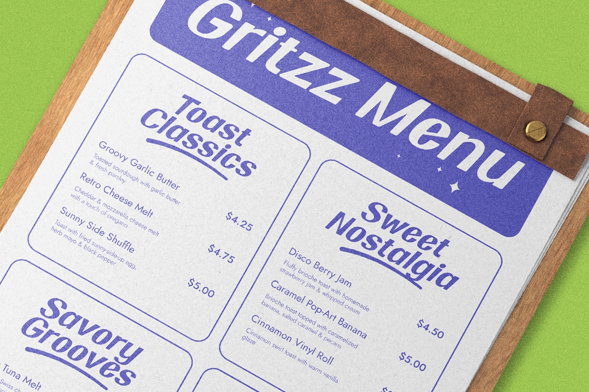
The “Gritzz Menu” reference is a great example of how retro display fonts can make a menu feel more branded. The large headline uses a bold, rounded style that feels playful and clear. The menu sections, such as “Toast Classics,” “Sweet Nostalgia,” and “Savory Grooves,” also use expressive typography to separate categories.
Why It Works
This style works because the font helps organize the menu while keeping the mood fun. Customers can quickly scan categories, but the design still feels unique.
For fast food restaurants, use retro display fonts for:
- Menu titles
- Category names
- Signature items
- Combo names
- Special offers
Keep the smaller descriptions in a simpler supporting font so the menu remains readable.
2. Social Media Campaigns
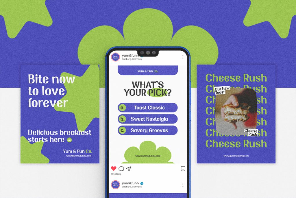
The reference with the phone mockup and promotional posters shows how retro display fonts can support digital branding. The typography is bold, colorful, and easy to notice on a small screen.
Why It Works
Fast food brands rely heavily on social media. A playful display font can make Instagram posts, stories, reel covers, and promotional graphics more clickable.
Use this style for:
- New menu launches
- Limited-time offers
- Polls and interactive posts
- “What’s your pick?” content
- Food challenge campaigns
A retro display font works well when paired with simple calls to action and strong color contrast.
3. Promotional Posters
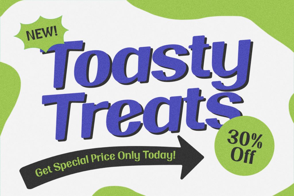
The “Toasty Treats” poster uses oversized typography, a bold shadow effect, a price badge, and a directional arrow. This creates a strong promotional layout that feels energetic and direct.
Why It Works
Fast food promotions need quick communication. Customers should immediately understand the offer, the mood, and the reason to take action.
Use retro display fonts for:
- Discount posters
- Breakfast deals
- Lunch specials
- Grand opening promos
- Seasonal food campaigns
Large type, strong shadows, and simple offer badges can make the promotion easier to remember.
4. Store Signage
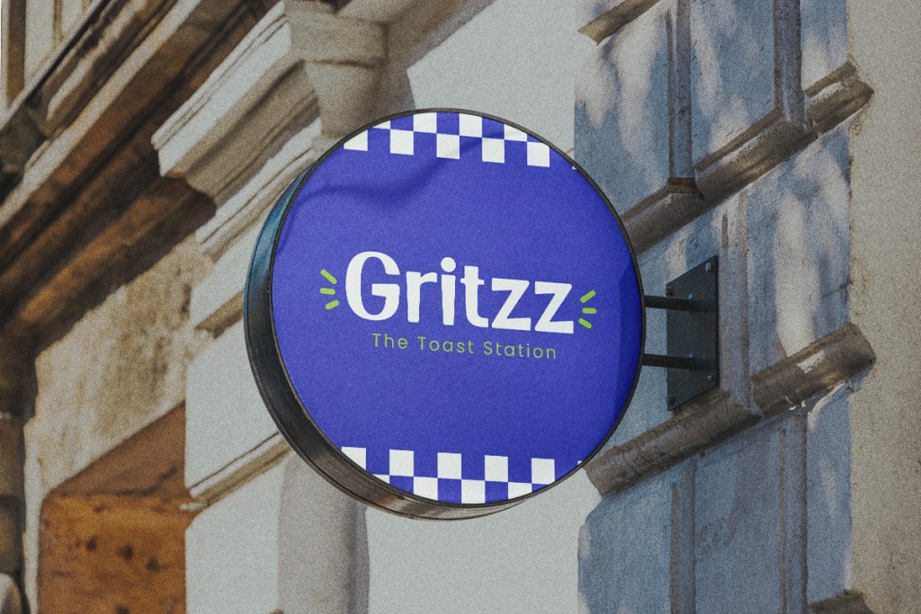
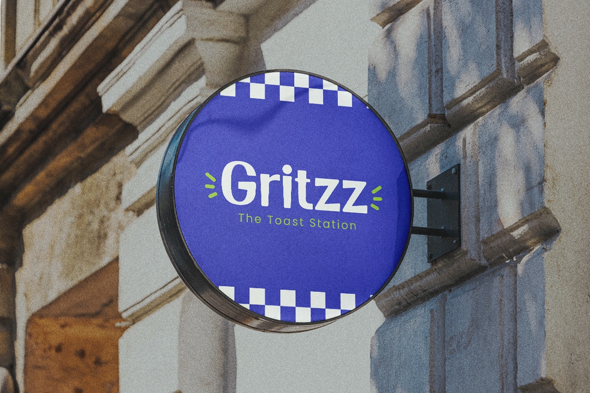
The round “Gritzz” sign shows how retro typography can become a physical brand asset. The bold font remains readable from a distance, while the checkerboard detail adds a nostalgic diner-inspired touch.
Why It Works
Signage needs clarity. A restaurant sign should be readable from the street, inside a mall, or across a food court. Retro display fonts with thick shapes are ideal because they stay visible.
Use this approach for:
- Outdoor signs
- Counter signs
- Menu boards
- Window stickers
- Food truck branding
5. Brand Identity and Logo Stickers

The image with multiple brand-style stickers shows how retro display fonts can create a flexible identity system. Each label has a different shape, but the overall mood still feels connected through bold typography, high contrast, and playful layouts.
Why It Works
Fast food brands often need logos, packaging stickers, cup labels, takeout seals, and merchandise graphics. A retro display font can create a strong brand mark that works across many formats.
Use this style for:
- Logo badges
- Packaging labels
- Sauce stickers
- Cup branding
- Merchandise stickers
- Loyalty cards
Sticker-like typography can make the brand feel more collectible and shareable.
6. Packaging and Brand Story Visuals
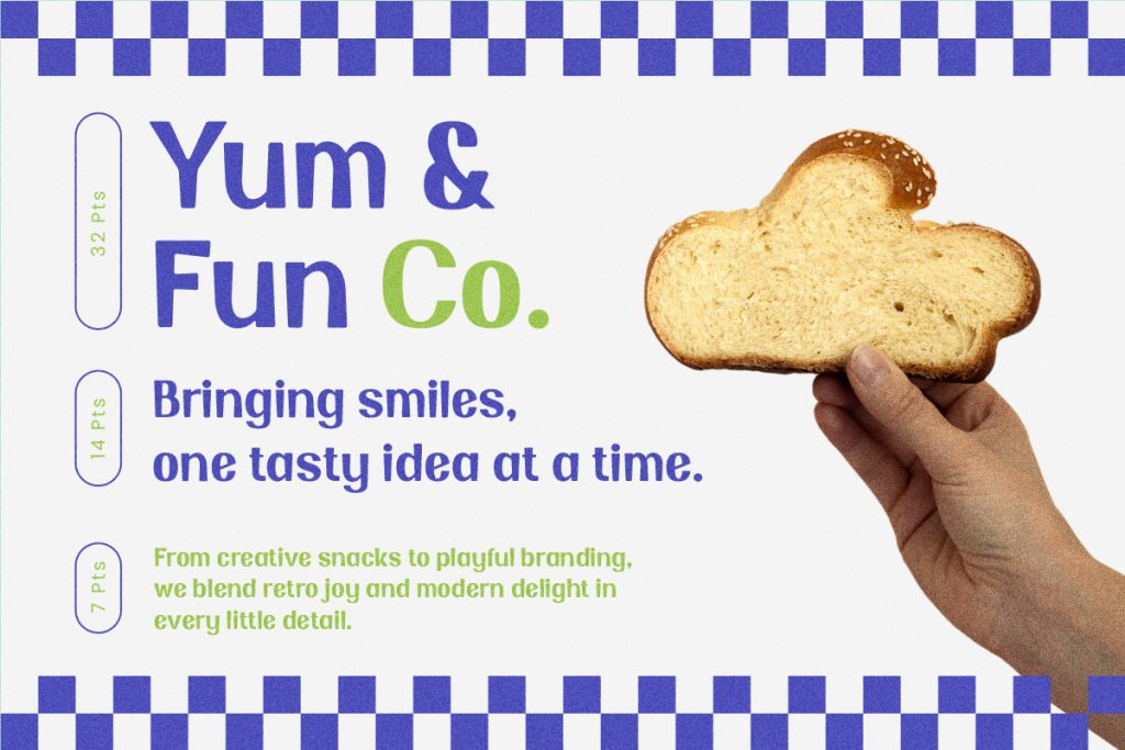
The “Yum & Fun Co.” reference shows a clean brand message with playful retro typography and a simple food image. It feels friendly, modern, and easy to understand.
Why It Works
Packaging and brand storytelling need a balance between personality and clarity. Retro fonts can create charm, while clean spacing keeps the message professional.
This approach works well for:
- Takeaway boxes
- Paper bags
- Thank-you cards
- Brand introduction cards
- Food wrappers
- Tray liners
Tips for Implementation
Choosing a retro display font is only the first step. To make the design effective, designers need to apply typography with intention.
1. Use Bold Fonts for Main Headlines
Retro display fonts work best when used for short, high-impact text. Use them for brand names, menu categories, campaign headlines, and signature products.
Keep Headlines Short
Short phrases are easier to read and more visually powerful. Examples include:
- Toasty Treats
- Cheese Rush
- Bite Now
- Crispy Mood
- Fresh Bites
- Breakfast Club
Long text can make a display font feel crowded, especially on small layouts.
2. Pair Display Fonts with Simple Supporting Fonts
Retro display fonts usually have a strong personality. Because of that, they should be paired with simpler fonts for body text.
Use display fonts for headlines and clean sans-serif fonts for:
- Descriptions
- Prices
- Ingredients
- Opening hours
- Contact details
- Website links
This keeps the design expressive without losing readability.
3. Build a Strong Color System
The references use bright green, deep purple, white, and black. This palette creates strong contrast and a fun retro mood.
Use Contrast for Readability
Fast food branding should be bold but still easy to read. Make sure the text stands out clearly from the background.
Good combinations include:
- Purple text on white background
- White text on purple background
- Green accents for badges
- Black shadows for depth
- Checkerboard details for retro energy
4. Add Shadows and Outlines Carefully
Retro display typography often looks stronger with shadows, outlines, or layered effects. These details can make the text feel dimensional and more playful. However, avoid overusing effects. Too many shadows, strokes, and textures can make the design hard to read. Use effects to support the headline, not distract from it.
5. Create a Consistent Brand System
A fast food restaurant needs typography across many touchpoints. The same retro display font can appear in the logo, menu, posters, packaging, signage, and social media.
Keep the Mood Consistent
Even if each layout is different, the brand should feel connected. Use consistent colors, font styles, graphic shapes, and spacing rules. This helps customers recognize the brand faster.
6. Make Typography Work on Small Screens
Many customers will first see the brand through social media or delivery apps. This means the font must remain readable on mobile. Test your designs at small sizes before publishing. If the title becomes unclear, simplify the layout or increase contrast.
7. Use Retro Elements as Supporting Details
Retro typography becomes stronger when supported by the right visual elements.
You can use:
- Checkerboard patterns
- Starburst shapes
- Price badges
- Arrows
- Sticker frames
- Wavy backgrounds
- Grainy texture
- Rounded boxes
These elements can make the brand feel more nostalgic and playful without relying only on the font.
Read Related Articles
If you want to explore more expressive typography ideas, read “Handwritten and Display Fonts for Sticker Packs.” This article explains how playful display fonts can create personality, emotion, and visual impact in small-format designs.
You can also continue with “Sticker Design Tips for Print, Packaging, and Merch” to learn how typography, layout, contrast, and print-ready details can make your packaging stickers and promotional merch look more professional.
Conclusion
Using retro display fonts for fast food restaurant branding is a smart way to create visuals that feel bold, playful, and memorable. Fast food branding needs to communicate quickly, and retro typography helps create instant personality.
Based on the visual references, this style works especially well for menus, social media campaigns, promotional posters, signage, packaging stickers, and brand storytelling materials. The combination of chunky display fonts, strong shadows, bright green and purple colors, checkerboard patterns, and sticker-style layouts can make a restaurant brand feel energetic and recognizable.
The key is balance. Use retro display fonts for headlines and brand accents, then pair them with clean supporting fonts for readable details. With the right typography system, a fast food restaurant can look more fun, more professional, and more marketable across both print and digital platforms.
