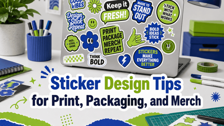
Understanding sticker design tips for print packaging and merch is essential for designers, small business owners, and creative brands that want stickers to look professional, readable, and marketable. Many sticker designs look attractive on screen, but they often fail when printed, placed on packaging, or used as merchandise because the typography is too small, the colors lack contrast, or the layout does not match the final use.
Stickers may be small, but they carry big branding potential. They can make packaging feel more personal, turn simple products into memorable brand experiences, and become merchandise that customers actually want to keep. A well-designed sticker can support marketing, strengthen visual identity, and add emotional value to a product.
Whether you are creating thank-you stickers, product labels, planner stickers, laptop decals, event merch, or packaging seals, the design needs to work beyond the digital preview. In this article, we will explore practical sticker design tips for print, packaging, and merch so your final result feels polished, functional, and brand-ready.
Sticker Design Tips for Print
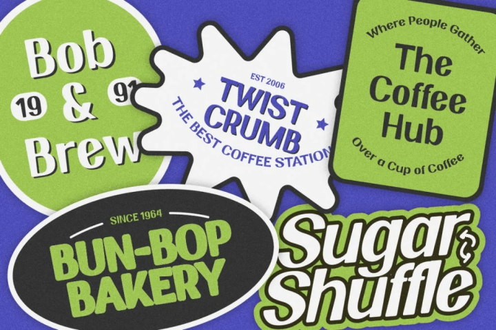
1. Use High-Resolution Artwork
Always create sticker artwork in high resolution. Low-resolution files may look fine on a monitor but become blurry or pixelated in print. For best results, prepare artwork at 300 DPI and use the correct final sticker size from the beginning. This helps avoid scaling issues later.
2. Choose Readable Typography
Typography is one of the most important parts of sticker design. Since stickers are often small, fonts must remain readable at the final size. Avoid using fonts that are too thin or overly detailed for tiny stickers. Instead, choose fonts with clear shapes, strong spacing, and enough weight. A good rule is simple: if the text cannot be read quickly, the sticker will not communicate effectively.
3. Keep the Text Short
Stickers work best with short, memorable phrases. Long sentences can make the design feel crowded.
Examples of effective sticker copy include:
- Thank You
- Freshly Packed
- Good Vibes
- Limited Edition
- New Arrival
Short copy gives the typography room to breathe and creates a stronger impact.
4. Check Color Contrast
Contrast is essential for print readability. Soft colors may look aesthetic, but they can become difficult to read if the text and background are too similar. Test contrast before printing. Dark text on a light background or light text on a dark background is usually safer.
5. Add Bleed and Safe Margins
Print stickers need bleed and safe margins. Bleed ensures the design reaches the edge after cutting, while safe margins keep important text and logos away from the trim line. If text is placed too close to the edge, it may get cut off during production. Always follow the printer’s file setup requirements.
Sticker Design Tips for Packaging
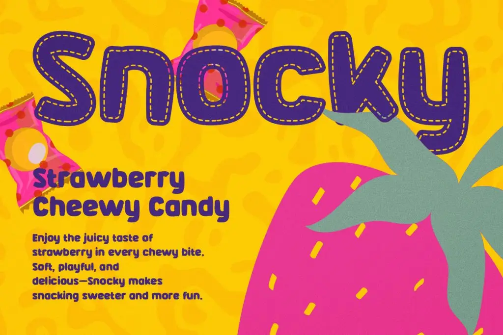
1. Match the Sticker to the Packaging Style
A sticker should feel connected to the overall packaging design.
For example:
- Minimal packaging works well with clean typography.
- Food packaging benefits from playful and appetizing typography.
- Luxury packaging needs refined spacing and elegant font choices.
The sticker should look intentional, not like an afterthought.
2. Consider Sticker Shape
The sticker shape can influence the entire design.
Popular shapes include:
- Circle stickers for seals and logos
- Rectangle stickers for product labels
- Oval stickers for boutique packaging
- Custom die-cut stickers for playful branding
Choose a shape that supports the message and packaging surface.
3. Use Stickers as Brand Touchpoints
Packaging stickers can serve many purposes.
They can be used for:
- Logo labels
- Thank-you notes
- Product names
- Ingredient highlights
- QR code labels
Each sticker should have a clear role. Avoid trying to communicate too many things in one small design.
4. Make Product Information Easy to Read
If the sticker includes product details, readability becomes even more important.
Use a clean font for:
- Product names
- Ingredients
- Sizes
- Instructions
- Website links
- Social media handles
Decorative fonts can be used for accents, but essential information should stay clear.
Sticker Design Tips for Merch
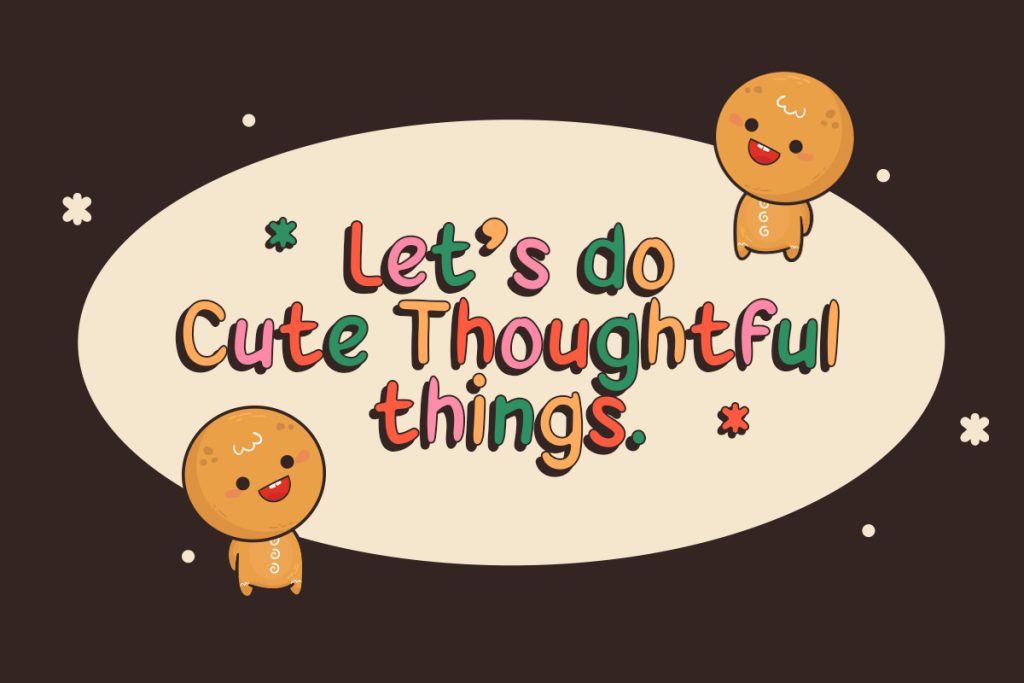
1. Design for Emotional Appeal
Merch stickers often succeed because they express identity, mood, or humor.
Popular merch sticker themes include:
- Funny quotes
- Motivational phrases
- Cute characters
- Brand slogans
- Seasonal graphics
Typography should match the emotional tone of the message.
2. Make the Design Stand Alone
A merch sticker should work even when separated from the original packaging or brand campaign. This means the design should feel complete on its own. The phrase, font, color, and illustration should create a clear message without needing extra explanation.
3. Use Bold Visual Elements
Merch stickers compete with many other visuals. Bold typography, strong shapes, and clean outlines help stickers stand out. This is especially important for physical stickers that may be viewed from different distances.
4. Think About Durability
Merch stickers are often placed on surfaces that experience friction, sunlight, or moisture. While material choice depends on the printer, the design should still support durability. Avoid extremely tiny details that may fade or disappear. Clear shapes and readable typography usually perform better over time.
Typography Tips for Sticker Design
1. Use Display Fonts for Impact
Display fonts are great for short sticker phrases because they create personality and visual strength.
They work well for:
- Merch stickers
- Promotional stickers
- Event stickers
- Food packaging stickers
- Fun quote stickers
2. Use Handwritten Fonts for Warmth
Handwritten fonts help stickers feel personal and expressive.
They are ideal for:
- Handmade businesses
- Planner stickers
- Thank-you labels
- Cute packaging
- Lifestyle merchandise
3. Use Sans-Serif Fonts for Clarity
Sans-serif fonts are useful when readability is the priority. They work well for product labels, QR code stickers, contact details, and clean packaging systems.
4. Avoid Too Many Fonts
Most sticker designs only need one or two fonts. Too many fonts can make the design feel messy and difficult to understand.
A simple pairing could be:
- Display font for headline
- Sans-serif font for small details
If you’d like to learn about typography for sticker design, read “Handwrittten and Display Fonts for Sticker Packs.” This article shares font recommendations and practical ideas for creating expressive sticker packs.
You can also continue with “Display Fonts Guide: What Designers Need to Know” to learn about display font guidelines for designers.
For more typography inspiration, visit the Font Kingdom Blog and explore premium font collections for stickers, packaging, branding, posters, and merchandise design.
Conclusion
Applying the right sticker design tips for print packaging and merch can help designers create stickers that look attractive, readable, and professional in real-world use. Stickers may be small, but they can play a powerful role in branding, packaging, and customer experience.
Strong sticker design depends on clear typography, high-resolution artwork, proper contrast, thoughtful spacing, and awareness of the final application. A sticker for packaging may need to feel branded and functional, while a merch sticker should feel expressive and desirable.
By designing with print quality, packaging context, and customer use in mind, you can create stickers that do more than decorate. They can strengthen brand identity, improve product presentation, and turn small visual details into memorable brand moments.
