Retro design has made a strong comeback in recent years, especially in graphic design. One of the most popular elements in this trend is retro game fonts. These fonts bring back the nostalgic feeling of classic video games from the 80s, 90s, and early 2000s.
Understanding how to use retro game fonts correctly can help designers create visuals that feel fun, nostalgic, and emotionally engaging. Whether you are designing posters, game interfaces, or social media graphics, retro typography can instantly transport your audience back in time.
In this article, we will explore what retro game fonts are, their characteristics, why they are effective, and how to use them to create nostalgic design styles.
What Are Retro Game Fonts?
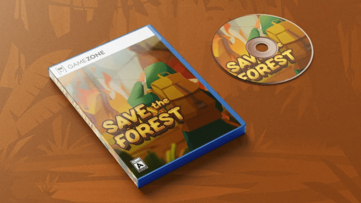
Retro game fonts are typefaces inspired by classic video games, especially from arcade machines, early consoles, and pixel-based computer systems.
These fonts often reflect limitations of old technology, such as low resolution and simple shapes. As a result, they have a distinctive visual style that feels both nostalgic and iconic.
Retro typography style is commonly associated with:
- Pixel art games
- Arcade machines
- 8-bit and 16-bit consoles
- Vintage gaming culture
Because of their unique style, these fonts are widely used in modern design to evoke nostalgia and fun.
Characteristics of Retro Game Fonts
1. Pixel-Based Structure
Many retro fonts are built using square pixels. This reflects early digital screens, where graphics were made from small blocks. This pixel style creates a strong nostalgic feel and is instantly recognizable.
2. Bold and Blocky Shapes
Retro game fonts often have thick, bold letters. These shapes make them easy to read on low-resolution screens. Even today, this boldness helps text stand out in designs.
3. Limited Detail
Because early technology had limitations, retro fonts usually have simple forms without complex curves. This simplicity is part of their charm and makes them visually clean.
4. Bright and High-Contrast Colors
Retro typography is often paired with vibrant colors such as neon green, bright yellow, or electric blue. These colors enhance the nostalgic gaming atmosphere.
5. Fun and Playful Style
Retro game fonts feel energetic and playful. They are perfect for designs that aim to entertain and engage audiences.
Why Retro Game Fonts Are Popular in Modern Design
1. Nostalgia Marketing
People love designs that remind them of their childhood. Retro fonts trigger memories of classic games and simpler times. This emotional connection makes designs more memorable.
2. Unique Visual Identity
Retro fonts stand out from modern minimalist designs. They give brands a distinctive and recognizable style.
3. Versatility in Design
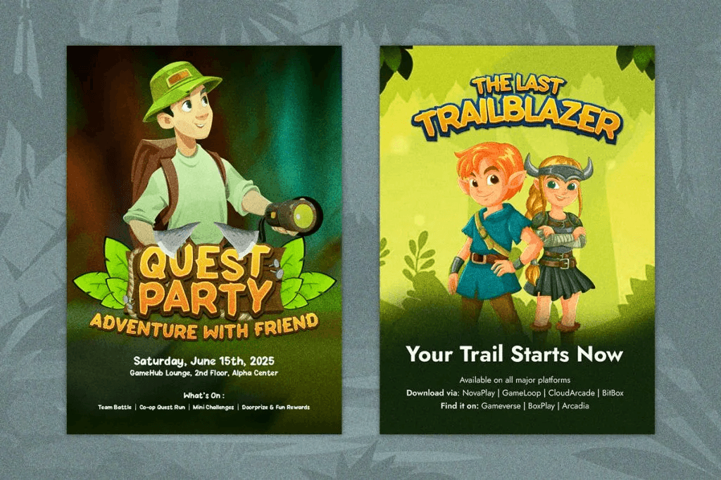
Retro game fonts can be used in various projects, including:
- Posters
- Game design
- Branding
- Merchandise
- Social media content
To better understand how decorative typography works, read our Display Fonts Guide and discover how display fonts enhance visual impact.
How to Create Nostalgic Design Styles with Retro Game Fonts
1. Choose the Right Font Style
Not all retro fonts are the same. Some are pixel-based, while others are inspired by arcade or futuristic styles.
Choose a font that matches your design theme:
- Pixel fonts → classic 8-bit games
- Arcade fonts → bold and dynamic
- Retro futuristic → sci-fi game vibes
2. Use Pixel Effects
To enhance the retro look, add pixel effects to your typography.
You can:
- Use sharp edges
- Avoid smooth curves
- Apply grid-based layouts
This will make your design feel more authentic.
3. Apply Vintage Color Palettes
Color plays a big role in retro design.
Popular retro color combinations include:
- Neon green + black
- Yellow + orange gradient
- Purple + blue tones
These colors create a strong nostalgic atmosphere.
4. Add Texture and Grain
Old screens and game visuals were not perfectly clean. Adding texture or grain can simulate that vintage look.
This makes your design feel more realistic and less digital.
5. Combine with Modern Elements
To keep your design relevant, combine retro fonts with modern layouts.
For example:
- Retro font for headline
- Clean sans-serif for body text
This creates a balance between nostalgia and readability.
Conclusion
Retro design continues to inspire modern creatives, and retro game fonts play a key role in bringing that nostalgic feeling to life. These fonts are more than just visual elements; they are emotional triggers that connect audiences with memories of classic gaming experiences.
By understanding their characteristics and applying the right techniques, designers can create engaging and memorable visuals. From pixel effects to vibrant colors, every detail contributes to the overall nostalgic style.
When used correctly, retro game fonts can transform ordinary designs into unique and captivating experiences.