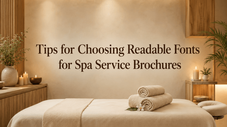
Understanding tips for choosing readable fonts for spa service brochures is important for designers, spa owners, and wellness brands that want to communicate services clearly while maintaining a calm and premium visual identity. Many spa brochures look beautiful at first glance, but they often fail to guide potential clients because the typography is too decorative, too small, or difficult to scan.
A spa brochure is not only a printed design. It is also a silent sales tool. It introduces services, explains treatment benefits, shows packages, displays pricing, and encourages people to book. If the font is hard to read, potential clients may feel confused or lose interest before they understand the offer.
Readable typography helps solve this problem. The right font makes a spa brochure feel professional, relaxing, and easy to navigate. It allows clients to focus on the experience being offered instead of struggling to understand the information. In wellness branding, clarity and beauty should work together.
Why Readable Fonts Matter in Spa Brochures
Spa branding is closely connected to emotion. Clients want to feel relaxed, cared for, and confident before choosing a treatment. Typography helps shape that feeling from the first page of the brochure.
When a brochure uses readable fonts, it creates a smoother experience for the reader. Service names become easier to compare. Treatment descriptions feel more inviting. Booking details become easier to find.
A Spa Brochure Must Inform and Persuade
Unlike a poster that may only need one strong headline, a spa brochure usually contains more detailed information. It may include massage treatments, facial services, body scrubs, wellness packages, memberships, opening hours, contact details, and promotional offers.
Because of this, the font must support both aesthetics and function. A beautiful font is not enough if clients cannot read it comfortably.
Readability Builds Trust
Clients often associate clean design with professional service. If a spa brochure looks organized and easy to understand, the brand feels more reliable. On the other hand, unclear typography can make the business appear less polished.
Readable fonts help communicate that the spa pays attention to detail. That detail matters in an industry built around care, comfort, and personal experience.
Tips for Choosing Readable Fonts for Spa Service Brochures
Choosing the right font for a spa brochure requires more than picking something pretty. The font must match the mood, support the content, and remain clear in both print and digital formats.
1. Choose Fonts with Clean Letterforms
Clean letterforms are easier to read because each character is clearly defined. For spa brochures, fonts with simple shapes usually work better than overly decorative styles. Sans-serif fonts are often a strong choice because they feel modern, fresh, and uncluttered. They work well for service menus, treatment descriptions, and contact information.
However, serif fonts can also work beautifully when used for headings or premium branding. The key is to choose serif fonts with balanced spacing and clear character shapes.
Use clean fonts for:
- Service descriptions
- Pricing details
- Treatment duration
- Booking information
- Brochure body text
This ensures clients can understand important information quickly.
2. Match the Font Mood with the Spa Brand
Every spa has a different personality. A luxury spa, beauty clinic, holistic wellness studio, and boutique massage center may need different typography styles.
Before choosing a font, define the brand mood.
For example:
- Luxury spa: elegant, refined, spacious typography
- Wellness studio: soft, natural, calming typography
- Beauty clinic: modern, clean, professional typography
- Boutique spa: stylish, memorable, expressive typography
The font should reflect the service experience clients expect.
Why Mood Matters
Typography influences emotion. A sharp and bold font may feel too aggressive for a calming spa. A highly playful font may not fit a premium wellness brand. A soft, clean, and balanced font usually creates a better impression for spa brochures.
3. Prioritize Readability Over Decoration
Decorative fonts can look attractive, but they are not always suitable for brochures. Spa brochures often contain several sections of information, so readability should come first.
Use decorative fonts only in limited areas, such as:
- Main brochure title
- Spa name
- Short quote
- Special package name
For longer text, choose a simpler and more readable font.
Keep the Reader Comfortable
A brochure should feel relaxing to read. If the font requires too much effort, the design loses its calming effect. Good typography should guide the reader naturally from one section to another.
4. Use Proper Font Size
Even the most readable font can fail if it is too small. Spa brochures are often printed in folded formats, so designers may be tempted to reduce text size to fit more information.
Small text makes service descriptions difficult to read and can make the brochure feel crowded. Instead of forcing too much content into one page, simplify the copy and use enough spacing.
Use larger text for:
- Section headings
- Treatment names
- Package names
- Promotional offers
Use comfortable body text size for:
- Descriptions
- Benefits
- Terms
- Contact information
The goal is to make every section easy to scan.
5. Create a Clear Typography Hierarchy
Hierarchy helps readers understand which information is most important. A spa brochure should not make every text element look the same. Instead, it should guide the reader through levels of information.
Example hierarchy:
Main headline: largest and most noticeable
Service category: medium and clear
Treatment name: slightly emphasized
Description: simple and readable
Price or duration: easy to find
CTA: visible and direct
This structure helps potential clients compare services and make decisions faster.
6. Limit Font Pairings
Using too many fonts can make a brochure feel messy. For spa service brochures, two fonts are usually enough.
A simple pairing could be:
- One elegant font for headings
- One clean sans-serif font for body text
This keeps the brochure polished and consistent.
Recommended Pairing Style
For a premium spa brochure, use an elegant serif or stylish sans-serif for headings and a clean sans-serif for descriptions. For a modern beauty clinic, use two sans-serif fonts with different weights.
7. Pay Attention to Spacing
Spacing is one of the most important parts of readable typography. Even a good font can look difficult to read if the spacing is too tight.
Consider:
- Letter spacing
- Line spacing
- Paragraph spacing
- Margins
- Space between service sections
Spa brochures should have enough breathing room. White space supports the feeling of calm and makes the layout easier to understand.
8. Test the Font in Real Brochure Layouts
A font may look beautiful in a preview but perform poorly in an actual brochure. Always test the font with real content.
Try placing the font in:
- Service descriptions
- Price lists
- Contact sections
- Package pages
- Brochure cover
Then check whether the text remains readable at the final size.
Print and Digital Testing
Spa brochures may be used in print, as PDFs, on websites, or in social media previews. Test the typography across all relevant formats to make sure the design remains consistent.
Benefits of Choosing the Right Font
Better Client Experience
A readable brochure makes it easier for clients to explore services. They can understand treatment options, compare packages, and find booking information without frustration. This creates a smoother first interaction with the brand.
Stronger Spa Branding
Typography helps define brand personality. A consistent font system makes the spa feel more professional and memorable. When the same typography style appears across brochures, websites, social media, and booking materials, the brand becomes easier to recognize.
Higher Perceived Value
Well-designed typography can make services feel more premium. Clean spacing, elegant font choices, and readable layouts help communicate quality. This is especially important for spas offering high-end treatments, wellness packages, or luxury experiences.
Better Booking Decisions
A brochure should help people take action. When fonts are readable, and the layout is clear, clients can easily find:
- What service do they want
- How much does it cost
- How long does it take
- How to book
Clear typography supports better decision-making and can improve conversion.
Read Related Articles
If you want to explore font recommendations specifically for wellness branding, read “Sans-Serif Fonts for Spa Service Brochures.”
You can also continue with “Condensed Sans Serif vs Regular Font: Key Differences Explained” to understand how font width affects readability, layout space, and visual hierarchy in brochure design.
Conclusion
Applying these tips for choosing readable fonts for spa service brochures can help designers create brochures that look beautiful and function effectively. In spa branding, typography should support a sense of calm, clarity, and trust.
Readable fonts make service information easier to understand, improve the client experience, and strengthen the overall brand identity. By choosing clean letterforms, matching the font mood to the spa brand, creating a clear hierarchy, using proper spacing, and testing the design in real layouts, you can create brochures that feel professional and inviting.
A spa brochure should not only look relaxing. It should also help clients confidently choose a service and take the next step. With the right font strategy, typography becomes more than a design detail. It becomes part of the wellness experience.