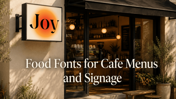
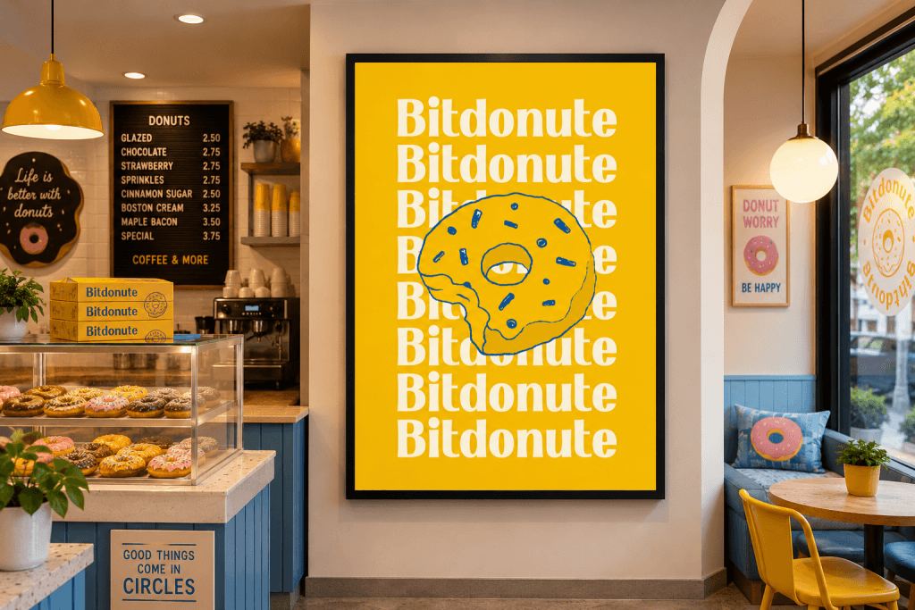
Finding the right food fonts for cafe menus and signage can be surprisingly difficult. Many cafe owners and designers invest heavily in interior design, food photography, and branding but overlook typography. The result is often a visual identity that feels cold, generic, or disconnected from the atmosphere they want to create.
Typography has the power to make a cafe feel warm, inviting, premium, playful, or handcrafted before customers even order their first drink. The right font helps communicate your brand personality, improve menu readability, and create memorable signage that attracts attention.
Whether you’re designing a coffee shop menu, bakery packaging, restaurant signage, food truck branding, or social media promotions, choosing the right font can dramatically improve the customer experience.
In this article, we’ll explore some of the best food fonts for cafe menus and signage, along with practical examples, pairing suggestions, and usage recommendations.
Why Typography Matters in Cafe Branding
Typography is one of the first visual elements customers notice.
Before they taste your food or drinks, customers interact with:
- Store signage
- Menu boards
- Packaging
- Social media graphics
- Website content
- Promotional materials
The typography you choose influences how people perceive your business.
A well-selected font can make a cafe appear:
- Cozy
- Modern
- Premium
- Handmade
- Trendy
- Family-friendly
Poor typography, however, can make even a beautifully designed cafe feel unprofessional.
Recommended Food Fonts for Cafe Menus and Signage
1. Kinzle
Kinzle delivers a charming and approachable personality that works beautifully for artisan cafes, bakeries, and specialty coffee brands. Its friendly character creates a welcoming atmosphere while remaining highly readable.
2. Boldova
Boldova offers strong visual impact with bold letterforms that stand out in signage applications. This font is ideal for businesses that want to create a confident and memorable brand presence.
3. Bretish
Bretish combines sophistication and character, making it suitable for premium cafes and upscale dining concepts. Its refined appearance helps communicate quality and craftsmanship.
4. Glibby
Glibby brings playful energy that works particularly well for dessert shops, ice cream brands, family cafes, and casual dining concepts. The font feels approachable and fun without sacrificing readability.
5. Yoksen
Yoksen offers a modern and stylish appearance that fits contemporary coffee shops and minimalist food brands. Its clean structure works well across both digital and print applications.
Best Use Cases for Food Fonts
Different typography styles perform better in different situations. Understanding these use cases helps maximize the effectiveness of your cafe branding.
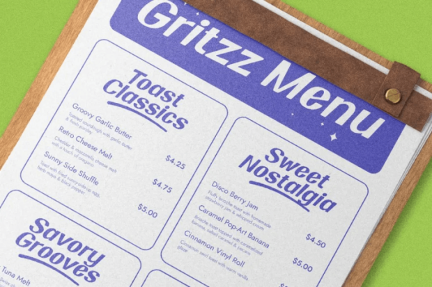
Cafe Menus
Menus must balance personality and readability.
Food fonts help:
- Highlight menu sections
- Create visual hierarchy
- Reinforce brand identity
- Improve customer experience
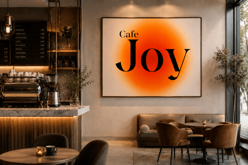
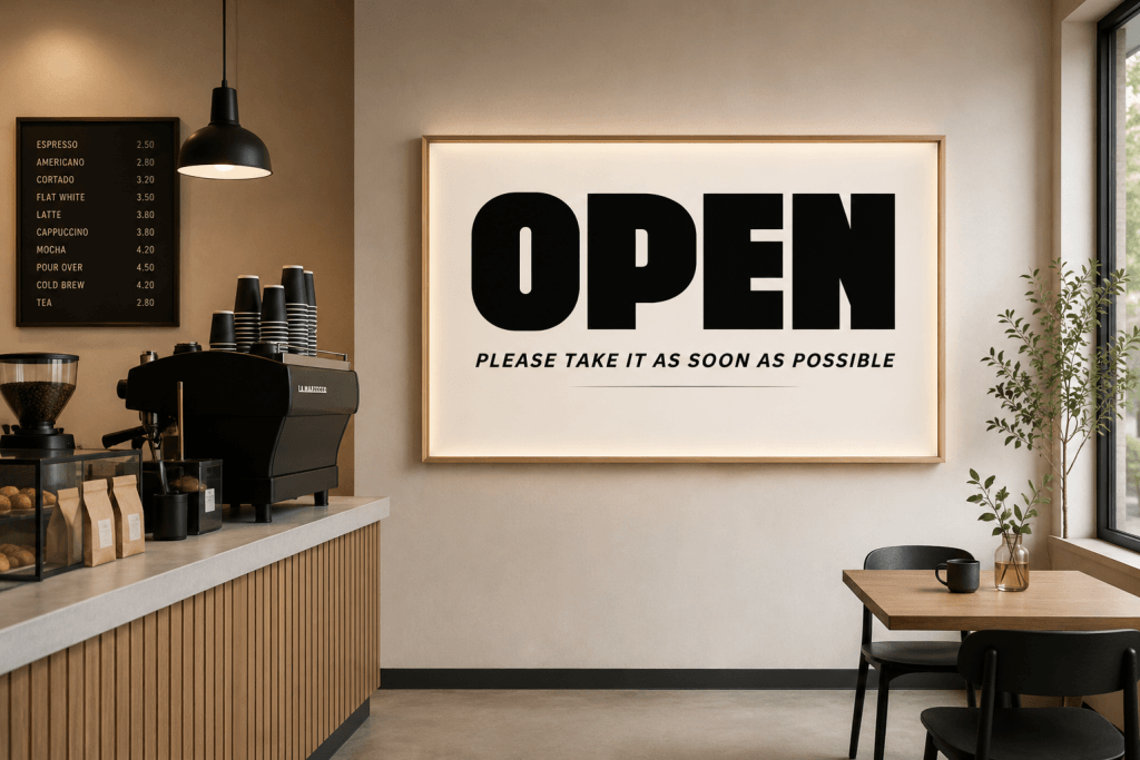
Exterior Signage
Storefront signage serves as your first impression.
Effective signage typography should:
- Be visible from a distance
- Reflect your brand personality
- Remain readable in different lighting conditions
Packaging Design
Typography plays a major role in packaging perception.
Food packaging often includes:
- Product names
- Ingredient information
- Brand messaging
- Promotional content
Consistent typography helps create stronger brand recognition.
Social Media Content
Cafe marketing increasingly depends on social platforms.
Typography used in social media graphics should:
- Capture attention quickly
- Remain readable on mobile devices
- Match the overall brand identity
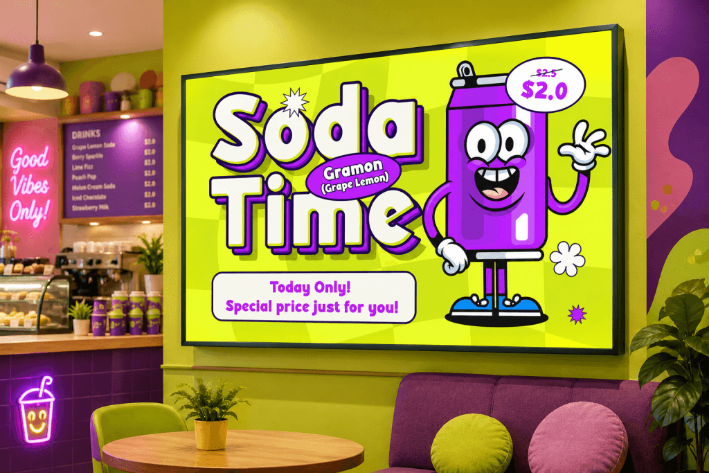
Promotional Posters
Seasonal promotions, special menus, and event advertisements benefit from typography that feels energetic and engaging.
Food fonts help attract attention while maintaining a cohesive visual identity.
Font Pairing Suggestions
Using a display font for every element can make designs feel overwhelming.
Pairing fonts strategically improves readability and creates a more professional appearance.
Kinzle Pairing
Headline:
- Kinzle
Body Text:
This combination creates warmth while maintaining clarity.
Boldova Pairing
Headline:
- Boldova
Body Text:
Ideal for bold restaurant branding.
Bretish Pairing
Headline:
- Bretish
Body Text:
Perfect for upscale cafes and premium dining concepts.
Glibby Pairing
Headline:
- Glibby
Body Text:
Creates a friendly and approachable atmosphere.
Yoksen Pairing
Headline:
- Yoksen
Body Text:
Excellent for modern coffee brands and contemporary cafes.
How Food Fonts Influence Customer Perception
Typography affects customer expectations more than many business owners realize.
Builds Emotional Connection
Customers often associate typography with brand personality. Warm typography can make a cafe feel inviting and comfortable.
Supports Brand Recognition
Consistent typography strengthens visual identity across:
- Menus
- Packaging
- Websites
- Social media
- Signage
Enhances Professionalism
A thoughtful typography system communicates attention to detail and quality.
Improves Readability
Good typography makes menus easier to navigate and helps customers make decisions more quickly.
Related Articles You May Like
Looking for more typography inspiration for branding projects? Continue exploring:
- Best Fonts for Food Branding That Make Your Brand Memorable
- Best Fonts for Food Packaging and Label Design
- 10 Typography Tips for Eye Catching Snack Packaging
Conclusion
Choosing the right food fonts for cafe menus and signage can transform the way customers perceive your business. Typography influences first impressions, strengthens branding, improves readability, and helps create an atmosphere that aligns with your cafe’s identity.
Fonts such as Kinzle, Boldova, Bretish, Glibby, and Yoksen offer unique personalities that work across menus, storefront signage, packaging, social media content, and promotional materials. By pairing them thoughtfully and maintaining consistency across all touchpoints, you can create a stronger and more memorable customer experience.