
Understanding common typography mistakes is essential if you want to create clean, professional, and visually balanced designs. Typography is more than choosing a beautiful font; it shapes readability, hierarchy, brand perception, and overall user experience. Even strong layouts can fail when typography is poorly executed.
Whether you are designing a website, branding materials, a poster, or a social media graphic, avoiding common typography mistakes can dramatically improve your results. In this guide, we’ll explore the most frequent errors and how to fix them.
Why Typography Matters in Design
Typography influences how people read and interpret your message. Good typography creates clarity, structure, and emotional tone. Poor typography creates confusion, distraction, and visual imbalance.
If you need a refresher on typography fundamentals, you may also read: What Is Typography? Definition, Examples, and Practical Uses
1. Using Too Many Fonts
One of the most common typography mistakes is mixing too many fonts in a single design.
Why Too Many Fonts Hurt Your Design
When multiple typefaces compete for attention, your layout becomes chaotic. Instead of looking creative, it appears unstructured and inconsistent.
How to Fix It
Limit yourself to:
- One primary font for headings
- One secondary font for body text
- Optional accent font (if necessary)
Keeping typography simple improves visual harmony.
2. Ignoring Typography Hierarchy
Hierarchy helps readers understand what is most important.
What Happens Without Hierarchy
Without a clear hierarchy:
- Everything looks equally important
- Users struggle to scan content
- Important messages get lost
How to Fix It
Use:
- Larger font sizes for headlines
- Bold weights for emphasis
- Clear spacing between sections
3. Poor Line Spacing and Letter Spacing
Spacing plays a critical role in readability.
Tight Line Spacing
When line spacing (leading) is too tight, text becomes hard to read and visually overwhelming.
Excessive Letter Spacing
Too much tracking can make words feel disconnected.
How to Fix It
- Adjust line height for comfortable reading
- Keep letter spacing balanced
- Test typography at different screen sizes
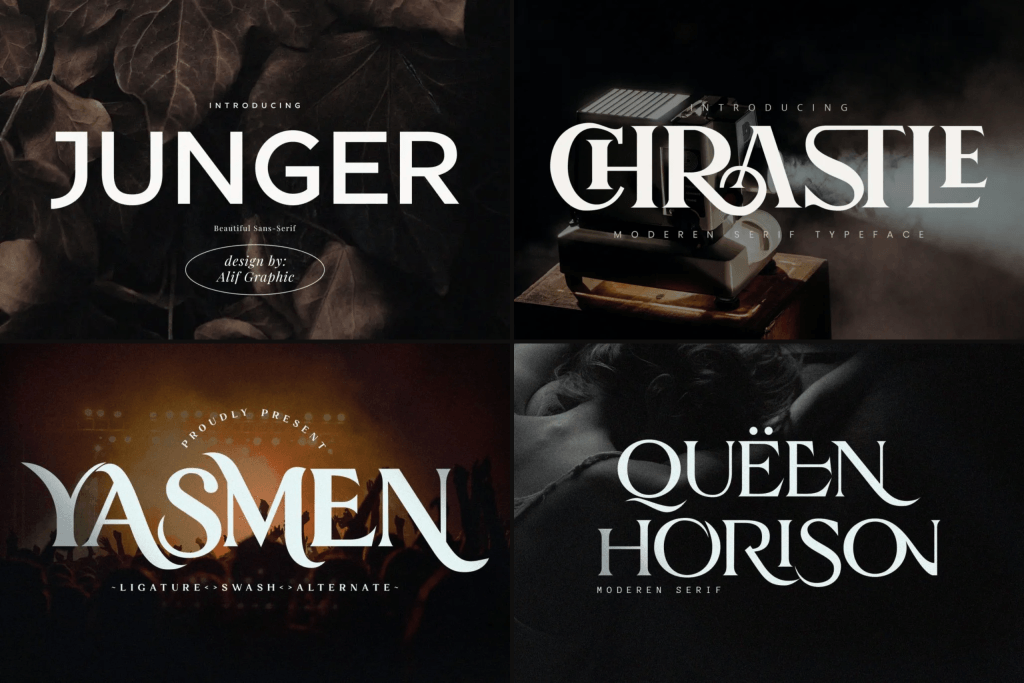
4. Overusing Decorative Fonts
Decorative fonts can look exciting, but overuse is one of the most common typography mistakes in branding and digital design.
Why Decorative Fonts Can Ruin Design
Highly stylized fonts reduce readability and may feel unprofessional when used excessively.
When to Use Decorative Fonts
- Headlines only
- Logos
- Short phrases
Avoid using decorative fonts for long paragraphs.
5. Poor Font Pairing Choices
Combining incompatible fonts weakens your design.
What Makes Bad Font Pairing
Pairing fonts with similar structure or conflicting personalities creates an imbalance.
How to Fix It
Combine:
- Serif with sans serif
- Bold headline with clean body text
- Script accent with minimal supporting font
6. Ignoring Readability on Different Devices
Designing only for desktop view is a major mistake.
Why Responsiveness Matters
Fonts that look elegant on large screens may appear too thin or too bold on mobile.
How to Fix It
- Test on multiple devices
- Adjust font sizes for mobile
- Avoid extremely thin weights
7. Using All Caps Excessively
All caps text can feel aggressive and difficult to read in large blocks.
When All Caps Work
- Short headings
- Labels
- Navigation items
Avoid writing full paragraphs in all caps.
8. Inconsistent Alignment
Alignment affects visual balance.
Common Alignment Errors
- Mixing left and center alignment randomly
- Uneven margins
- Poor grid structure
How to Fix It
Choose one primary alignment style and maintain consistency throughout your layout.
9. Low Contrast Between Text and Background
Contrast directly affects readability.
Why Low Contrast Fails
Light gray text on white backgrounds may look elegant, but it becomes hard to read.
How to Fix It
- Increase color contrast
- Avoid overly light font weights
- Test readability in real conditions
10. Not Considering Brand Personality
Typography should align with brand identity.
Why Brand Alignment Matters
A luxury brand using playful cartoon fonts creates confusion. A children’s brand using rigid corporate fonts feels disconnected.
How to Fix It
Choose fonts that reflect:
- Brand tone
- Target audience
- Emotional message
For branding-focused typography insights, you may also explore: Branding Logo Fonts: Best Fonts for Logo Design That Stand Out
How to Avoid Common Typography Mistakes
Avoiding common typography mistakes requires attention to detail and consistency.
Practical Tips
- Use font pairing intentionally
- Maintain a consistent hierarchy
- Test readability across platforms
- Keep spacing balanced
- Align typography with brand identity
Strong typography improves both aesthetics and usability.
Final Thoughts on Common Typography Mistakes
Recognizing common typography mistakes helps designers create clearer, more professional work. Typography is not just decoration; it shapes how people understand and interact with your content.
By avoiding excessive fonts, maintaining hierarchy, improving spacing, and aligning typography with brand personality, you can elevate your design from average to exceptional.
Typography done right builds trust, improves readability, and enhances the overall user experience.
One Comment