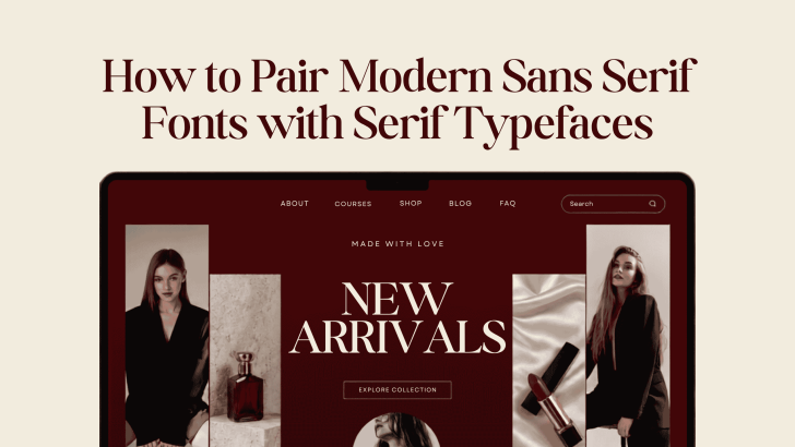
Learning how to pair modern sans serif fonts with serif typefaces can help designers create layouts that feel balanced, polished, and easier to read. Sans serif fonts often bring clarity and a contemporary mood, while serif typefaces add character, elegance, and visual contrast. When both styles work together, they can create a stronger hierarchy without making the design feel complicated.
Font pairing is useful across websites, fashion campaigns, branding systems, packaging, portfolios, and editorial layouts. However, choosing two attractive fonts is not enough. Their proportions, personality, weight, and purpose should also complement each other.
Why Pair Sans Serif and Serif Fonts?
Sans serif and serif fonts naturally create contrast. Serif typefaces usually have more decorative details, while sans serif fonts tend to use cleaner letterforms.
This difference makes it easier to separate headlines from supporting information. For example, a fashion website might use an elegant serif for the collection title and a modern sans serif for product details, navigation, and buttons.
The result can feel sophisticated without sacrificing usability.
Font pairing also helps establish personality. A luxury brand may use a refined serif alongside a minimalist sans serif, while a lifestyle company might choose softer, friendlier versions of both styles.
How to Pair Modern Sans Serif Fonts with Serif Typefaces
A successful combination needs more than visual contrast. Both fonts should still feel connected.
1. Start With One Dominant Typeface
Choose which font will define the overall personality first. Then select the second typeface to support it. For an editorial fashion layout, the serif may become the dominant font for large headlines. A sans serif can then handle captions, product descriptions, and navigation. For a technology or lifestyle website, you might reverse the system. Use a modern sans serif for major headings and bring in a serif for quotes, editorial sections, or selected promotional messages. This approach prevents both fonts from competing for attention.
2. Look for Similar Proportions
Fonts do not need to look alike, but similar proportions can make them feel more harmonious. Compare the height of lowercase letters, overall width, and shape of rounded characters. If one font is extremely narrow and the other is unusually wide, the combination may feel disconnected.
Try typing the same phrase in both fonts. Place them close together and compare their visual weight. They should create contrast while still looking like part of the same design system.
3. Create Contrast Through Personality
The strongest font pairs often have clear differences. A clean geometric sans serif can balance a more expressive serif. Likewise, a soft contemporary sans serif may complement a traditional serif with elegant curves. However, avoid pairing two highly decorative typefaces. Too much personality can make headings and supporting information compete with each other.
For more inspiration on contemporary sans serif styles, explore Modern Sans Serif Fonts for Fashion and Lifestyle Branding. It offers ideas for using clean typography across fashion, beauty, and lifestyle identities.
Use Hierarchy to Give Each Font a Role
Good font pairing depends on function. Decide where each typeface belongs before applying it throughout the layout.
Serif Fonts for Headlines

Serif fonts often work beautifully for large titles because their details become more visible at display sizes.
They can add an editorial or premium feeling to:
- Campaign headlines
- Collection names
- Website hero sections
- Lookbook covers
- Packaging titles
Keep the wording relatively short so the typography remains impactful.
Sans Serif Fonts for Supporting Text
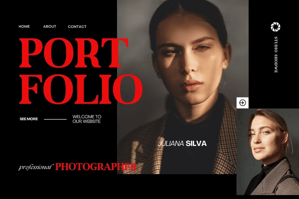
Sans serif fonts are often easier to use for smaller interface elements and longer sections of text.
They can support:
- Navigation menus
- Product descriptions
- Captions
- Pricing
- Buttons
- Contact details
This division creates a natural reading order. The serif attracts attention, while the sans serif makes the supporting information easy to process.
Match Font Weight Carefully
Weight is just as important as font style. If the serif headline is already bold and dramatic, use a regular or medium sans serif for body text. Two heavy fonts can make the page feel visually dense. Likewise, avoid combining an extremely thin serif with an equally thin sans serif if readability is important. Thin styles may look elegant on large screens but become difficult to read at smaller sizes. Test the pairing on both desktop and mobile layouts.
Use Size to Strengthen the Contrast
You do not need dramatic font differences when the size hierarchy is already strong.
For example, you might use:
48–64 px: Serif headline
24–32 px: Sans serif subheading
16–20 px: Sans serif body text
14–16 px: Supporting information
These values are only a starting point. The ideal size depends on the font itself and the final format. The goal is to make the hierarchy obvious without making the page feel disconnected.
Keep Font Pairing Consistent Across Branding
Once you find a strong combination, use it consistently. A fashion brand could use the same serif for campaign headlines across its website, lookbook, and packaging. The supporting sans serif could remain consistent for product information and digital interfaces. This creates familiarity. Customers begin to recognize the typographic style even when the layout changes. Consistency also saves time because future designs already have an established system.
Avoid Common Font Pairing Mistakes
One common mistake is choosing fonts that are too similar. If both typefaces have nearly identical proportions and personality, there may not be enough contrast to create a useful hierarchy.
The opposite problem can also happen. Pairing two fonts with completely unrelated visual languages may make the design feel inconsistent. Another mistake is introducing too many typefaces. Two font families are usually enough for most branding and website projects. Additional styles should only be added when they serve a clear purpose.
Finally, always test readability. A beautiful combination is not effective when users struggle to understand product information or navigate the page.
Build Better Designs Through Intentional Font Pairing
Knowing how to pair modern sans serif fonts with serif typefaces gives designers more control over both personality and hierarchy. Use one font to establish the visual mood and the other to support readability. Then adjust size, weight, spacing, and placement until both styles feel connected. The best combinations do not simply look attractive. They make information easier to understand while helping the brand feel more distinctive.
Ready to explore modern typography further? Read Sans Serif Fonts: Complete Guide for Modern Designers to understand how sans serif styles work across branding, websites, and contemporary layouts.

One Comment