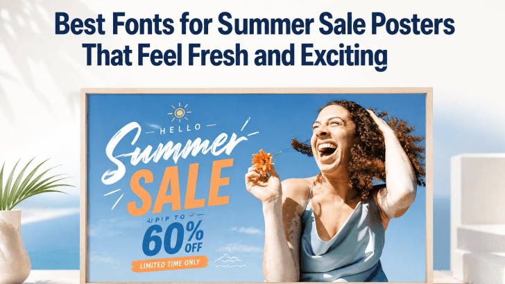
Choosing the best fonts for summer sale posters can help a promotion feel more energetic, seasonal, and memorable. Bright colors and summery photographs may attract attention, but typography gives the message its personality. The right typeface can make a beach event feel relaxed, a fashion sale feel stylish, or a lifestyle promotion feel modern and approachable.
Summer campaigns often appear on posters, website banners, social media posts, storefront displays, and email promotions. Therefore, the selected font should look attractive while keeping essential information easy to read. Sale percentages, event dates, product categories, and calls to action must remain clear at a glance.
Why Typography Matters in Summer Sale Posters
A summer sale poster usually has only a few seconds to capture attention. Viewers need to recognize the offer, understand the seasonal mood, and decide whether they want to learn more.
Typography creates this visual order. A large display font can highlight the campaign name, while a simpler supporting font can present prices, dates, locations, and promotional terms.
The font also communicates the type of summer experience being promoted. Elegant serif fonts can support resort, fashion, and premium lifestyle campaigns. Meanwhile, modern sans-serif fonts may suit beauty products, casual apparel, creative services, or digital promotions.
Best Fonts for Summer Sale Posters
The following five fonts offer different visual directions for creating fresh and exciting summer campaigns.
1. Yasmen
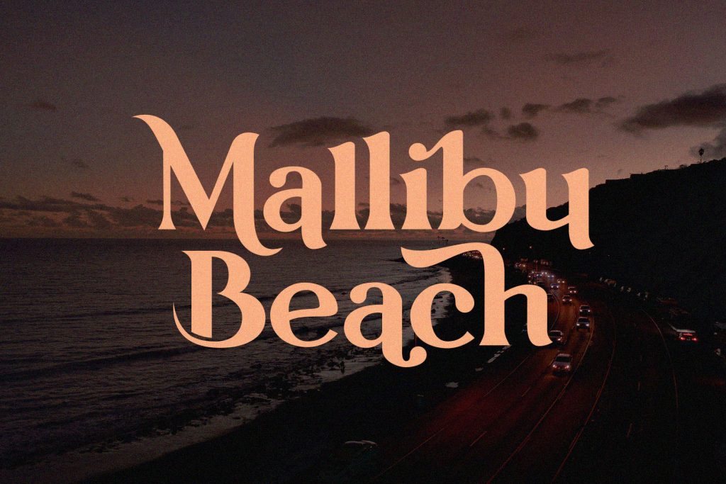
Yasmen creates a bold, elegant presence that works beautifully over atmospheric beach photography. This font can suit summer resort promotions, beachwear launches, sunset events, and premium travel campaigns. Use it at a large size so its distinctive curves remain visible, then pair it with a simple font for discount information and event details.
2. Cllerista
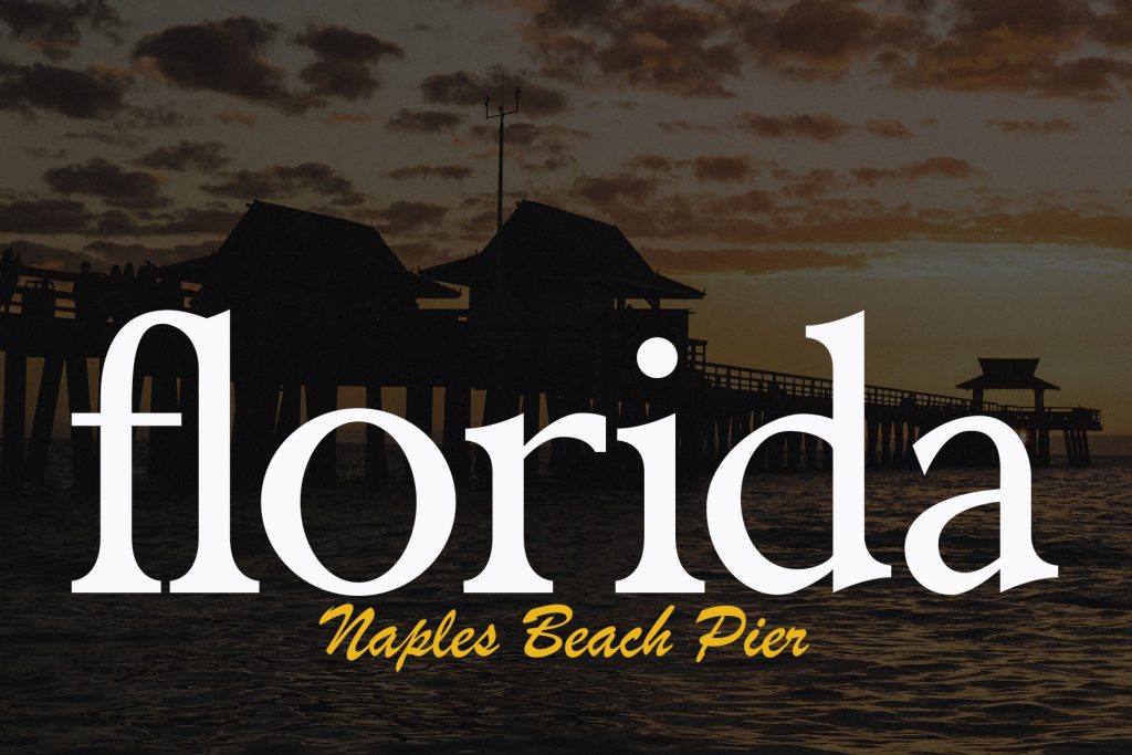
Cllerista offers a fashionable serif style with strong visual contrast. This combination can work well for coastal events, destination promotions, boutique hotels, and summer lifestyle posters. Keep Cllerista as the primary headline font and avoid placing too many additional decorative typefaces around it.
3. Biospace
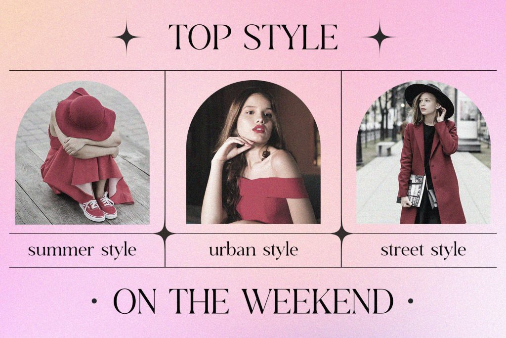
Biospace brings a polished editorial quality to summer fashion promotions. It is a strong choice for summer clothing collections, beauty campaigns, lookbooks, and boutique sales. Biospace can help a promotional design feel trendy and curated rather than overly commercial.
4. Schindler
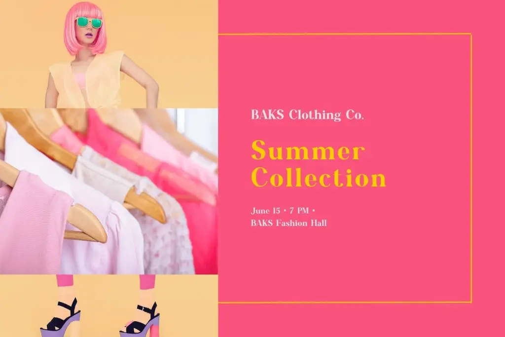
Schindler combines elegance with a confident seasonal personality. In the summer collection design, its serif letterforms create a premium fashion mood while remaining noticeable against the bright pink background.
This font works well for apparel launches, seasonal catalogs, beauty promotions, and limited-edition collections. Its refined appearance can make a discount campaign feel more exclusive, especially when paired with clean spacing and a bold color palette.
5. Kelysta
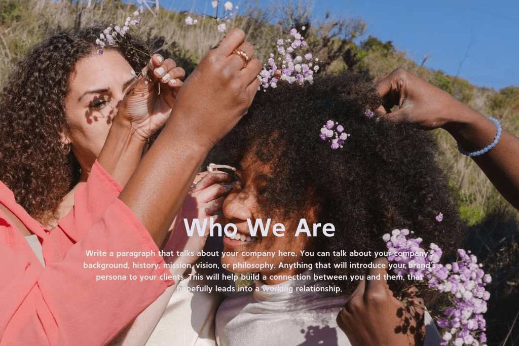
Kelysta is a modern sans-serif typeface that feels friendly, clear, and versatile. It is suitable for summer campaigns that need a cleaner and more approachable tone. Consider Kelysta for beauty brands, community events, wellness promotions, creative businesses, or casual fashion sales.
How to Choose a Font for a Summer Campaign
A font should reflect both the offer and the audience. Before selecting one, consider the products being promoted and where the poster will appear.
1. Match the Font to the Campaign Style
Use Yasmen or Cllerista for beach, travel, and destination-inspired designs. Biospace and Schindler may be better suited to fashion, beauty, and premium retail campaigns. Choose Kelysta when the promotion needs a modern, accessible, and less formal look.
The seasonal mood should feel natural. A highly formal typeface may not suit a playful pool party, while a casual handwritten style may feel out of place in a luxury resort campaign.
2. Prioritize the Main Message
The headline should be the largest and most distinctive text. It may include the campaign name, product category, or seasonal phrase.
Keep the discount, dates, and CTA easy to find. Do not allow decorative letters to make important information difficult to understand. A customer should quickly notice phrases such as “Summer Sale,” “Up to 50% Off,” or “Shop the Collection.”
3. Use a Simple Font Pairing
One display font and one supporting font are often enough. The display typeface creates character, while the simpler font handles prices, descriptions, and conditions.
For example, pair Schindler with a clean sans-serif for product details. Kelysta can also function as a supporting font when combined with a more expressive serif headline.
Build a Fresh Visual Hierarchy
Typography should guide viewers from the headline to the promotional details and finally to the CTA. Use size, weight, contrast, and spacing to create a clear reading sequence.
Avoid making every line equally bold. Instead, emphasize the sale name, discount, and primary action. Supporting information can remain smaller but should still have enough contrast against the background.
Summer posters often use colorful photographs, gradients, or bright backgrounds. Test the text over each visual area and add a subtle overlay when necessary. Strong readability will make the design feel more polished and trustworthy.
Recommended articles
For more seasonal typography inspiration, explore The Role of Sans-Serif Fonts in Summer Posters to understand how clean typefaces can strengthen modern campaigns. Then, read Summer Poster Design Trends: Typography Techniques That Capture Attention to discover more ways to create fresh promotional layouts that stand out.

Create a Summer Poster That Encourages Action
The best fonts for summer sale posters should communicate excitement without creating clutter. Yasmen and Cllerista bring a luxurious coastal mood; Biospace and Schindler support fashion-focused campaigns; while Kelysta offers a clean, modern direction.
Choose the typeface that matches the brand, keep the hierarchy simple, and test the poster at its final size. These steps can make a summer promotion feel more consistent, attractive, and ready to convert attention into action.
