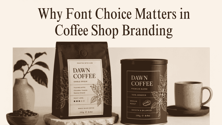
Understanding why font choice matters in coffee shop branding can help café owners build a visual identity that feels memorable, consistent, and relevant to their customers. Typography appears almost everywhere in a coffee business, including the logo, menu, packaging, storefront signage, social media posts, and takeaway cups.
Customers may not consciously analyze a typeface, but they often respond to the feeling it creates. A refined serif font can make a café feel premium, while a friendly handwritten style may suggest warmth and familiarity. A bold display font can create energy, whereas a clean sans serif may communicate simplicity and modernity. For that reason, font selection should be treated as a branding decision rather than a decorative choice.
Typography Shapes the First Impression
A customer may see your logo, storefront, or Instagram post before tasting your coffee. Typography helps form an immediate opinion about what kind of experience the business offers.
A traditional serif typeface may suit a specialty roaster that emphasizes craftsmanship and origin stories. Meanwhile, a geometric sans serif can support a modern café with a minimalist interior and technology-friendly service.
The font should match the atmosphere customers will experience inside the shop. When the visual identity and physical space feel connected, the brand appears more thoughtful and trustworthy.
Why Font Choice Matters in Coffee Shop Branding
The right typeface influences more than appearance. It helps communicate personality, organize information, and build recognition across different platforms.
1. Fonts Communicate Brand Personality
Every coffee shop has a different story. Some cafés focus on premium beans and slow brewing methods. Others want to feel casual, youthful, artistic, or community-centered.
Typography can express those differences quickly. Elegant letterforms may support a luxury coffee brand, while textured or handcrafted fonts can suggest an artisanal approach. Before choosing a font, define the café in three or four words. Descriptions such as cozy, premium, playful, modern, rustic, or sustainable can guide the design direction.
2. Fonts Improve Brand Recognition
Consistent typography makes a coffee brand easier to recognize. When customers repeatedly see the same typeface on packaging, menus, signs, and digital content, they begin to associate that visual style with the business. This consistency is especially useful for growing coffee shops. A recognizable font system can connect several locations, product lines, and seasonal promotions without requiring every design to look identical.
For more ideas on building this system, explore Best Coffee Shop Fonts for Branding and Packaging. The guide offers font inspiration for logos, product labels, promotional graphics, and retail applications.
3. Fonts Influence Menu Readability
A café menu needs to look attractive, but it must also help customers make decisions quickly. Decorative fonts may add personality to section titles, but they can become tiring when used for long descriptions or prices.
Create a Clear Menu Hierarchy
Use typography to separate categories, item names, descriptions, and prices. Customers should immediately understand where to look for espresso, tea, food, and seasonal products. A display font can work well for headings such as “Signature Drinks” or “Fresh Pastries.” A simpler serif or sans serif should handle product details and pricing.
Avoid Fonts That Slow Down Reading
Very thin letters, tightly spaced text, and highly decorative scripts may become difficult to read from a distance. This problem is especially noticeable on wall menus and digital ordering screens.
Test the menu at its final size before printing it. For more practical inspiration, read Food Fonts for Cafe Menus and Signage to discover typography approaches that balance personality with everyday usability.
4. Fonts Strengthen Coffee Packaging
Coffee packaging is both a product container and a marketing tool. It may need to communicate the brand name, roast level, flavor notes, origin, weight, and brewing information within a limited space. A clear font hierarchy keeps these details organized. The brand name should attract attention first, while supporting information remains easy to scan.
Typography can also help differentiate product varieties. You might use the same font family across every coffee bag while changing color, weight, or layout for different origins and roast profiles. This creates variety without losing brand consistency.
5. Fonts Support Storefront and Signage Design
Storefront typography must remain recognizable from a distance. A logo that looks attractive on a laptop screen may lose clarity when placed above a café entrance.
Consider the width, weight, and spacing of the letters. Thin type may disappear under bright sunlight, while overly detailed fonts may become difficult to understand from across the street. Directional signs, opening hours, order counters, and promotional boards should also follow the same visual system. These smaller applications help create a complete and professional customer experience.
6. Font Pairing Creates Visual Balance
Most coffee brands benefit from using one or two complementary typefaces rather than relying on several unrelated styles.
Use One Font for Personality
Choose a distinctive font for the logo, campaign headline, or packaging title. This typeface becomes the main expression of the brand.
Use Another Font for Clarity
Pair the primary font with a readable typeface for menus, product descriptions, website text, and contact details. The supporting font should feel compatible without competing for attention. For example, a refined serif logo can pair with a clean sans serif for practical information. A bold display font may also work with a neutral body typeface.
Commercial Licensing Is Part of the Decision
A font may look perfect for your café, but you still need to confirm whether its license covers commercial branding. Some licenses may allow personal design work but restrict logos, packaging, merchandise, advertising, or products for sale. Review these terms before applying the typeface across your business.
This step is particularly important when producing coffee bags, cups, stickers, uniforms, and branded merchandise. Read Font Licensing Explained for Commercial Use in a Branding Project to better understand what to check before launching the identity.
Build a Coffee Brand Customers Remember
Why font choice matters in coffee shop branding becomes clear when you look at every customer touchpoint. Typography shapes first impressions, improves menu readability, strengthens packaging, and connects physical and digital experiences.
Choose a font that reflects the café’s personality, remains readable at different sizes, and works across real applications. Then use it consistently so customers can recognize the brand more easily.
