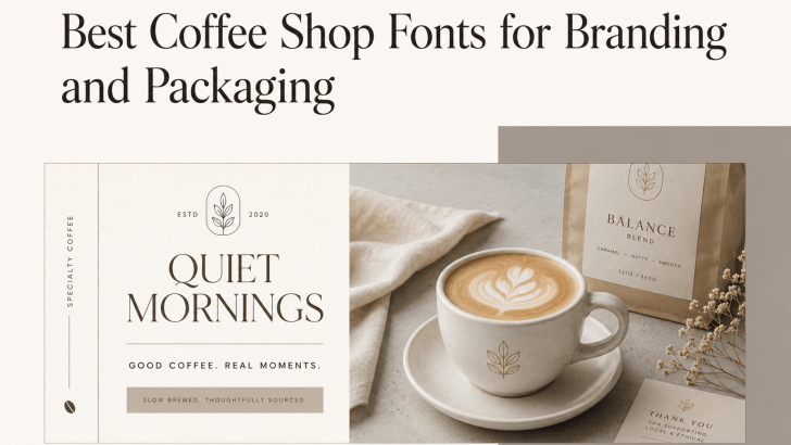
Choosing the best coffee shop fonts for branding and packaging can shape how customers remember your café before they even taste the coffee. Typography appears on logos, cup labels, bean packaging, menu boards, stickers, social media posts, and takeaway bags. Because of that, the right font can help a coffee brand feel premium, cozy, artisanal, modern, or bold.
Coffee businesses often compete through experience as much as product quality. A warm neighborhood café may need a softer visual identity, while a specialty roaster may want typography that feels refined and professional. Therefore, selecting the right font is not only about beauty. It is also about clarity, personality, and consistency across every customer touchpoint.
Why Fonts Matter for Coffee Branding
A coffee brand usually lives in many formats at once. It appears on printed packaging, small labels, loyalty cards, social media graphics, posters, and storefront signage. If the font looks attractive on one medium but unclear on another, the brand may feel inconsistent.
That is why good typography should do two things at once. First, it should reflect the café’s personality. Second, it should remain readable in both large and small applications.
For example, a font used for a coffee bean bag should still work when printed on a sticker or cup sleeve. If you are also developing the visual identity of your café, you may want to explore Coffee Shop Logo Ideas for Small Businesses for more inspiration on building a cohesive brand.
What to Look for in Coffee Shop Fonts
Before choosing a typeface, it helps to understand what makes a font suitable for coffee branding and packaging.
Readability at Different Sizes
Coffee packaging often contains product names, roast details, weight, and origin information. These details must stay readable even when printed in small spaces.
Brand Personality
Some cafés want a classic and handcrafted mood. Others prefer a modern, minimalist, or editorial look. The font should support that tone naturally.
Versatility Across Applications
A strong font should work across packaging, menus, social media graphics, and promotional materials. This flexibility helps the brand feel more recognizable.
Best Coffee Shop Fonts for Branding and Packaging
Below are five font recommendations based on the visual style shown in your attached examples.
1. Baigont
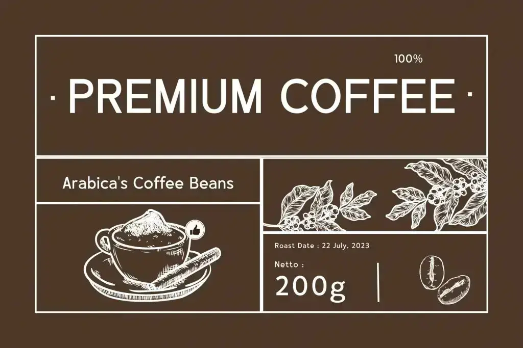
Baigont has a clean, structured look that feels perfect for premium coffee packaging. This makes Baigont a strong choice for bean bags, coffee labels, box packaging, and menu headers. If your brand wants to appear polished, trustworthy, and slightly upscale, Baigont can help create that impression without looking too stiff.
2. Circle Amolens

Circle Amolens brings a bold and expressive personality that fits coffee branding with a strong morning or lifestyle angle. It feels suitable for poster promotions, café campaigns, social media creatives, and limited-edition merchandise. For coffee shops that want a more memorable and energetic identity, Circle Amolens can make short phrases feel impactful.
3. Rosela
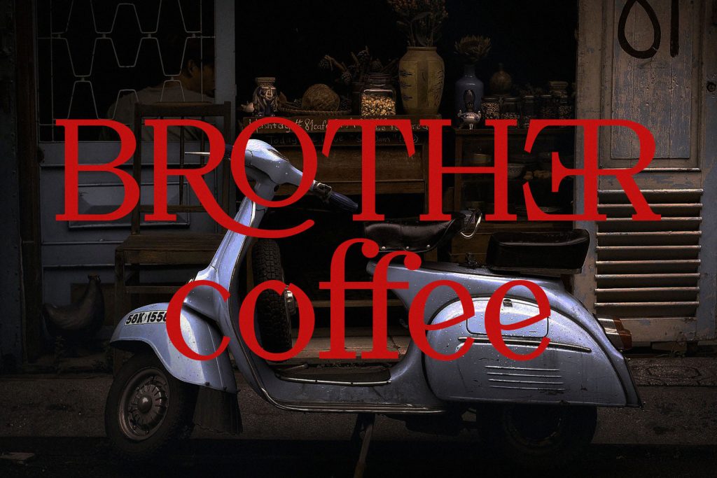
Rosela has a dramatic and stylish character that gives coffee branding a more artistic and editorial mood. This font is ideal for specialty coffee brands, creative cafés, and businesses that want their packaging or posters to feel more expressive. Rosela works especially well when the brand wants to stand out with personality rather than a purely minimal look.
4. Jochepine
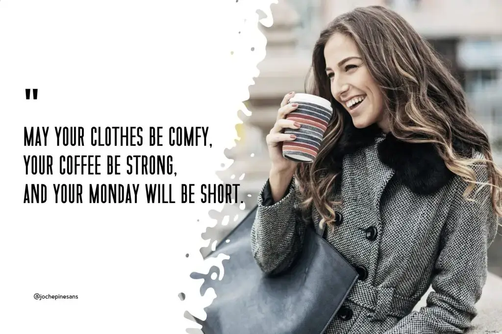
Jochepine has a tall, compact, and modern look that’s perfect for quote-based content and lifestyle branding. It’s clean and easy to read while adding character to compositions, making it useful for coffee quotes, promotional posters, packaging accents, and social media content. It’s contemporary and approachable, especially when paired with photography. If your cafe brand frequently shares visual stories or campaign graphics, Jochepine can effectively support that voice.
5. Viona Collins
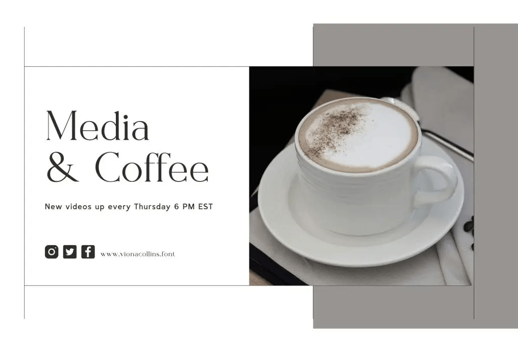
Viona Collins offers an elegant serif style that feels refined and calm, making it a strong option for premium coffee branding. This font is suitable for café logos, coffee packaging, lifestyle branding, and printed promotional pieces that need a clean editorial feel. Viona Collins works especially well for brands that want to look tasteful, modern, and slightly luxurious.
How to Use Fonts in Coffee Packaging
Choosing the right typeface is only the first step. You also need to apply it strategically.
1. Create a Clear Hierarchy
Use one font style for the main brand name or product title, then a simpler supporting style for roast details, weight, and description. This keeps the label easy to scan.
2. Match the Font to the Product Style
A premium single-origin coffee may suit an elegant serif or structured display font. Meanwhile, a playful bottled coffee drink may benefit from something more casual and expressive.
3. Keep the Layout Clean
Even a beautiful font can feel messy when the packaging is overcrowded. Leave enough whitespace so the typography can breathe.
If you plan to add product labels, promotional decals, or takeaway seals, you can also read Sticker Design Tips for Print, Packaging, and Merch for practical ideas on making printed branding elements more effective.
4. Don’t Forget Commercial Licensing
Before finalizing your coffee branding, always check whether the font license allows commercial use. This is especially important if the font will appear on products for sale, packaging, logos, advertising, or merchandise.
Licensing is often overlooked during the design stage. However, it can become a serious issue once the brand launches. To avoid problems, read Font Licensing Explained for Commercial Use in a Branding Project before using any font in a commercial identity system.
Build a Memorable Coffee Brand With the Right Font
The best coffee shop fonts for branding and packaging should do more than look attractive. They should help customers recognize the brand, understand the product, and remember the overall experience. Baigont offers structure and premium clarity, Circle Amolens brings bold warmth, Rosela adds artistic personality, Jochepine supports modern lifestyle visuals, and Viona Collins creates refined elegance.
