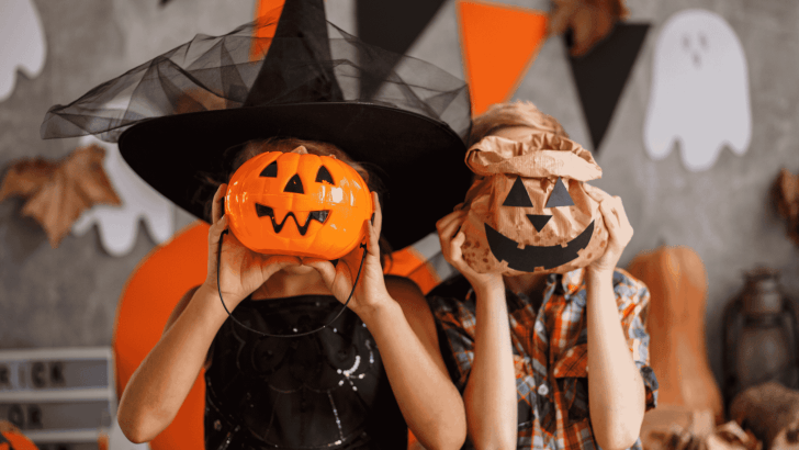
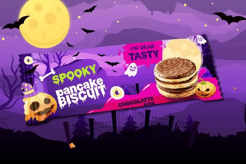
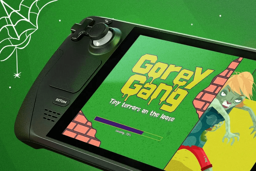
Choosing the best spooky fonts for Halloween design is essential if you want your visuals to stand out during the Halloween season. Typography plays a huge role in creating a creepy atmosphere, whether you are designing posters, social media graphics, invitations, or product packaging.
Spooky fonts instantly communicate horror, mystery, and fun. The right font can transform a simple design into something terrifying or playful, depending on your concept. In this article, we will explore the characteristics of spooky fonts, key tips for using them, and the best font recommendations for Halloween projects.
Why Best Spooky Fonts for Halloween Design Matter
Halloween design is all about mood. Colors, illustrations, and typography must work together to create a strong visual impact.
Using the best spooky fonts for Halloween design helps you:
- Create a creepy and immersive atmosphere
- Grab attention instantly
- Strengthen your theme and storytelling
- Make designs more memorable
Without the right typography, even the best Halloween visuals can feel incomplete.
Characteristics of Spooky Fonts for Halloween Design
Spooky fonts have unique visual traits that make them perfect for horror and Halloween themes.
1. Irregular and Distorted Shapes
Spooky fonts often feature uneven lines, jagged edges, or distorted letterforms. These imperfections create a sense of unease and unpredictability.
2. Dripping or Melting Effects
Many Halloween fonts include dripping elements that resemble blood, slime, or decay. This effect enhances the horror aesthetic.
3. Rough and Textured Appearance
Textures like scratches, cracks, or rough brush strokes give spooky fonts a gritty and aged look.
4. Handwritten or Chaotic Style
Some spooky fonts mimic messy handwriting, making them feel more human and unsettling.
5. Bold and Eye-Catching Forms
Despite their irregularity, spooky fonts are usually bold enough to stand out in posters and headlines.
Best Spooky Fonts for Halloween Design
1. Blood Melt
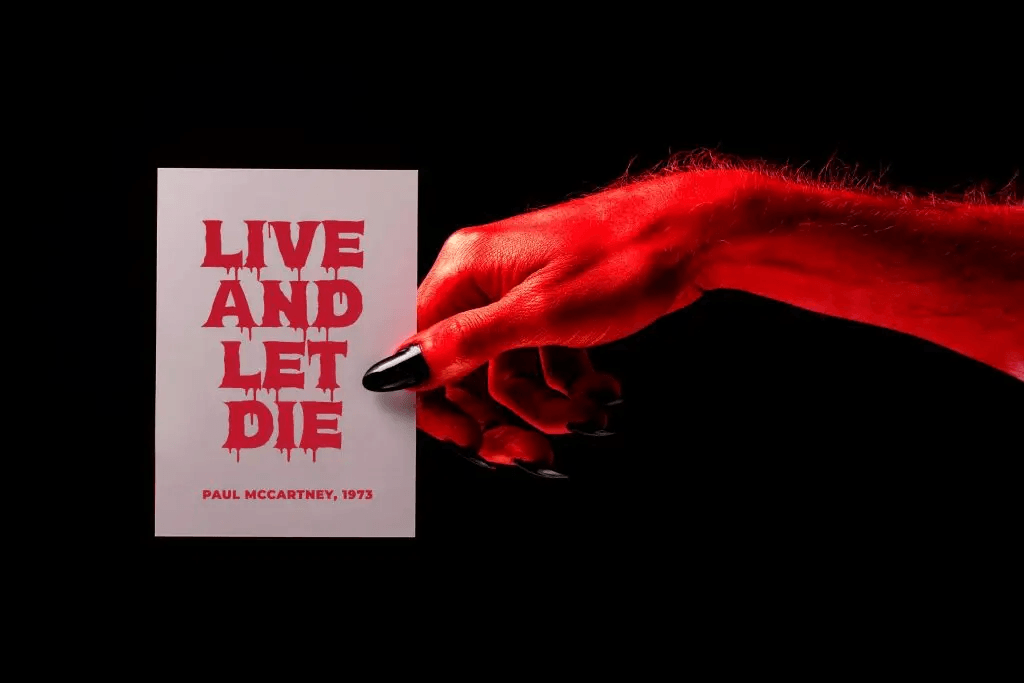
Blood Melt is a freaky font with a dripping horror style that adds chilling drama to your designs.
Characteristics:
- Dripping blood effect
- Bold and horror-themed
- Highly visual and dramatic
Best for:
- Halloween party invitations
- Halloween flyers
- Haunted house promotions
This font immediately creates a terrifying atmosphere and is perfect for designs that aim to shock and grab attention.
2. Freakdrip
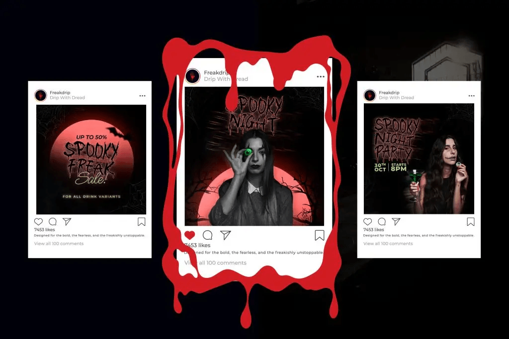
Freakdrip is a freaky horror dripping font that oozes with personality. Its bold, liquid-like letterforms create a creepy, edgy, and thrilling vibe, perfect for designs that need to look spooky and unforgettable.
Characteristics:
- Liquid-like typography
- Smooth yet eerie curves
- Unique and eye-catching
Best for:
- Social media graphics
- Trendy Halloween branding
- Digital posters
Freakdrip is ideal if you want a spooky look that still feels stylish and contemporary.
3. Ghoulie Script
Ghoulie Script is a horror display font full of character. Each letter looks like it’s melting and dripping like slime, with creepy details such as hollow eyes peering from inside the glyphs.
Characteristics:
- Script-style handwriting
- Slightly uneven strokes
- Playful yet creepy vibe
Best for:
- Halloween merchandise
- Halloween memes
- Horror movie posters
This font is perfect when you want something spooky but not too scary.
4. Slime Rage
Slime Rage is a bold and freaky display font dripping with spooky energy. Inspired by slimy textures and horror movie vibes, it combines organic, uneven letterforms with a gooey, melting effect
Characteristics:
- Thick and dripping forms
- Cartoonish horror style
- High visibility
Best for:
- Creepy game titles
- Kids Halloween events
- Packaging design
Slime Rage adds a playful horror touch that works well for casual and fun designs.
5. Zombox
Zombox delivers a rough, decayed, and zombie-inspired typography.
Characteristics:
- Broken and cracked letters
- Rough texture
- Dark and gritty aesthetic
Best for:
- Eerie social media content
- Halloween party flyers
- Zombie game UI
Zombox is perfect for projects focused on apocalyptic or undead themes.
Key Tips for Using Best Spooky Fonts for Halloween Design
Using spooky fonts correctly is just as important as choosing the right one.
1. Use for Headlines Only
Spooky fonts are often decorative, so they work best for titles, not long paragraphs.
2. Combine with Simple Fonts
Pair spooky fonts with clean sans-serif fonts to maintain readability.
Example:
- Spooky font → headline
- Simple font → body text
3. Match the Theme
Not all spooky fonts are the same.
- Blood fonts → horror theme
- Slime fonts → fun Halloween
- Script spooky → elegant Halloween
Choose based on your design goal.
4. Don’t Overuse Effects
Too many spooky elements can make your design messy. Keep balance in typography.
5. Focus on Contrast
Use colors like black, orange, purple, and red to enhance spooky typography.
Conclusion
The best spooky fonts for Halloween design can transform your visuals into something memorable, engaging, and perfectly themed. From dripping horror styles like Blood Melt to playful fonts like Slime Rage, each font brings its own personality to your design.
Understanding font characteristics and applying the right design principles will help you create Halloween visuals that stand out and connect with your audience.
Whether you are designing for horror, fun, or elegant Halloween themes, choosing the right spooky font is the key to success.